Do you think IIT Guwahati certified course can help you in your career?
Introduction
Hello Ninjas! Welcome back. Are you a Data Science enthusiast? Are you here to expand your knowledge about EDA? Do you find Datasets fascinating? If yes, you're at the right place.
In this article, we will talk about Exploratory Data Analysis in Data Science, the dataset used, insights from the dataset, handling the missing values, data visualization, and handling the outliers. So let's get started with eda in data science.
What is Exploratory Data Analysis?
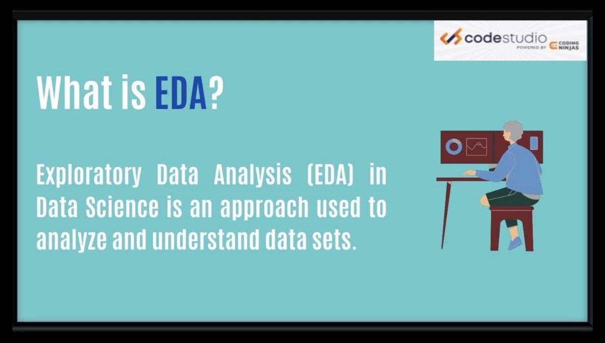
Exploratory Data Analysis or EDA in Data science is used to analyze and understand data sets. It is an iterative process that involves visualizing, summarizing, and editing data to fetch meaningful information. It provides insights and patterns in our data before building predictive models and is an essential part of the process.
EDA in data science aims to gain a general understanding of the data, which covers the data's distribution, outliers, and structure. We use data transformation, statistics, and visualization techniques to achieve this goal. EDA in data science is important to analyze and completely understand our data better. EDA helps users identify any potential data issues, for example, outliers. While building predictive models, it is crucial to address these issues.
Why is Exploratory Data Analysis important in Data Science?
EDA(Exploratory data analysis) is an important part of data science. It helps data scientists look at the data thoroughly before making any assumptions. Its importance is denoted in the following points:
Identifying errors
Understanding patterns in the data
Discovering new insights
Detecting outliers
Discovering crucial factors
Finding exciting relationships between variables
If you want to know more about data science, Check out our Data Science Course
Exploratory Data Analysis Tools
Exploratory Data Analysis tools consist of many options. Some of them are listed below:
R and Python It offers various libraries for data visualization, data manipulation, and data analysis.
KNIME It is an open-source analysis platform to analyze data. It has many useful features for data visualization and blending.
Orange It is also an open-source machine learning and data mining software that can be used for the purpose of EDA.
Histograms Histograms are the bar plots that are used for continuous or categorical data. Each of the bars represent the frequency of class for a range of values.
Exploratory Data Analysis (EDA) Using Python Libraries
The dataset used in EDA can be described as any data collection relevant to the problem, for example, data acquired from a survey, file, or database. The first step in EDA is to import the dataset into a program and load it into a data frame. Doing this allows the data to be easily visualized.
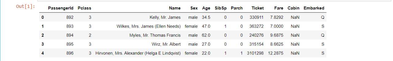
Let’s look at the following data set to understand better - Titanic Dataset.
import pandas as pd
import numpy as np

df = pd.read_csv(r"C:\Users\priya\Dropbox\My PC (LAPTOP-6CMD6BRV)\Downloads\test (1).csv")
df.head()
In the above example, we have printed the first five rows of our dataset using the Pandas Module. Here, we have used the head() function. Similarly, we can use the tail() function to print the last five rows of our dataset.
Now that the data is loaded, the second step is analyzing the structure and properties of the data. This process can include studying the number of observations and variables and the data distribution.
Insights From the Dataset
EDA insights refer to our understanding of the information given in the dataset. This information that we gather can examine the patterns, trends, data relationships, and other features of the dataset.
The goal of EDA in data science is to gain a general understanding of the data, conduct statistical research, identify and fix any issues with the data. The insights gained from EDA in data science help us ensure that the data analysis results are correct and meaningful. Given below are the various insights we can gather from our data -
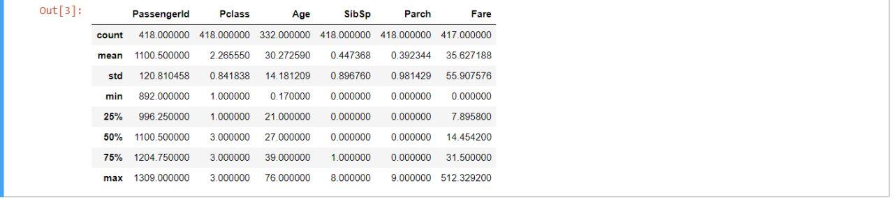
Summary of the dataset
We can get the summary of the dataset by using the "describe()" method.
For example -
df.describe()
Let’s use this feature on our dataset -
The shape of the dataset
We can find the number of rows and columns in our dataset using ".shape."
For example -
df.shape
Let’s use this feature to find out the shape of our dataset -
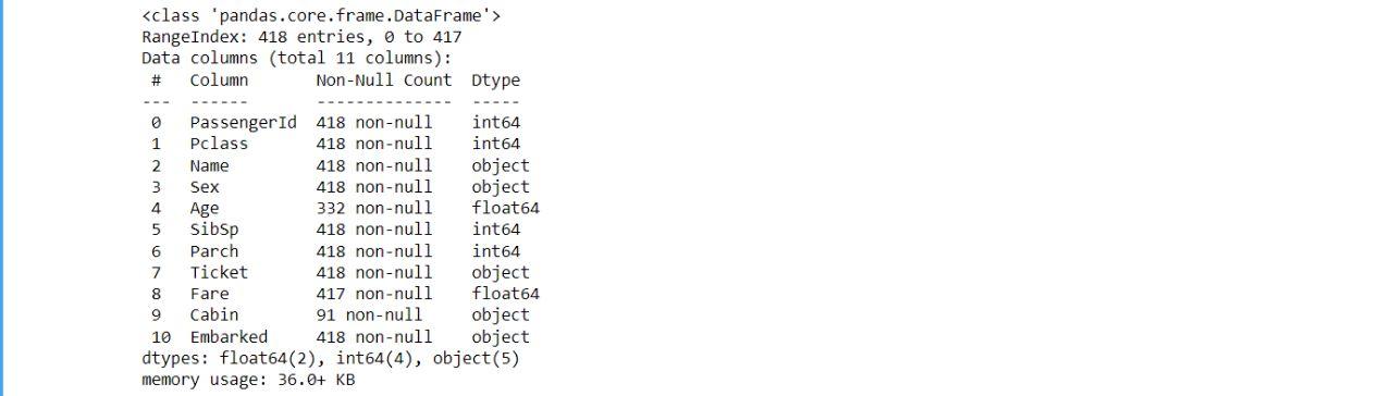
Information about the Data Frame
We can find the total number of rows and columns in our dataset, memory usage, and column and row data types using ".info."
For example -
df.info
Let’s use this feature to find out the shape of our dataset -
Handling the Missing Values
Missing values in a dataset is a common problem in the real world. This happens when people don't provide the required information in a dataset, such as a phone number. These values are considered missing in the dataset. We can handle the missing values in the dataset by removing the missing data, using a predictive model, or estimating the missing values.
Let's look at the various steps involved in handling the missing values in EDA -
Identifying the missing values: The first step is to detect and identify the missing values in the dataset.
Understanding the reason: Here, we find out why our data has missing values, for example, measurement error.
Selecting an imputation method: After finding out why our data has missing values, we decide what imputation methods we can use to fill in the missing values. For example - multiple imputations.
Imputing the missing values: We will now fill in the missing values using the imputation method we have selected.
Verifying the imputed values: Here, we verify the data using different methods and check if they are valid.
Justifying: The last step is to explain why we used the imputation method and make any assumptions made about that data.
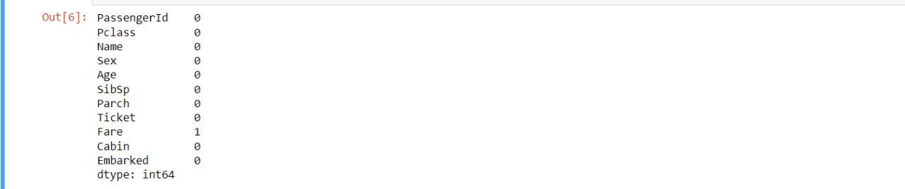
We can check if our data has any missing values by using the “df.isnull().sum()” feature. For example -
df.isnull().sum()
Output
Let's now fill in the missing values in our dataset:
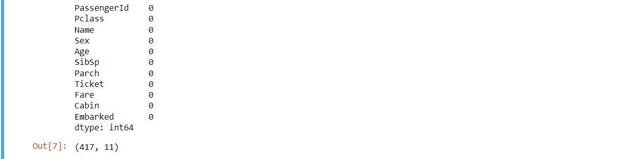
We will now remove the missing values in our dataset:
df = df.dropna(axis = 0, how ='any')

print(df.isnull().sum())
df.shape
Output
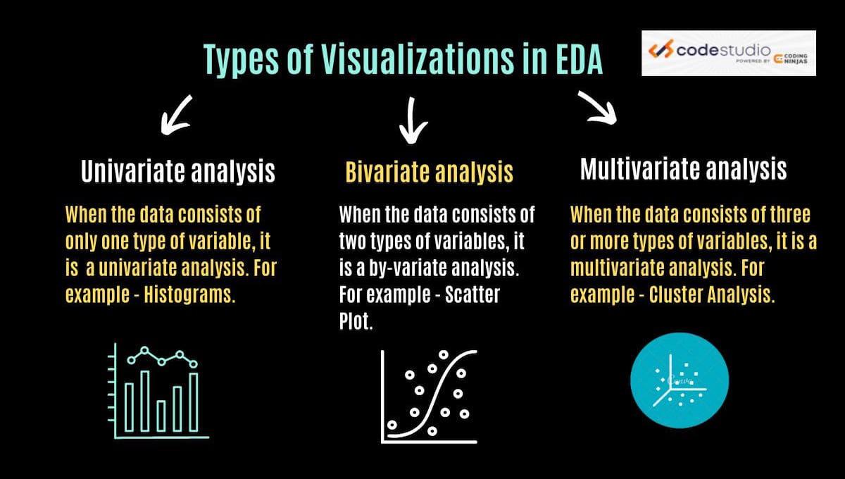
Types of Data Visualization
Data visualization in EDA is graphically representing data to understand data patterns. This helps to analyze the data better. Data visualization is used in EDA to detect outliers and analyze relationships between variables in the data that are not immediately noticeable. There are various kinds of visualizations in EDA.
For example -
Univariate analysis: When the data consists of only one variable type, it is called univariate analysis. For example - Histograms.
Bivariate analysis: When the data consists of two types of variables, it is called a by-variate analysis.
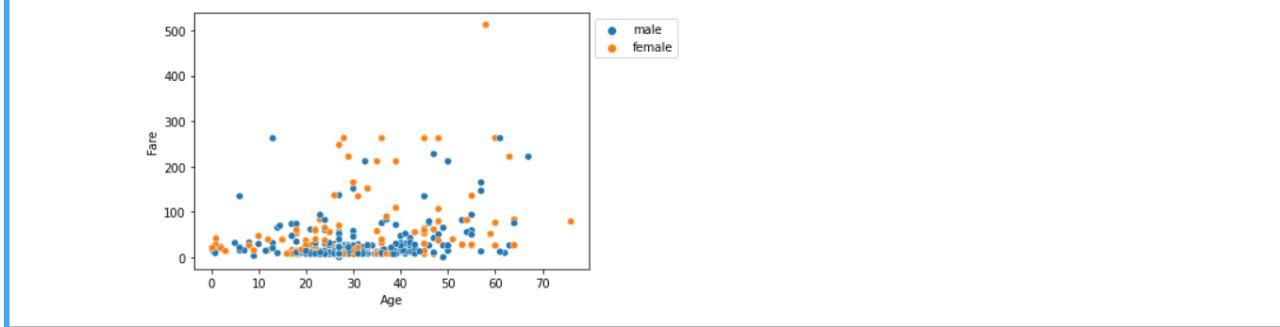
Multivariate analysis: When the data consists of three or more types of variables, it is called a multivariate analysis. For example - Scatter Plot.
There are several common types of data visualizations in EDA that are used to represent data graphically. For example - histograms, scatter plots, box plots, line plots, and bar plots. Each of these visualizations helps the users to understand patterns and identify important relationships in the data. Let's look at a few commonly used graphs -
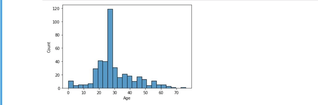
Histogram
Histograms are used to represent the distribution of a single variable. Histograms present a spread-out view of the data, which helps the users to identify outliers. For example -
import seaborn as sns
import matplotlib.pyplot as plt


sns.histplot(x='Age', data=df, )
plt.show()
Output
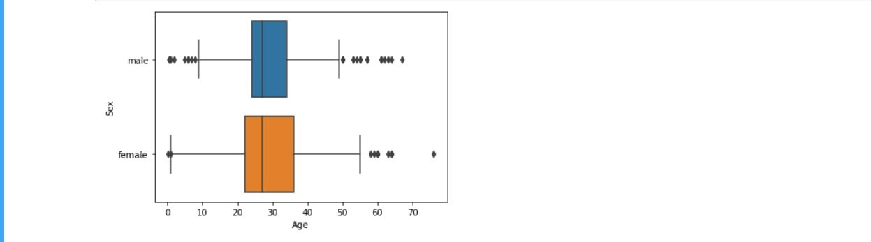
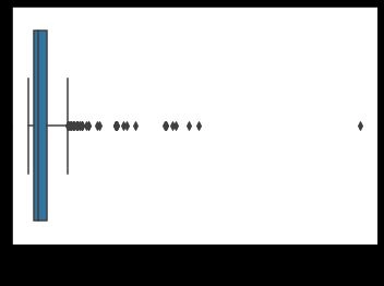
Box Plots
Box Plots visually represent a variable's median, range, and quartiles. They are used to identify skewness and outliers in the data. For example -
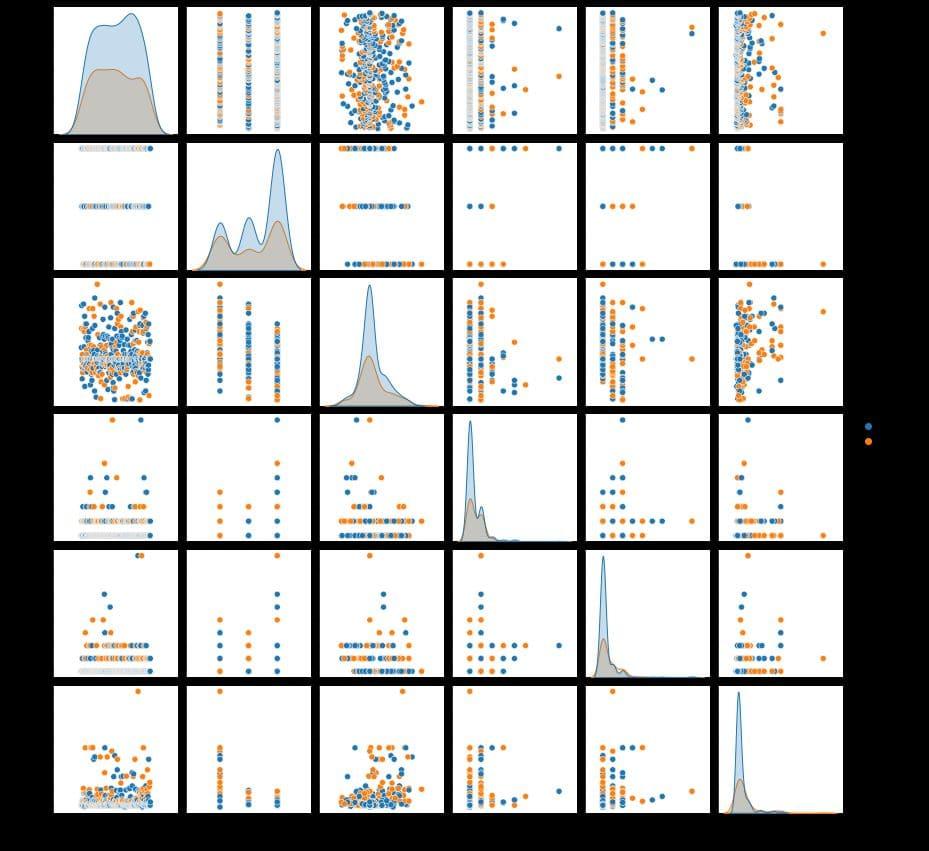
For multivariate analysis, let’s look at the following example -
sns.pairplot(df, hue='Sex', height=2)
Output 2
Handling the Outliers
Handling outliers in EDA is essential to ensure meaningful and accurate data analysis. Outliers are data points that exist far from other data points and skew the results of statistical analysis. However, outliers also provide us with insights and valuable information about the data. Let's look at the various ways to handle outliers in EDA -
Winsorizing: This method is used to replace outliers with a value that is in the range of the other data points.
Binning: This method is used to group the data, which helps to reduce the effect of outliers.
Trimming: This method is used to remove the outliers from the dataset completely. Note that this method should only be used when the outliers are considered errors.
Log transformation: As the name suggests, this method is used to transform the data into a log scale which can also sometimes reduce the impact of outliers.
Let us understand the example below to detect and remove outliers from our dataset.
EDA stands for Exploratory data analysis that is an approach which is used to analyze and understand the data sets which summarize the main characteristics for the data scientists.
How is EDA in data science important for users?
EDA helps users identify any potential issues with the data, for example - outliers. While building predictive models, it is essential to address these issues.
How do I master EDA for data science?
Best way to master EDA for data science is to focus on the data manipulation and visualization skills, where you have to practice with the large datasets.
What are the various ways of handling outliers in EDA?
There are several ways to handle outliers in EDA, such as trimming, winsorizing, log transformation, and standardization.
What are the 4 types of exploratory data analysis?
Exploratory data analysis (EDA) can be broken down into four main categories: examining single variables (univariate), exploring relationships between two variables (bivariate), and understanding interactions between multiple variables (multivariate). These can be further divided into graphical and non-graphical techniques.
Conclusion
This article discussed What is Exploratory Data Analysis in Data Science, the dataset used, insights from the dataset, handling the missing values, data visualization, and handling the outliers. If you want to dig deeper into Data Science, here are some related articles -


 9+ registered

