Do you think IIT Guwahati certified course can help you in your career?
Introduction
"If you want to create beautiful and responsive websites, mastering CSS is necessary. In this blog, we'll discuss CSS flex property in web development and some examples of how it can enhance the look and functionality of a website and make it responsive and flexible."
What is the flex property in CSS?
CSS flex property is a shorthand property used to define how a flex item will grow, shrink, and what its initial size should be within a flex container. It combines three properties: flex-grow, flex-shrink, and flex-basis. This property allows items within a flexbox layout to adjust their size dynamically based on the available space.
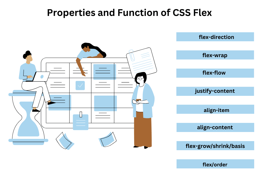
Properties of the flex property:
flex-grow: Defines the ability of a flex item to grow relative to other items when space is available.
flex-shrink: Specifies how much a flex item should shrink relative to others when the container has less space.
flex-basis: Sets the initial size of a flex item before any growing or shrinking occurs.
Syntax
The syntax of the CSS flex property is as follows:
flex: flex-grow flex-shrink flex-basis;
flex-grow: Specifies how much an item can grow relative to other flex items. It's a non-negative number (default is 0).
flex-shrink: Defines how much an item can shrink relative to others. It's a non-negative number (default is 1).
flex-basis: Sets the initial size of the item before free space is distributed. It can be a length value (e.g., px, %) or auto (default).
Explanation of Property Values
The flex property in CSS consists of values that determine how a flex item behaves within a flex container. These values define the item’s ability to grow, shrink, or set its initial size.
flex-grow: This value specifies the factor by which a flex item will grow relative to other flex items when there is extra space in the container. A value of 0 means it won't grow, while a value greater than 0 allows the item to expand.
flex-shrink: This value defines how much a flex item will shrink relative to other items when the container has less space. A value of 1 means it will shrink, while a value of 0 means it won't shrink.
flex-basis: This value sets the initial size of a flex item before any growing or shrinking occurs. It can be a specific length (e.g., 200px) or auto, which makes the item’s size depend on its content or other factors.
Examples of CSS Flex Property
In this part, we will discuss various examples to understand flex property in CSS.
Example 1: Using flex property
Here is an example of how to use the flex property with HTML implementation.
<!DOCTYPE html>
<html>
   <head>

      <meta charset="utf-8">

      <meta name="viewport" content="width=device-width, initial-scale=1">

      <title>Coding Ninjas</title>

      <style type="text/css">
         .container {
          display: flex; /* enables flexbox layout */
          flex-wrap: wrap; /* sets the flex-wrap property to wrap */
          justify-content: center; /* centers the items horizontally within the container */
          align-items: center; /* centers the items vertically within the container */
         }
         .item-1, .item-2, .item-3 {
          flex: 1; /* sets the flex-grow, flex-shrink, and flex-basis properties to 1 */
          padding: 10px; /* adds padding to the items */
          text-align: center; /* centers the text within the items */
         }
         .item-1{
            background-color: yellow;
         }
         .item-2{
            background-color: blue;
         }
         .item-3{
            background-color: red;
         }

      </style>
   </head>
   <body>
      <div class="container">

         <div class="item-1">Item 1</div>

         <div class="item-2">Item 2</div>

         <div class="item-3">Item 3</div>
      </div>
   </body>
</html>
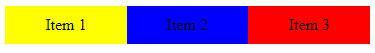
Output:
Explanation: This will create a container with three items inside, and the container will be center aligned, and the items will wrap to the following line if the space is not enough.
You can also use the flex property on individual items to control their size and position within the container. For example, you can use the align-self property on an item to override the align-items property set on the container and align the item differently from the other items.
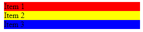
Example 2: Using flex-grow, flex-shrink and flex-basis
Here is an example of using the flex-grow, flex-shrink, and flex-basis properties with HTML implementation.
Explanation: In this example, the container is set to have the flex-wrap property set to wrap, so if the items don't fit in a single row, they will wrap to the next row.
The justify-content property is set to space-between so that the items will be evenly distributed within the container.
For example, on the first item (item1), the flex property is set to 2 1 150px, which means that the item will grow two times more than the other items, shrink one time less than the other items, and with a base size of 150px.
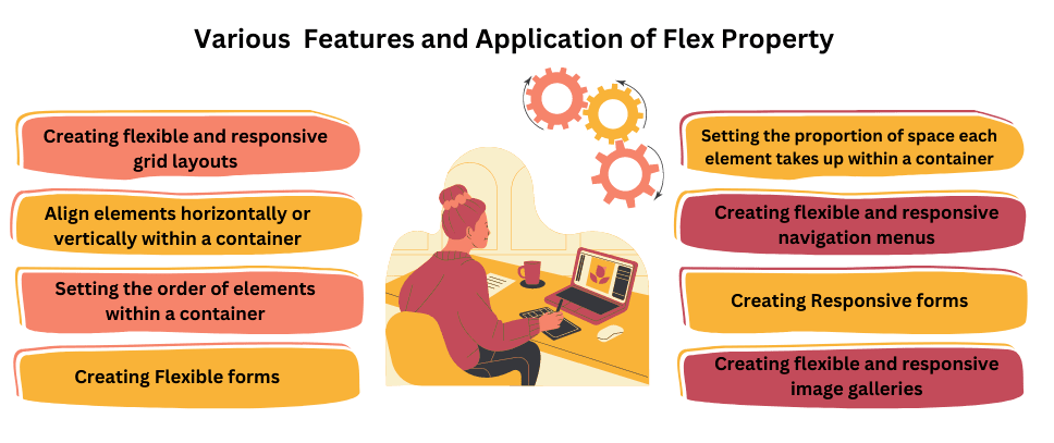
Features and Applications of CSS Flex Property
CSS flex property allows for a flexible box layout, meaning elements within a container can be laid out in any direction and adapt to different screen sizes and devices.
Some common features and applications of CSS flex property are:-
1. Creating flexible and responsive grid layouts for web pages.
2. Align elements horizontally or vertically within a container.
3. Setting the order of elements within a container.
4. Setting the proportion of space each element takes up within a container.
5. Creating flexible and responsive navigation menus.
6. Creating flexible and responsive forms.
7. Creating flexible and responsive image galleries.
Frequently Asked Questions
Why using flex in CSS?
Flex in CSS (Flexible Box Layout) is used to create flexible and responsive page layouts. It simplifies the design process, allowing elements to adapt to various screen sizes and orientations, enhancing web page responsiveness.
What is the flex 1 property?
The flex: 1 property in CSS is used within a flex container to distribute available space equally among its child elements. It makes the items expand and occupy the available space evenly.
What happens if you set display: flex; on every element in your website?
If you set the display property to flex on every element in your website, it will cause every element to become a flex container. This means that all the child elements within each component will become flex items and be subject to the Flexbox layout rules.
What is flex: 0.5 in CSS?
flex: 0.5 in CSS means the flex item will take 50% of the available space while allowing it to shrink or grow based on the container.
What does flex: 2 mean in CSS?
flex: 2 in CSS means the flex item will take twice the available space compared to other items with lower flex values, allowing growth or shrinkage.
Is Flexbox a CSS layout?
Yes, Flexbox is a CSS layout model that allows responsive and flexible alignment and distribution of items within a container.
How to make flex take all space?
Use flex: 1 on the flex item to make it take all available space in the flex container.
Conclusion
In this blog, we have discussed the CSS flex property. The CSS flex property in web development is used to make the design of the layout flexible and responsive.
To see and learn more about CSS, please read the following articles:


 9+ registered

