Do you think IIT Guwahati certified course can help you in your career?
Introduction
The radial gradient function in CSS is a powerful tool for creating visually appealing, circular or elliptical color transitions. Unlike linear gradients, radial gradients radiate from a central point, offering unique design possibilities.
Do you know what is ‘radial-gradient()’ function in CSS? If not, then don't worry. In this article, we will go all in and out about radial-gradient. We will discuss the radial gradient function in CSS, why we use it, and its syntax and parameters. We will also understand its use using code snippets and images for a better understanding.
What is radial-gradient() function in CSS?
This function helps in creating radial gradients. Radial gradients in CSS start from a center point and radiate outward in an elliptical or circular shape. This function accepts one or more colors as an argument that defines the colors and positions along the gradient. The function also accepts two optional parameters.
These two optional parameters are:
Shape of gradient: This parameter specifies the gradient's shape. The default shape of the gradient is an ellipse.
Center point's position of the gradient: It is used for specifying the center point's position of the gradient, which can be:‘center’, ‘top,’ ‘right,’ ‘bottom,’ or ‘Left’ (top-left, top-right, bottom-left, bottom-right) or an x and y coordinate.
Why do we use radial-gradient() function?
The radial-gradient() is used for creating smooth color transitions or gradients on an element. We can create complex color effects using it. We can use this function where we want smooth color transitions, background textures, color overlays, and Depth and shadows.
In the above syntax, The ‘shape’ (optional): This parameter specifies the gradient's shape. The default shape of the gradient is an ellipse. The ‘size’ (optional): This parameter specifies the size of the gradient. This can be :
‘closest-side’
‘closest-corner’
‘farthest-side’
‘farthest-corner’
‘position’ (optional): It is used for specifying the center point's position of the gradient. This can be:‘center’, ‘top,’ ‘right,’ ‘bottom,’ or ‘Left’ (top-left, top-right, bottom-left, bottom-right) or an x and y coordinate.
‘colorStop’: It specifies the color and position of a color stop along the gradient.
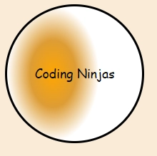
In the above example, the radial-gradient() function creates a gradient radiating from a specific point. We have used ‘circle’ as a shape value. This creates a circular gradient.
The color changes through three specified colors, i.e., ‘orange’(color of the gradient at the center), ‘rgb(221,157,54)’ (middle color), and ‘white’ (end color). Therefore the ‘background’ property creates a radial gradient background which starts with orange color at the center, then goes to a yellowish shade in the middle, and ends with white color.
Four different keywords are used in CSS to specify the size and shape of the gradient. These are mentioned below:
Closest-side
Using the ‘closest-side’ keyword, the gradient ending shape meets the box's side closest to its center for the circles. Therefore the gradient ends at the closest side of the element, which can be top, bottom, left, or right.
Using ‘farthest-side,’ the gradient ends at the farthest side of the element. We can see below that the radial gradient is being stretched on the right side, i.e., the gradient stretches to the maximum possible radius such that it can cover the entire element.
Using ‘closest-corner,’ the gradient ends at the corner of the element, closest to the starting point of the gradient. The code below specifies that the gradient ends at the corner of the element. The starting point of the gradient is 40% of the way across the element, which means that the gradient will be elliptical or circular but with a smaller radius as compared to ‘the farthest side or ‘closest-side.’
By using ‘farthest-corner’, the gradient ends at the corner of the element, farthest from the starting point/center of the gradient. It is the opposite of the ‘closest corner’.
The repeating radial-gradient () function is used for creating an image of repeating gradients that diverges from an origin. It accepts the same arguments as radial-gradient(). This type of radial gradient radiates outward in a circular path, repeating a similar pattern at regular intervals. We can adjust the gradient's colors, size, and shape to create different effects and patterns.
How to change the position of a radial gradient in CSS?
To change the position of a radial gradient in CSS, specify the at keyword followed by coordinates or keywords (like top, center, bottom). For example: radial-gradient(circle at 50% 50%, color1, color2).
What is the difference between gradient and radial?
The primary difference is in their structure: a gradient transitions colors along a straight line, while a radial gradient radiates colors from a central point, creating circular or elliptical patterns, enhancing depth and visual interest.
How do you position a gradient in CSS?
You can position a gradient in CSS by using keywords like top, bottom, left, right, or coordinates in percentage or pixels. For instance, background: linear-gradient(to right, color1, color2) positions the gradient horizontally.
What are the shapes of radial gradients?
Radial gradients can take on different shapes, primarily circle and ellipse. The circle shape creates a perfect circle, while the ellipse shape allows for wider or taller gradients, providing greater flexibility in design.
Conclusion
In this article, we have discussed the radial gradient function in CSS. The radial gradient function in CSS offers a versatile way to create captivating visual effects, enhancing the aesthetics of web designs. By understanding how to manipulate color transitions, positioning, and shapes, developers can craft stunning backgrounds and elements that draw attention and add depth to their projects.
You can read more such articles on our platform, Code360.


 9+ registered

