Sample Shoe Images:


Did you notice how the background is complementing the color schemes of the shoes? This will be our ideology behind picking the color scheme for our website. You might have to work with photoshop a bit to actually extract the image from the background, but trust me, it is worth the hard-work you are going to put in.
Now, let’s build a mind map of the website we are going to build: We need a navigation bar, we need a hero section and since we are using Bootstrap today, let’s throw in a carousel there. After that, we need an about section which will explain in a few words about the vision of the shoe company and a beautiful square picture complementing that vision right beside the text.
Now that we have compelled the users with our beautiful images and catchy text, it is time to display our products, let’s have three product categories on our website: shoes for men, shoes for women and shoes for kids. After this, let’s build a footer with all the links and FAQs for the company.
How to Build a Navigation Bar?
Bootstrap navigation bars by default take up the entire width of the screen, however, you can limit their width by putting them into a container with a smaller width or by altering the CSS. It goes without saying that the navigation bars are responsive. Note that to enable the hamburger menu functionality of bootstrap navbars on mobiles, you have to use Bootstrap JavaScript. Make sure you have added the script tags correctly.
In our navigation bar, we require the following components: Brand Name, About, Dropdown list for products and Contact Us. This is how the code for your navigation bar will look like:

The code for navigation bar can be easily taken from the official Bootstrap documentation if you are just starting out, however, once you get used to it, the classes and the structure will start coming naturally to you. In the official documentation, you can also find variations of navbars in the terms of colors, layout and other navbar items such as search buttons and search text field.
How to build a Bootstrap Carousel?
A carousel is a slideshow of images which look visually attractive in the hero section of a webpage. We would be utilising Bootstrap carousels to add some images, text and CTA buttons. We would be adding three main images on our website keeping in mind that they have to be in high definition and in accordance to the color scheme of our website.
To enable the working of a carousel, the addition of Bootstrap JavaScript is necessary so make sure you have added the script tags in a proper manner. There are different versions of carousels available in Bootstrap – only images (which is essentially a slideshow), images and previous and next controls (which enables the users to gain more control over the content), with indicators (this helps the users to understand how many images are they going to see and makes them swipe through them all), with captions (if you wish to add taglines to your images, this is the best one to look for).
We will be using a carousel with captions for our website, the code should look like this:
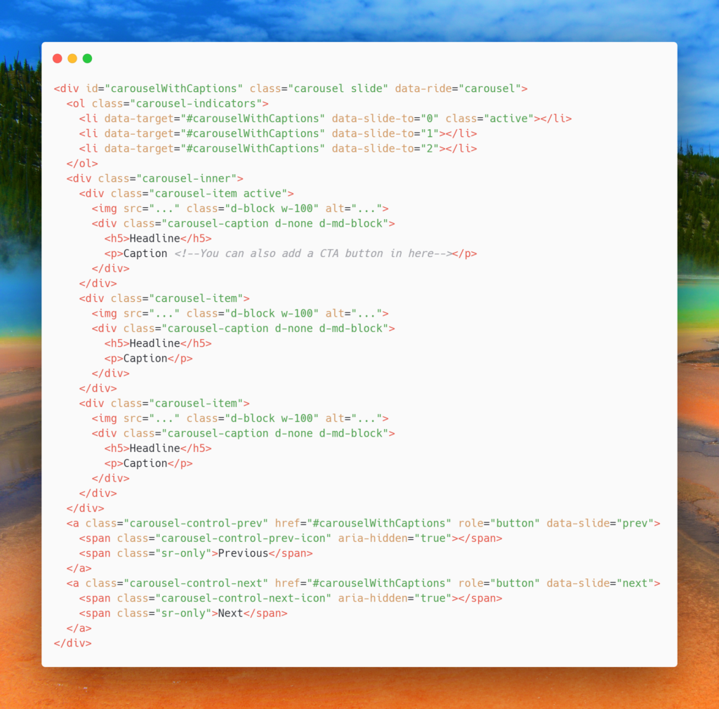
Since we required three images, we added three carousel-items, this number can be increased or decreased as per requirement. In place of the caption, you can also add in call-to-action buttons.
How to create the About Section?
Bootstrap has a jumbotron component that lets you add beautiful typography and content that stands out from the rest of the page. While it is generally used for the hero section, we can definitely experiment and put the About section in there.
The code for the same is:

You can also add a strong image that floats to the right of the container. Since we do not need any buttons here, there is no need to add one.
Understanding Bootstrap Grids and how to use them
Imagine your web page is divided into 12 parts along the width of the webpage. These are the 12 parts that are utilized with flexbox properties in Bootstrap Grid system. It enables us to plan out how the website will look on the desktop and how the website will look on the mobile.
For example, on our webpage, after the About section, we want three categories of products to be displayed – products for men, products for women, and products for kids. On a desktop, we want that these three containers to be displayed in one row side to side, however, on mobile, we want them to be stacked one on top of the other.
Remember that we had 12 parts on our webpage, now we want 3 columns in one row, which means that we want one column to cover 4 parts, therefore we will use col-lg-4 for each column in the div container with the class row.
The code for the same is as follows:

When the screen size changes, the column layout changes according to the breakpoints. The breakpoints for Bootstrap are at 1140px, 960px, 720px and below 540px. This is the reason why a column that was taking up as much space as 4 parts on a desktop, takes up as much space as 1 part on mobile screens.
How to make a Footer?
A footer can be made without Bootstrap as well, however, adding the class container gives a nice look because of Bootstrap’s design-centric CSS.
Before the footer, you can also add in a horizontal rule using the <hr> tag, it will offer a visual bifurcation from the main content and the footer. You can add in as many links and more content in the footer as per your requirements, however, avoid filling the footer with unnecessary information and links. Doing so will make your footer look cluttered and the user will be overwhelmed with information.


 9+ registered

