Table of contents
1.
Introduction
2.
CSS Functions
3.
RECAP
4.
Types of CSS Functions Continued
4.1.
Filter Functions
4.2.
brightness( )
4.2.1.
HTML
4.2.2.
CSS:
4.2.3.
Output
4.3.
blur( )
4.3.1.
HTML
4.3.2.
CSS:
4.3.3.
Output
4.4.
contrast( )
4.4.1.
HTML
4.4.2.
CSS
4.4.3.
Output:
4.5.
greyscale( )
4.5.1.
HTML
4.5.2.
CSS
4.5.3.
Output:
4.6.
invert( )
4.6.1.
HTML
4.6.2.
CSS
4.6.3.
Output:
4.7.
opacity( )
4.7.1.
HTML
4.7.2.
CSS
4.7.3.
Output
4.8.
saturate( )
4.8.1.
HTML
4.8.2.
CSS
4.8.3.
Output
4.9.
sepia( )
4.9.1.
HTML
4.9.2.
CSS
4.9.3.
Output
5.
drop-shadow( )
5.1.
HTML
5.2.
CSS
5.3.
Output:
6.
hue-rotate( )
6.1.
HTML
6.2.
CSS
6.3.
Output:
7.
Shape Functions
7.1.
circle( )
7.1.1.
HTML
7.1.2.
CSS
7.1.3.
Output:
7.2.
ellipse( )
7.2.1.
HTML
7.2.2.
CSS
7.2.3.
Output:
7.3.
inset( )
7.3.1.
HTML
7.3.2.
CSS
7.3.3.
Output
8.
Mathematical Functions
8.1.
calc( )
8.1.1.
HTML
8.1.2.
CSS
8.1.3.
Output
8.2.
min( ) and max( )
8.2.1.
HTML
8.2.2.
CSS
8.2.3.
Output
9.
Gradient Functions
9.1.
HTML
9.2.
CSS
9.3.
Output
10.
Grid Functions
11.
Animation Functions
12.
Difference Between CSS Functions and Normal Functions
13.
Types of CSS Functions with Examples
13.1.
CSS Custom Properties
13.1.1.
HTML
13.1.2.
CSS
13.1.3.
OUTPUT
13.2.
Colour Functions
13.2.1.
HTML
13.2.2.
CSS
13.2.3.
OUTPUT
13.3.
Pseudo Class Selector Functions
13.3.1.
nth-child( )
13.3.2.
HTML
13.3.3.
CSS
13.3.4.
OUTPUT
13.3.5.
nth - last - child( )
13.3.6.
HTML
13.3.7.
CSS
13.3.8.
OUTPUT
13.3.9.
nth - of - type( )
13.4.
Example 1
13.4.1.
HTML
13.4.2.
CSS
13.4.3.
OUTPUT
13.5.
Example 2
13.5.1.
HTML
13.5.2.
CSS
13.5.3.
OUTPUT
13.6.
nth - last - of - type( )
13.6.1.
HTML
13.6.2.
CSS
13.6.3.
OUTPUT
13.7.
Sizing and Scaling or Transform Functions
13.8.
scaleX( ), scaleY( ), scaleZ( ), scale3d( ) and scale( )
13.8.1.
HTML
13.8.2.
CSS
13.8.3.
OUTPUT
13.9.
translateX( ), translateY(), translateZ(), translate3d(), and translate()
13.9.1.
HTML
13.9.2.
CSS
13.9.3.
OUTPUT
13.10.
rotateX(), rotateY(), rotateZ(), rotate3d(), and rotate()
13.10.1.
HTML
13.10.2.
CSS
13.10.3.
OUTPUT
13.11.
skewX( ), skewY( ) and skew( )
13.11.1.
HTML
13.11.2.
CSS
13.11.3.
OUTPUT
14.
List of Common CSS Function
15.
Frequently Asked Questions 
15.1.
What are CSS functions?
15.2.
How are CSS functions different from regular functions?
15.3.
What are the advantages of CSS functions?
15.4.
Name some common CSS functions. 
15.5.
What is the difference between rgb( ) and rgba( )?
16.
Conclusion
Last Updated: Jul 3, 2025
Medium

CSS Functions

Author
0 upvote
Career growth poll
Do you think IIT Guwahati certified course can help you in your career?

Introduction

I am sure you are aware of CSS. Cascading Style Sheets (CSS) is a popular language used to style web pages. It is one of the powerful features of CSS is its ability to use functions to manipulate the values of CSS properties. So welcome back Ninja, In this blog, we will explore CSS functions and how they can be used to create dynamic and responsive web pages.

Introduction

CSS Functions

Surfing through the web is as easy as clicking a button. But have you ever wondered about the trouble behind putting up a website? What if you opened Facebook and the page looked like this:

without css

Pretty boring?

But if you apply the CSS it will take a new view see below:

css

That’s how important it is to style a webpage. 

The primary markup language used to style web pages is CSS (cascading style sheet). I’m pretty sure you already knew that, but did you know that, like any other programming language, there are functions in CSS too?

To formally define them, 

CSS functions are predefined functions in CSS that enhance the presentation of web pages by altering colours, layout, and fonts. 

Don’t worry if you didn’t, because in this article we’ll learn all about some CSS functions. 

RECAP

We also saw that CSS functions differ from normals functions in the following ways:

  1. They are always predefined.
  2. They always give an output in the form of changes in the presentation of web pages. 


We learnt about the following CSS functions too:

  • rgb( ) and rgba( )
  • hsl( ) and hsla( )
  • :nth-child( ) and :nth-last-child( )
  • :nth-of-type( ) and :nth-last-of-type( )
  • scaleX( ), scaleY( ), scaleZ( ), scale3d( ) and scale( )
  • translateX( ), translateY(), translateZ(), translate3d(), and translate()
  • rotateX(), rotateY(), rotateZ(), rotate3d(), and rotate()
  • skewX( ), skewY( ) and skew( )


But remember we said that this isn’t all?

In this article, we’ll finally finish discussing some standard CSS functions.

Types of CSS Functions Continued

Filter Functions

What’s the first thing that comes to your mind when you hear filter? 

For me, it’s Instagram filters, and that’s kind of what filter functions in CSS are too!

Exciting, isn’t it? Let’s see what they are without any more delay. 

brightness( )

This function adjusts the brightness of an element. A percentage is passed as a parameter to the function which determines the brightness. 

HTML

<!DOCTYPE html>
<html lang="en">
  <head>
    <meta charset="UTF-8" />
    <meta http-equiv="X-UA-Compatible" content="IE=edge" />
    <meta name="viewport" content="width=device-width, initial-scale=1.0" />
    <title>Coding Ninja</title>
    <link rel="stylesheet" href="style.css" />
  </head>
  <body>
  
    <img src="codingninja.png" class="original"></img>
    <img src="codingninja.png" class="pic">
  </body>
</html> 

CSS:

.pic {
  height: 25%;
  width: 25%;
  filter: brightness(150%);
}
.original {
  height: 25%;
  width: 25%;
}

Output

brightness( )

blur( )

As the name suggests, this function blurs the element.

For example,

HTML

<!DOCTYPE html>
<html lang="en">
  <head>
    <meta charset="UTF-8" />
    <meta http-equiv="X-UA-Compatible" content="IE=edge" />
    <meta name="viewport" content="width=device-width, initial-scale=1.0" />
    <title>Coding Ninja</title>
    <link rel="stylesheet" href="style.css" />
  </head>
  <body>
    <img src="codingninja.png" class="original"></img>
    <img src="codingninja.png" class="pic">
  </body>
</html> 

CSS:

.pic {
  height: 25%;
  width: 25%;
  filter: blur(5px);
}
.original {
  height: 25%;
  width: 25%;
}

Output

blur( )

contrast( )

This function modifies the contrast between the light and the dark elements in an image. 

HTML

<!DOCTYPE html>
<html lang="en">
  <head>
    <meta charset="UTF-8" />
    <meta http-equiv="X-UA-Compatible" content="IE=edge" />
    <meta name="viewport" content="width=device-width, initial-scale=1.0" />
    <title>Coding Ninja</title>
    <link rel="stylesheet" href="style.css" />
  </head>
  <body>
    <img src="codingninja.png" class="original"></img>
    <img src="codingninja.png" class="pic">
  </body>
</html>

CSS

.pic {
    height: 25%;
    width: 25%;
    filter: contrast(500%);
  }
  .original {
    height: 25%;
    width: 25%;
  }

Output:

contrast( )

greyscale( )

Almost everyone has fooled around with the greyscale filter on Instagram, so we probably already know that greyscale means removing all the colour from an image. Let’s see how it’s done in CSS using a function with our old example.

HTML

<!DOCTYPE html>
<html lang="en">
  <head>
    <meta charset="UTF-8" />
    <meta http-equiv="X-UA-Compatible" content="IE=edge" />
    <meta name="viewport" content="width=device-width, initial-scale=1.0" />
    <title>Coding Ninja</title>
    <link rel="stylesheet" href="style.css" />
  </head>
  <body>
    <img src="codingninja.png" class="original"></img>
    <img src="codingninja.png" class="pic">
  </body>
</html>

CSS

.pic {
  height: 25%;
  width: 25%;
  filter: grayscale(50%);
}
.original {
  height: 25%;
  width: 25%;
}

Output:

greyscale( )

invert( )

This function inverts the colours in an image. For example, white (rgb(255,255,255)) will become black (rgb(0,0,0)) and red (rgb(255,0,0)) will become blue (rgb(0,0,255)).

HTML

<!DOCTYPE html>
<html lang="en">
  <head>
    <meta charset="UTF-8" />
    <meta http-equiv="X-UA-Compatible" content="IE=edge" />
    <meta name="viewport" content="width=device-width, initial-scale=1.0" />
    <title>Coding Ninja</title>
    <link rel="stylesheet" href="style.css" />
  </head>
  <body>
    <img src="codingninja.png" class="original"></img>
    <img src="codingninja.png" class="pic">
  </body>
</html>

CSS

.pic {
  height: 25%;
  width: 25%;
  filter: invert(100%);
}
.original {
  height: 25%;
  width: 25%;
}

Output:

invert( )

opacity( )

We have already seen how we can modify the opacity of coloured elements by adding the alpha value to them. The same can be done for images, too, as shown below.

HTML

<!DOCTYPE html>
<html lang="en">
  <head>
    <meta charset="UTF-8" />
    <meta http-equiv="X-UA-Compatible" content="IE=edge" />
    <meta name="viewport" content="width=device-width, initial-scale=1.0" />
    <title>Coding Ninja</title>
    <link rel="stylesheet" href="style.css" />
  </head>
  <body>
    <img src="codingninja.png" class="original"></img>
    <img src="codingninja.png" class="pic">
  </body>
</html>

CSS

.pic {
  height: 25%;
  width: 25%;
  filter: opacity(50%);
}
.original {
  height: 25%;
  width: 25%;
}

Output

opacity( )


saturate( )

This function changes the intensity of the colours in the image. 

HTML

<!DOCTYPE html>
<html lang="en">
  <head>
    <meta charset="UTF-8" />
    <meta http-equiv="X-UA-Compatible" content="IE=edge" />
    <meta name="viewport" content="width=device-width, initial-scale=1.0" />
    <title>Coding Ninja</title>
    <link rel="stylesheet" href="style.css" />
  </head>
  <body>
    <img src="codingninja.png" class="original"></img>
    <img src="codingninja.png" class="pic">
  </body>
</html>

CSS

.pic {
  height: 25%;
  width: 25%;
  filter: saturate(50%);
}
.original {
  height: 25%;
  width: 25%;
}

Output

saturate( )

sepia( )

This function is the CSS counterpart of everyone’s favourite filter, making a picture look old fashioned. 

HTML

<!DOCTYPE html>
<html lang="en">
  <head>
    <meta charset="UTF-8" />
    <meta http-equiv="X-UA-Compatible" content="IE=edge" />
    <meta name="viewport" content="width=device-width, initial-scale=1.0" />
    <title>Coding Ninja</title>
    <link rel="stylesheet" href="style.css" />
  </head>
  <body>
    <img src="codingninja.png" class="original"></img>
    <img src="codingninja.png" class="pic">
  </body>
</html>

CSS

.pic {
  height: 25%;
  width: 25%;
  filter: sepia(100%);
}
.original {
  height: 25%;
  width: 25%;
}

Output

sepia( )

drop-shadow( )

This function is used to create a shadow of an image to give a 3-D effect. 

HTML

<!DOCTYPE html>
<html lang="en">
  <head>
    <meta charset="UTF-8" />
    <meta http-equiv="X-UA-Compatible" content="IE=edge" />
    <meta name="viewport" content="width=device-width, initial-scale=1.0" />
    <title>Coding Ninja</title>
    <link rel="stylesheet" href="style.css" />
  </head>
  <body>
    <img src="codingninja.png" class="original"></img>
    <img src="codingninja.png" class="pic">
  </body>
</html>

CSS

.pic {
  height: 25%;
  width: 25%;
  filter: drop-shadow(10px 10px 0.2rem #ff9e20);
}
.original {
  height: 25%;
  width: 25%;
}

Output:

drop-shadow( )

hue-rotate( )

This method is used to shift the hue of each pixel in an image by the amount specified as the parameter. 

For example, if we rotate the hue by 90 degrees in the picture of the C, orange will become green and green will become blue. (red --> 90deg rotate -->green --> 180 degree rotate --> blue --> 180 degree rotate --> red).

HTML

<!DOCTYPE html>
<html lang="en">
  <head>
    <meta charset="UTF-8" />
    <meta http-equiv="X-UA-Compatible" content="IE=edge" />
    <meta name="viewport" content="width=device-width, initial-scale=1.0" />
    <title>Coding Ninja</title>
    <link rel="stylesheet" href="style.css" />
  </head>
  <body>
    <img src="codingninja.png" class="original"></img>
    <img src="codingninja.png" class="pic">
  </body>
</html>

CSS

.pic {
  height: 25%;
  width: 25%;
  filter: hue-rotate(90deg);
}
.original {
  height: 25%;
  width: 25%;
}

Output:

hue-rotate( )

Shape Functions

When we view someone’s profile on Facebook or even Instagram, their profile picture is displayed inside a circle. Using the shape functions in CSS, we can do it ourselves! Let’s see how. 

circle( )

This function creates a circular mask for an image. In other words, a picture is displayed inside a circle, as shown below.

HTML

<!DOCTYPE html>
<html lang="en">
  <head>
    <meta charset="UTF-8" />
    <meta http-equiv="X-UA-Compatible" content="IE=edge" />
    <meta name="viewport" content="width=device-width, initial-scale=1.0" />
    <title>Coding Ninja</title>
    <link rel="stylesheet" href="style.css" />
  </head>
  <body>
    <img src="codingninja.png" class="original"></img>
    <img src="codingninja.png" class="pic">
  </body>
</html>

CSS

.pic {
  height: 25%;
  width: 25%;
  clip-path: circle(50%);
}
.original {
  height: 25%;
  width: 25%;
}

Output:

circle( )

ellipse( )

This function gives a similar output as the circle( ), except an elliptical mask is made for the image.

HTML

<!DOCTYPE html>
<html lang="en">
  <head>
    <meta charset="UTF-8" />
    <meta http-equiv="X-UA-Compatible" content="IE=edge" />
    <meta name="viewport" content="width=device-width, initial-scale=1.0" />
    <title>Coding Ninja</title>
    <link rel="stylesheet" href="style.css" />
  </head>
  <body>
    <img src="codingninja.png" class="original"></img>
    <img src="codingninja.png" class="pic">
  </body>
</html>

CSS

.pic {
  height: 25%;
  width: 25%;
  clip-path: ellipse(20vw 10vw at 50% 50%);
}
.original {
  height: 25%;
  width: 25%;
}

Output:

ellipse( )

inset( )

This function masks an image in the shape of a rectangle. Notice that by masking, we are cropping the image and not changing the size.

HTML

<!DOCTYPE html>
<html lang="en">
  <head>
    <meta charset="UTF-8" />
    <meta http-equiv="X-UA-Compatible" content="IE=edge" />
    <meta name="viewport" content="width=device-width, initial-scale=1.0" />
    <title>Coding Ninja</title>
    <link rel="stylesheet" href="style.css" />
  </head>
  <body>
    <img src="codingninja.png" class="original"></img>
    <img src="codingninja.png" class="pic">
  </body>
</html>

CSS

.pic {
  height: 25%;
  width: 25%;
  clip-path: inset(25% 25% 10px 3vw);
}
.original {
  height: 25%;
  width: 25%;
}

Output

inset( )

Mathematical Functions

No matter how much we don’t like Maths, it never really leaves us alone, does it? Well, look here’s again - mathematical functions in CSS, but wait, isn’t that a good thing? Now we won’t have to do the maths ourselves since there are functions for the same!

calc( )

This function is most commonly used to size and scale elements to their original size. 

HTML

<!DOCTYPE html>
<html lang="en">
  <head>
    <meta charset="UTF-8" />
    <meta http-equiv="X-UA-Compatible" content="IE=edge" />
    <meta name="viewport" content="width=device-width, initial-scale=1.0" />
    <title>Coding Ninja</title>
    <link rel="stylesheet" href="style.css" />
  </head>
  <body>
    <img src="codingninja.png" class="original"></img>
    <img src="codingninja.png" class="pic">
  </body>
</html>

CSS

.pic {
  height: 25%;
  width: calc(25% + 5rem);
}
.original {
  height: 25%;
  width: 25%;
}

Output

calc( )

min( ) and max( )

As in normal programming languages, the min( ) and max( ) functions find the smallest and largest values of the two parameters passed, respectively. 

HTML

<!DOCTYPE html>
<html lang="en">
  <head>
    <meta charset="UTF-8" />
    <meta http-equiv="X-UA-Compatible" content="IE=edge" />
    <meta name="viewport" content="width=device-width, initial-scale=1.0" />
    <title>Coding Ninja</title>
    <link rel="stylesheet" href="style.css" />
  </head>
  <body>
    <img src="codingninja.png" class="original"></img>
    <img src="codingninja.png" class="pic">
  </body>
</html>

CSS

.pic {
  height: 25%;
  width: min(100px, 30rem);
}
.original {
  height: 25%;
  width: 25%;
}

Output

min( ) and max( )

Gradient Functions

Do you know what the word gradient means in English?

If you guessed a gradual change, you are correct!

So, gradient functions are CSS functions that provide a gradual colour change, but doesn’t this remind you of something? 

That’s right, the Instagram logo!  

The Instagram logo is a perfect example of what the gradient function does. We can learn more about CSS gradients here.

HTML

<!DOCTYPE html>
<html>
    <head>
        <link rel="stylesheet" href="style.css">
    </head>
   

<body>

<div>
  <h1>
    Here we are using gradient colour.
  </h1>  
</div>

</body>
</html>


CSS

div {
    height: 500px;
     width: 500px;
    background: linear-gradient(to bottom, #0e2025 0%, #27e227 100%)
}
h1{
    color: #fff
}


Output

gradient function

Grid Functions

With the advancement of technology, web development has had its advances too. CSS grid is one of them. With its help, websites are optimised to display on any device and any browser correctly. Some grid functions are:

Function

Use

fit-content( )

This function is used to fit the content in a particular row or column by adjusting the size of the element or lines of text.

minmax( )

This function limits the width and height of rows and columns in grid rows and columns.

repeat( )

This function replicates the attributes of a row or a column in the grid layout.

Animation Functions

If we get the choice to read a short paragraph or watch an animation of it, which one will we choose?

I’m sure most of us will choose to watch the animation. So, adding visual effects to a web page is an important part of styling it. To do that, there are certain animation functions like steps( ), path( ) and cubic-bezier( ). We can learn more about CSS animations here

Difference Between CSS Functions and Normal Functions

Before moving on to the actual CSS functions, let us see some basic differences between functions in CSS and the functions we usually use in any programming language.

In any other programming language, functions may be predefined or user-defined. In contrast to this, CSS functions are only predefined. A concept similar to user-defined functions can, however, be implemented using CSS selectors. 

Apart from this, in any programming language, the result of functions are usually returned and then used elsewhere in the program. 

For example, in the Python code below, the function returns the sum of two numbers, which is used to find the average numbers in a list. 

def sum(a,b):
  return a+b

numbers = [1,2,3,4,5]
avg = 0
for each in numbers:
  avg = sum(avg,each)
print(avg)


Output :

15

In CSS functions, an output is produced, which is visible in the layout of the webpage. 

For example, the colour of an element may be specified using the rgb( ) or rgba( ) method.

Don’t worry if these functions' names confuse you because next, we’ll learn about the different CSS functions. 

Types of CSS Functions with Examples

So far, we only know a bit about CSS functions, but we haven’t seen any examples. 

Then what are we waiting for?

Let’s see the different types of CSS functions. 

CSS Custom Properties

Do you remember what a big advantage of using functions was? 

If you’re thinking about reusability, you’re right. 

The var( ) function in CSS is used for reusability too. To understand this better, let us see an example. 

HTML

<!DOCTYPE html>
<html lang="en">
<head>
    <meta charset="UTF-8">
    <meta http-equiv="X-UA-Compatible" content="IE=edge">
    <meta name="viewport" content="width=device-width, initial-scale=1.0">
    <title>Coding Ninja</title>
    <link rel="stylesheet" href="style.css">
   
</head>
  <body>
    <h1 class="first-para">Hello Ninja, In the root, we have defined two colours.</h1>
    <h2 class="second-para">This heading will use colour 1 </h2>
    <h2 class="third-para">This heading will use colour 2 </h2>
  </body>
</html>

CSS

    :root
      {
          --color1: blue;
          --color2: red;
      }

      .first-para
      {
          color: var(--color1);
      }

      .second-para
      {
          color: var(--color1);
      }

      .third-para
      {
          /* <!-- color1 is reused --> */
          color: var(--color2);
      }

OUTPUT

OUTPUT

In the style sheet, two colours, red and blue, were already specified. Then, for the three headings (from the HTML code), we specified the colours of each heading using the var( ) function. 

Colour Functions

There are two colour functions in CSS - rgb( ) and hsl( ). These two again have another variation - rgba( ) and hsla( ), where ‘a’ denotes alpha which determines the opacity of the colour. You can read more about CSS colour here. 

HTML

<!DOCTYPE html>
<html lang="en">
  <head>
    <meta charset="UTF-8" />
    <meta http-equiv="X-UA-Compatible" content="IE=edge" />
    <meta name="viewport" content="width=device-width, initial-scale=1.0" />
    <title>Coding Ninja</title>
    <link rel="stylesheet" href="style.css" />
  </head>
  <body>
    <h1 class="first-para">This heading is using rgba colour</h1>
    <h2 class="second-para">This heading is using rgb colour</h2>
  </body>
</html>

CSS

:root {
  --color1: blue;
  --color2: red;
}

h1 {
  background-color: rgba(218, 55, 14, 0.5);
}
h2 {
  background-color: rgb(173, 216, 230);
}

OUTPUT

Output

Pseudo Class Selector Functions

We have all seen tables where every other row is of a different colour, making the table background look striped. 

Have you ever wondered how they are made?

Well, pseudo-class selector functions are the answer. There are two kinds of these functions that can be used to style a page. Let’s see what they are.

nth-child( )

This function takes an argument that is an equation in n to style only those elements. 

The example given below styles every other paragraph. 

HTML

<!DOCTYPE html>
<html lang="en">
  <head>
    <meta charset="UTF-8" />
    <meta http-equiv="X-UA-Compatible" content="IE=edge" />
    <meta name="viewport" content="width=device-width, initial-scale=1.0" />
    <title>Coding Ninja</title>
    <link rel="stylesheet" href="style.css" />
  </head>
  <body>
    <h2 class="first-para">Hello, my name is Neelakshi. How are you?</h2>
    <h2 class="second-para">What's your name?</h2>
    <h2 class="third-para">Do you know about CSS functions?</h2>
    <h2 class="fourth-para">I guess not.</h2>
    <h2 class="fifth-para">Let us learn about CSS functions</h2>
  </body>
</html>

CSS

h2:nth-child(2n) {
  background-color: rgb(202, 32, 32);
  color: rgb(174, 201, 68);
}

OUTPUT

OUTPUT

nth - last - child( )

This method starts counting from the end and styles the elements accordingly.

For example, in the code below, every 4th element from the end is styled.

HTML

<!DOCTYPE html>
<html lang="en">
  <head>
    <meta charset="UTF-8" />
    <meta http-equiv="X-UA-Compatible" content="IE=edge" />
    <meta name="viewport" content="width=device-width, initial-scale=1.0" />
    <title>Coding Ninja</title>
    <link rel="stylesheet" href="style.css" />
  </head>
  <body>
    <h2 class="first-para">Hello, my name is Ninja. How are you?</h2>
    <h2 class="second-para">What's your name?</h2>
    <h2 class="third-para">Do you know about CSS functions?</h2>
    <h2 class="fourth-para">I guess not.</h2>
    <h2 class="fifth-para">Let us learn about CSS functions</h2>
    <h2 class="first-para">Hello, my name is Ninja. How are you?</h2>
    <h2 class="second-para">What's your name?</h2>
    <h2 class="third-para">Do you know about CSS functions?</h2>
    <h2 class="fourth-para">I guess not.</h2>
    <h2 class="fifth-para">Let us learn about CSS functions</h2>
  </body>
</html>

CSS

h2:nth-last-child(2n) {
  background-color: rgb(255, 162, 0);
  color: white;
}

OUTPUT

output

nth - of - type( )

Here, we can specify the type of the element, for example, even or odd. We can also mention the position of the element. 

Example 1

HTML

<!DOCTYPE html>
<html lang="en">
  <head>
    <meta charset="UTF-8" />
    <meta http-equiv="X-UA-Compatible" content="IE=edge" />
    <meta name="viewport" content="width=device-width, initial-scale=1.0" />
    <title>Coding Ninja</title>
    <link rel="stylesheet" href="style.css" />
  </head>
  <body>
    <h2 class="first-para">Hello, my name is Ninja. How are you?</h2>
    <h2 class="second-para">What's your name?</h2>
    <h2 class="third-para">Do you know about CSS functions?</h2>
    <h2 class="fourth-para">I guess not.</h2>
    <h2 class="fifth-para">Let us learn about CSS functions</h2>
    <h2 class="first-para">Hello, my name is Ninja. How are you?</h2>
    <h2 class="second-para">What's your name?</h2>
    <h2 class="third-para">Do you know about CSS functions?</h2>
    <h2 class="fourth-para">I guess not.</h2>
    <h2 class="fifth-para">Let us learn about CSS functions</h2>
  </body>
</html>

CSS

h2:nth-of-type(odd) {
  background-color: black;
  color: white;
}

OUTPUT

OUTPUT

Example 2

HTML

<!DOCTYPE html>
<html lang="en">
  <head>
    <meta charset="UTF-8" />
    <meta http-equiv="X-UA-Compatible" content="IE=edge" />
    <meta name="viewport" content="width=device-width, initial-scale=1.0" />
    <title>Coding Ninja</title>
    <link rel="stylesheet" href="style.css" />
  </head>
  <body>
    <h2 class="first-para">Hello, my name is Ninja. How are you?</h2>
    <h2 class="second-para">What's your name?</h2>
    <h2 class="third-para">Do you know about CSS functions?</h2>
    <h2 class="fourth-para">I guess not.</h2>
    <h2 class="fifth-para">Let us learn about CSS functions</h2>
    <h2 class="first-para">Hello, my name is Ninja. How are you?</h2>
    <h2 class="second-para">What's your name?</h2>
    <h2 class="third-para">Do you know about CSS functions?</h2>
    <h2 class="fourth-para">I guess not.</h2>
    <h2 class="fifth-para">Let us learn about CSS functions</h2>
  </body>
</html>

CSS

h2:nth-of-type(5)
{
    background-color: black;
    color: white;
}

OUTPUT

OUTPUT

nth - last - of - type( )

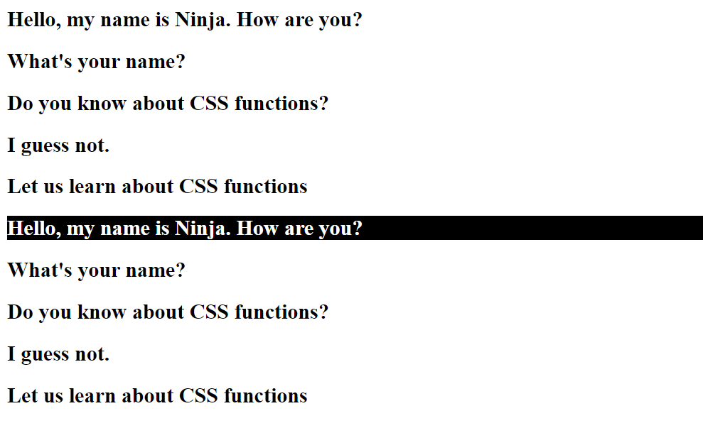
This is similar to nth-last-child, where the elements are counted from the end and styled accordingly.

For example, the 5th element from the end, i.e., the first element, will be styled only in the code below.

HTML

<!DOCTYPE html>
<html lang="en">
  <head>
    <meta charset="UTF-8" />
    <meta http-equiv="X-UA-Compatible" content="IE=edge" />
    <meta name="viewport" content="width=device-width, initial-scale=1.0" />
    <title>Coding Ninja</title>
    <link rel="stylesheet" href="style.css" />
  </head>
  <body>
    <h2 class="first-para">Hello, my name is Ninja. How are you?</h2>
    <h2 class="second-para">What's your name?</h2>
    <h2 class="third-para">Do you know about CSS functions?</h2>
    <h2 class="fourth-para">I guess not.</h2>
    <h2 class="fifth-para">Let us learn about CSS functions</h2>
    <h2 class="first-para">Hello, my name is Ninja. How are you?</h2>
    <h2 class="second-para">What's your name?</h2>
    <h2 class="third-para">Do you know about CSS functions?</h2>
    <h2 class="fourth-para">I guess not.</h2>
    <h2 class="fifth-para">Let us learn about CSS functions</h2>
  </body>
</html>

CSS

h2:nth-last-of-type(5)
{
    background-color: black;
    color: white;
} 

OUTPUT

OUTPUT

Sizing and Scaling or Transform Functions

In the introduction, we saw a picture of Facebook without any styling. None of the elements was scaled or arranged correctly on the page. So how do we scale the elements?

By using the sizing and scaling functions, of course!

Let’s see the different sizing and scaling functions in CSS.

scaleX( ), scaleY( ), scaleZ( ), scale3d( ) and scale( )

The scaleX( ), scaleY( ), scaleZ( ), scale3d( ) and scale( ) are used to scale elements along the x-axis, y-axis, z-axis, all three axes and in a 2-d plane, respectively. 

The value given as a parameter determines the fraction of scaling. 

The code below shows how the scaleX( ) function scales elements along the x-axis. 

HTML

<!DOCTYPE html>
<html lang="en">
  <head>
    <meta charset="UTF-8" />
    <meta http-equiv="X-UA-Compatible" content="IE=edge" />
    <meta name="viewport" content="width=device-width, initial-scale=1.0" />
    <title>Coding Ninja</title>
    <link rel="stylesheet" href="style.css" />
  </head>
  <body>
    <h2 class="first-para">Hello, my name is Ninja. How are you?</h2>
    <h2 class="second-para">What's your name?</h2>
    <h2 class="third-para">Do you know about CSS functions?</h2>
    <h2 class="fourth-para">I guess not.</h2>
    <h2 class="fifth-para">Let us learn about CSS functions</h2>
    <h2 class="first-para">Hello, my name is Ninja. How are you?</h2>
    <h2 class="second-para">What's your name?</h2>
    <h2 class="third-para">Do you know about CSS functions?</h2>
    <h2 class="fourth-para">I guess not.</h2>
    <h2 class="fifth-para">Let us learn about CSS functions</h2>
  </body>
</html>

CSS

h2
{
    transform: scaleX(0.7);
}

OUTPUT

OUTPUT

translateX( ), translateY(), translateZ(), translate3d(), and translate()

Similar to the scale function, the translate function can translate any element along all three axes’ individually and simultaneously and in a 2-d plane. 

A percentage or number of pixels determining the translation is passed as a parameter to the function.

An example of translateX( ) is shown below.

HTML

<!DOCTYPE html>
<html lang="en">
  <head>
    <meta charset="UTF-8" />
    <meta http-equiv="X-UA-Compatible" content="IE=edge" />
    <meta name="viewport" content="width=device-width, initial-scale=1.0" />
    <title>Coding Ninja</title>
    <link rel="stylesheet" href="style.css" />
  </head>
  <body>
    <h2 class="first-para">Hello, my name is Ninja. How are you?</h2>
    <h2 class="second-para">What's your name?</h2>
    <h2 class="third-para">Do you know about CSS functions?</h2>
    <h2 class="fourth-para">I guess not.</h2>
    <h2 class="fifth-para">Let us learn about CSS functions</h2>
    <h2 class="first-para">Hello, my name is Ninja. How are you?</h2>
    <h2 class="second-para">What's your name?</h2>
    <h2 class="third-para">Do you know about CSS functions?</h2>
    <h2 class="fourth-para">I guess not.</h2>
    <h2 class="fifth-para">Let us learn about CSS functions</h2>
  </body>
</html>

CSS

h2
{
    transform: translate(50px);
}

OUTPUT

OUTPUT

Here, the heading is translated along the x-axis by 50 pixels.

rotateX(), rotateY(), rotateZ(), rotate3d(), and rotate()

These functions are used to rotate an element along the x-axis, y-axis, z-axis, all three axes’ or in a 2-D plane. 

In the example below, we rotate div2 along the x-axis to produce a 3-D effect using the perspective attribute.

HTML

<!DOCTYPE html>
<html lang="en">
  <head>
    <meta charset="UTF-8" />
    <meta http-equiv="X-UA-Compatible" content="IE=edge" />
    <meta name="viewport" content="width=device-width, initial-scale=1.0" />
    <title>Coding Ninja</title>
    <link rel="stylesheet" href="style.css" />
  </head>
  <body>
   <div class="div1">
      DIV1
      <div class="div2">DIV2</div>
    </div>   
  </body>
</html>

CSS

 .div1 {
        position: relative;
        height: 150px;
        width: 150px;
        margin-left: 60px;
        border: 5px solid rgb(67, 205, 21);
        perspective: 100px;
      }
      .div2 {
        padding: 50px;
        position: absolute;
        border: 1px solid black;
        background: rgba(255, 153, 0, 0.5);
        transform-style: preserve-3d;
        transform: rotateX(60deg);
      }

OUTPUT

rotate

skewX( ), skewY( ) and skew( )

These methods are used to distort an element. This will be better understood with the help of an example. 

HTML

<!DOCTYPE html>
<html lang="en">
  <head>
    <meta charset="UTF-8" />
    <meta http-equiv="X-UA-Compatible" content="IE=edge" />
    <meta name="viewport" content="width=device-width, initial-scale=1.0" />
    <title>Coding Ninja</title>
    <link rel="stylesheet" href="style.css" />
  </head>
  <body>
    <div class="div1">
      DIV1 30 deg skew
      <div class="div2">50 deg incline to plane</div>
    </div>
  </body>
</html>

CSS

.div1
{
    position: relative;
    height: 150px;
    width: 150px;
    margin-left: 50px;
    border: 1px solid rgb(9, 231, 79);
    perspective: 100px;
    transform: skew(30deg);
}
.div2
{
    padding: 50px;
    position: absolute;
    border: 1px solid black;
    background: rgba(255, 157, 0, 0.5);
    transform-style: preserve-3d;
    transform: rotateX(50deg);
}

OUTPUT

skew

List of Common CSS Function

Here is a list of some commonly used CSS functions:

  • calc() - performs calculations to determine property values
  • rgb() - sets a color using red, green, and blue values
  • rgba() - sets a color using red, green, blue, and alpha (opacity) values
  • hsl() - sets a color using hue, saturation, and lightness values
  • hsla() - sets a color using hue, saturation, lightness, and alpha (opacity) values
  • url() - sets a background image or other resources
  • linear-gradient() - creates a gradient color effect
  • radial-gradient() - creates a circular gradient color effect
  • var() - sets a variable value
  • clamp() - creates a range with a minimum, preferred, and maximum value
  • min() - sets the smallest value among a set of values
  • max() - sets the largest value among a set of values
  • attr() - sets the value of an HTML attribute as a CSS value.
  • transform() - applies transformations to an element such as rotate, scale, skew, and translate
  • transition() - sets the transition effect for an element when its properties change
  • animation() - sets an animation effect for an element
  • cubic-bezier() - creates a custom cubic-bezier timing function for animations
  • repeat() - repeats an element a certain number of times, either vertically or horizontally
  • calc() - performs calculations to determine property values
  • rem() - sets a font-size relative to the root element's font-size
  • vw() - sets a length relative to the width of the viewport
  • vh() - sets a length relative to the height of the viewport
  • rotate() - rotates an element around a specified point
  • scale() - scales an element up or down in size
  • skew() - skews an element along the X and/or Y axis
  • translate() - moves an element horizontally and/or vertically

In the next part we will discuss more CSS Function.

Frequently Asked Questions 

What are CSS functions?

CSS functions are predefined functions in CSS that enhance the presentation of web pages by altering colours, layout, and fonts.

How are CSS functions different from regular functions?

They are always predefined. They always give an output in the form of changes in the presentation of web pages.

What are the advantages of CSS functions?

Functions in CSS can be easily used to style web pages. Moreover, they also facilitate reusability like normal functions.

Name some common CSS functions. 

Some common functions in CSS are: rgb( ), scale( ), translate( ), rotate( ) and skew( ).

What is the difference between rgb( ) and rgba( )?

The rgb( ) function requires only three parameters - the intensity of red, green and blue, respectively. In contrast, the rgba( ) function requires an additional parameter alpha that determines the opacity of an element.

Conclusion

In this article, we learn what CSS functions are. We also saw some different kinds of functions in CSS and examples of them, but they are not the only functions available in CSS. 

There are so many more functions about which we don’t know yet. So without further ado, let’s learn about them in the second part of this article - CSS Functions Part 2.

Live masterclass