Introduction
Imagine a user submitting a form without any information filled or filling address in the phone number field or selecting all the radio buttons for the same group. This will lead to our website not knowing what to do with the incorrect data. It will send back an error code, and our website and the user will get stuck. What a nightmare!
Thankfully its not so in most of the applications we use now, the developers and product team work day and night to do testing of each and every feature. testing is done in order to find bugs in our software and check whether our software works appropriately without getting errors in every scenario. Forms and validation testing are one of the most important among all the testing. Let us dive deeper into this topic in this blog.
Things to keep in mind while testing forms
Add before looking at what it is and how its done, lets look at some of the important factors to be analyzed while doing form and validation testing.
The styling of the form and form elements
Make sure the form’s position on the web page is as per the requirement. For instance, if there is only a form in the whole web page, then it should be at the center of the web page like so:

Positioning the form like above helps utilize the space correctly and grabs attention to the form. If there is an image or information on the web page as necessary as the form, the form’s position should be beside it:

Ensure that the form is responsive and looks good even on smaller screen devices. Check whether the alignment of all the elements and tags in the form is good or not. There should be proper spacing between the elements in the form. The font size, background color, and other styles of the form and the fields should be suitable.

The elements and fields in the form
Ensure that you have all the necessary fields in the form. Your form should have a suitable heading. For example, a registration form should have a “Sign up” or “Register” heading. Check whether all the fields have proper and non-ambiguous labels. For instance, if there is a label for the phone number, it should be clear whether the form wants the office, home, landline, or mobile number. The mandatory fields should have an asterisk.

A common example of sign up form: Source
Validation of fields in the form
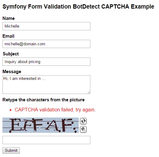
All fields should have validation and a clear validation message. The user should only be allowed to enter the fields with the correct data, data type, and format. Fill all the fields with the wrong information and see the form reaction to test these. Leave the fields empty to test whether the form responds correctly or not. We will talk about this in more detail later.

Tooltips in the form
There should be proper tooltips for fields with relevant information. Make sure that the position of the tooltip does not block the view of the fields. Check whether the tooltip disappears when moving our cursor away from the field.

Submission of the form
Ensure your form is not submitted until all the fields are filled with the proper format. You can do this by disabling the submit button until all the required fields are filled. You should not allow multiple clicks on the form’s submit button while the registration is in process. If the back button is clicked, the form fields should become empty.


