Get a skill gap analysis, personalised roadmap, and AI-powered resume optimisation.
Introduction
Graphs are a powerful tool for visualizing data and understanding relationships between variables. In programming, Python is a popular language that offers different libraries for creating graphs. One of the those important library is Matplotlib, which provides a wide range of functionalities for plotting different types of graphs.
In this article, we will discuss how to plot graphs with the help of Matplotlib in Python. We will cover the installation process, basic concepts, and see different examples of different types.
Installation of Matplotlib
To get started with plotting graphs in Python using Matplotlib, we first need to install the library. The installation process is straightforward and can be done using pip, the package installer for Python. Open your terminal or command prompt and type the following command:
pip install matplotlib
This command will download and install the Matplotlib library along with its dependencies. Once the installation is complete, you are ready to start using Matplotlib in your Python scripts.
Basic Concept of Matplotlib
Matplotlib is a plotting library for Python that provides a wide range of functionalities for creating static, animated, and interactive visualizations. It allows you to create various types of graphs, including line graphs, bar graphs, pie charts, histograms, and scatter plots. Matplotlib is built on top of NumPy, a library for numerical computing in Python, which makes it efficient for handling large datasets.
The basic concept of Matplotlib revolves around the figure and axes. A figure is the overall window or page that contains the graph, while axes are the individual plots within the figure. You can think of a figure as a canvas and axes as the actual graphs drawn on that canvas. Matplotlib provides a set of functions and methods to create and customize these figures and axes.
To create a graph using Matplotlib, we usually follow below mentioned steps:
1. Import the necessary Matplotlib modules.
2. Create a figure and one or more axes.
3. Plot the data on the axes using appropriate functions.
4. Customize the appearance of the graph, such as adding labels, titles, and legends.
5. Display or save the graph.
Introduction to pyplot
Pyplot is a module within Matplotlib that provides a MATLAB-like interface for creating graphs. It is a convenient way to quickly create plots without the need for explicit figure and axes objects. Pyplot provides a set of functions that allow you to create, customize, and display graphs with just a few lines of code.
To use pyplot, you first need to import it from the Matplotlib library. The convention is to import it with the alias `plt`.
For example:
import matplotlib.pyplot as plt
Once imported, you can use various pyplot functions to create and manipulate graphs. Some commonly used functions are:
- `plt.plot()`: Creates a line graph.
- `plt.bar()`: Creates a bar graph.
- `plt.pie()`: Creates a pie chart.
- `plt.hist()`: Creates a histogram.
- `plt.scatter()`: Creates a scatter plot.
These functions take the data as arguments and automatically create the necessary figure and axes objects behind the scenes. You can also use additional functions to customize the appearance of the graph, such as:
- `plt.title()`: Sets the title of the graph.
- `plt.xlabel()` and `plt.ylabel()`: Set the labels for the x-axis and y-axis, respectively.
- `plt.legend()`: Adds a legend to the graph.
- `plt.grid()`: Adds gridlines to the graph.
Finally, to display the graph, you use the `plt.show()` function, which opens a new window or updates the existing one with the graph.
Basic Example of Plotting a Graph
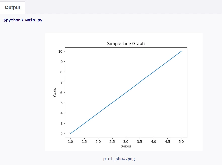
Let's discuss a basic example of plotting a graph with Matplotlib and pyplot. We'll create a simple line graph that represents the relationship between the x-axis and y-axis values.
Python
Python
import matplotlib.pyplot as plt

# Data for the graph

x = [1, 2, 3, 4, 5]

y = [2, 4, 6, 8, 10]

# Create the graph

plt.plot(x, y)

# Add labels and title

plt.xlabel('X-axis')

plt.ylabel('Y-axis')

plt.title('Simple Line Graph')

# Display the graph

plt.show()
You can also try this code with Online Python Compiler
1. We import the pyplot module from Matplotlib and alias it as `plt`.
2. We define the data for the x-axis and y-axis values. In this example, we have five data points for each axis.
3. We use the `plt.plot()` function to create the line graph. We pass the x and y data as arguments to the function.
4. We add labels to the x-axis and y-axis using `plt.xlabel()` and `plt.ylabel()`, respectively. This provides meaningful context to the graph.
5. We set a title for the graph using `plt.title()`.
6. Finally, we use `plt.show()` to display the graph in a new window.
When you run this code, a new window will open, displaying the line graph with the x-axis and y-axis values, along with the labels and title.
Plotting Different Types of Graphs
Matplotlib provides a wide range of functions to plot different types of graphs. Now, we will see few examples of plotting line graphs, bar graphs, pie charts, histograms, and scatter plots.
1. Line Graph
A line graph is used to represent the relationship between two variables, typically with the independent variable on the x-axis and the dependent variable on the y-axis.
For example :
Python
Python
import matplotlib.pyplot as plt

# Data for the graph

x = [1, 2, 3, 4, 5]

y = [2, 4, 6, 8, 10]

# Create the line graph

plt.plot(x, y)

# Add labels and title

plt.xlabel('X-axis')

plt.ylabel('Y-axis')

plt.title('Line Graph')

# Display the graph

plt.show()
You can also try this code with Online Python Compiler
A bar graph is used to compare different categories or groups using rectangular bars. The height or length of each bar represents the value for that category.
For example :
Python
Python
import matplotlib.pyplot as plt

# Data for the graph

categories = ['A', 'B', 'C', 'D']

values = [10, 7, 15, 5]

# Create the bar graph

plt.bar(categories, values)

# Add labels and title

plt.xlabel('Categories')

plt.ylabel('Values')

plt.title('Bar Graph')

# Display the graph

plt.show()
You can also try this code with Online Python Compiler
A pie chart is used to represent the proportional distribution of different categories within a whole. Each slice of the pie represents a category, and the size of the slice represents its proportion.
A histogram is used to represent the distribution of a dataset by dividing it into bins and showing the frequency or count of data points falling into each bin.
or example :
Python
Python
import matplotlib.pyplot as plt

import numpy as np


# Data for the graph

data = np.random.normal(0, 1, 1000)


# Create the histogram

plt.hist(data, bins=20)


# Add labels and title

plt.xlabel('Bins')

plt.ylabel('Frequency')

plt.title('Histogram')


# Display the graph

plt.show()
You can also try this code with Online Python Compiler
Can I create multiple subplots within a single figure using Matplotlib?
Yes, Matplotlib allows you to create multiple subplots within a single figure using the subplot() function or the subplots() function, which provides more flexibility in arranging the subplots.
How can I add axis labels and a title to a graph?
To add axis labels and a title to a graph, you can use the xlabel(), ylabel(), and title() functions, respectively. For example: plt.xlabel('X-axis label'), plt.ylabel('Y-axis label'), and plt.title('Graph Title').
Can I plot multiple graphs on the same figure?
Yes, you can plot multiple graphs on the same figure by calling the plotting functions multiple times before calling plt.show(). Each plot will be drawn on top of the previous one, allowing you to combine different types of graphs in a single figure.
Conclusion
In this article, we explored how to plot graphs using Matplotlib in Python. We covered the installation process, basic concepts of Matplotlib, and an introduction to the pyplot module. We provided examples of plotting different types of graphs, including line graphs, bar graphs, pie charts, histograms, and scatter plots. Additionally, we addressed common questions related to saving graphs, customizing line styles, and adding legends. Matplotlib offers a wide range of functionalities and customization options, making it a powerful tool for data visualization in Python.
You can also check out our other blogs on Code360.


 9+ registered