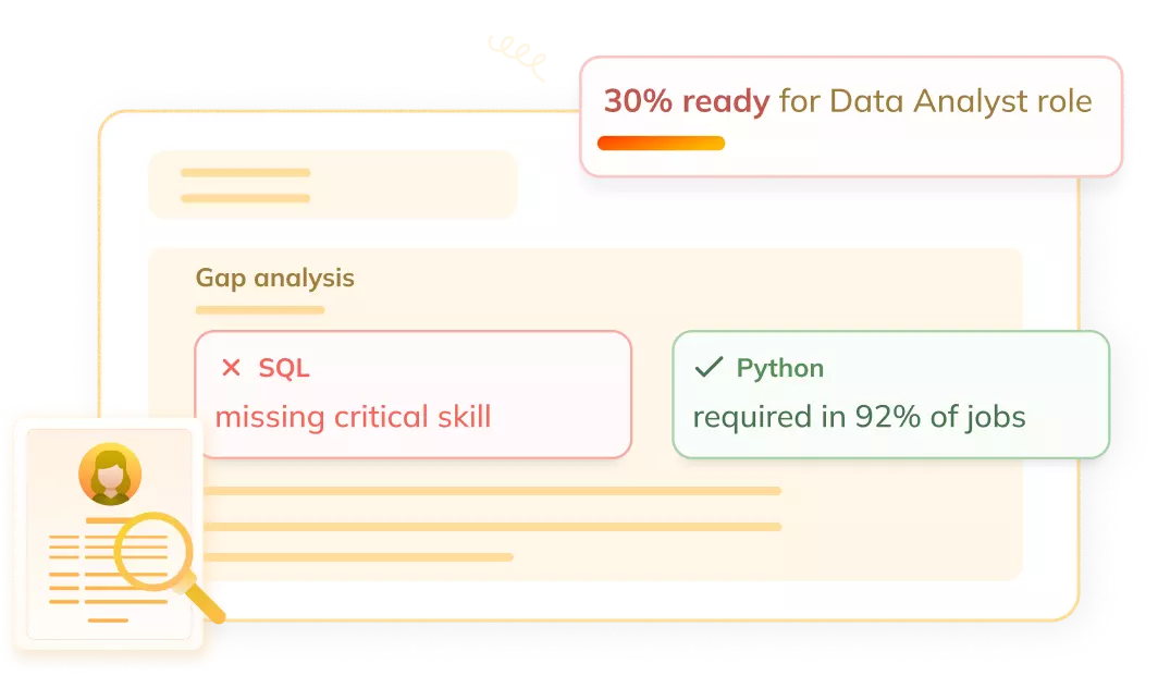
Get a skill gap analysis, personalised roadmap, and AI-powered resume optimisation.
Introduction
Seaborn is a powerful data visualization library in Python. It provides a simple way to create attractive & informative statistical graphics. Seaborn is built on top of Matplotlib & offers a high-level interface for drawing graphs & plots.
In this article, we will learn what Seaborn is, explore the different categories of plots it provides, see how to install the Seaborn library, & create some basic plots using Seaborn.
What is Seaborn?
Seaborn is a Python library used for making statistical graphics. It is built on top of Matplotlib & provides a high-level interface to create informative & attractive visualizations. Seaborn makes it easy to generate plots like heat maps, time series, violin plots & more with just a few lines of code.
The main idea of Seaborn is to make visualization a central part of exploring & understanding data. It provides dataset-oriented APIs so that we can switch between different visual representations for the same variables for better understanding of dataset.
Some of the important features of Seaborn are:
Built-in themes for styling Matplotlib graphics
Visualizing univariate & bivariate data
Fitting & visualizing linear regression models
Plotting statistical time series data
Seaborn works well with NumPy & Pandas data structures
Seaborn comes with some built-in themes & color palettes to make statistical plots more attractive. It uses a color palette to make meaningful & informative plots that make the data easy to understand.
Different categories of plot in Seaborn
Seaborn provides a wide range of plots that can be grouped into different categories based on their functionality & use case. Here are the main categories of plots in Seaborn:
Relational plots: These plots are used to visualize the relationship between two variables. Some examples are scatterplot, lineplot & relplot.
Distribution plots: These plots are used to visualize the distribution of a single variable. Some examples are histplot, kdeplot, rugplot & distplot.
Categorical plots: These plots are used to visualize the relationship between a categorical variable & a continuous variable. Some examples are boxplot, violinplot, stripplot & swarmplot.
Regression plots: These plots are used to visualize the linear relationship between two variables. Some examples are regplot & lmplot.
Matrix plots: These plots are used to visualize data in a matrix format. Some examples are heatmap & clustermap.
Multi-plot grids: These plots are used to combine multiple plots into a single figure. Some examples are FacetGrid, PairGrid & JointGrid.
Each category of plot has its own use case & helps in visualizing different aspects of data. Seaborn makes it easy to create these plots with just a few lines of code & also provides various customization options to enhance the visual appeal of the plots.
Installation of Seaborn Library
Installing Seaborn is a straightforward process. Here are the steps to install Seaborn using pip, which is the package installer for Python:
Open the command prompt or terminal on your system.
Run the following command to install Seaborn:
pip install seaborn
Wait for the installation process to complete. Pip will download & install Seaborn along with its dependencies.
Once the installation is finished, you can verify it by importing Seaborn in a Python script or interactive shell:
import seaborn as sns
If the import statement executes without any errors, it means Seaborn is successfully installed.
Alternatively, if you are using Anaconda distribution, you can install Seaborn using the conda package manager with the following command:
conda install seaborn
This command will install Seaborn & its dependencies in your Anaconda environment.
It's important to note that Seaborn requires Matplotlib & NumPy libraries to work properly.
However, pip & conda handle these dependencies automatically during the installation process.
After installing Seaborn, you are ready to start creating statistical visualizations in Python using the Seaborn library.
Some basic plots using seaborn
Now that we have Seaborn installed, let's discuss some basic plots that we can create using this library. Here are a few examples:
Scatterplot
A scatterplot is used to visualize the relationship between two continuous variables. Here's an example code snippet to create a scatterplot using Seaborn:
Python
Python
import seaborn as sns import matplotlib.pyplot as plt import pandas as pd
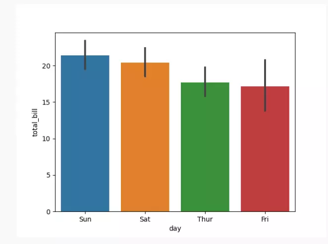
A bar plot is used to visualize the relationship between a categorical variable & a continuous variable. Here's an example code snippet to create a bar plot using Seaborn:
Python
Python
import seaborn as sns
import matplotlib.pyplot as plt
import pandas as pd

# Load the dataset from the URL directly using pandas
url = "https://raw.githubusercontent.com/mwaskom/seaborn-data/master/tips.csv"
tips = pd.read_csv(url)

# Create a bar plot
sns.barplot(data=tips, x="day", y="total_bill")

# Show the plot
plt.show()
You can also try this code with Online Python Compiler
These are just a few examples of the basic plots you can create using Seaborn. Seaborn provides a wide range of customization options to enhance the appearance & style of these plots.
Frequently Asked Questions
Can Seaborn be used with other Python libraries?
Yes, Seaborn integrates well with other Python libraries like NumPy, Pandas & Matplotlib.
Is Seaborn suitable for creating interactive plots?
While Seaborn itself doesn't provide interactive features, it can be used with libraries like Plotly or Bokeh for interactive visualizations.
How do I customize the appearance of plots in Seaborn?
Seaborn provides various styling functions & parameters to customize the appearance of plots, such as changing colors, styles & adding annotations.
Conclusion
In this article, we learned about Seaborn, a powerful data visualization library in Python. We discussed the different categories of plots provided by Seaborn, including relational plots, distribution plots & categorical plots. Seaborn makes it easy to create informative & visually appealing statistical graphics in Python.


 9+ registered

