Table of contents
1.
Introduction
2.
Class-based Animations and Transitions
3.
Transitions with Style bindings 
4.
Performance
5.
Timing
6.
Easing
7.
Frequently Asked Questions
8.
Key Takeaways
Last Updated: Aug 13, 2025

Transitions Overview

Author Rubleen Kaur
0 upvote
Career growth poll
Do you think IIT Guwahati certified course can help you in your career?

Introduction

VueJs offers us some abstracts that can work with transitions and animations. These abstracts particularly respond to some changes. A few of these abstracts are:

  • Hooks for components to enter and leave the DOM in CSS and Js; this uses the built-in <transition> component. 
  • Transition modes are also there, which can be used to orchestrate during a transition.
  • Hooks are also used for multiple elements to update their position with the FLP techniques applied under the hood to increase performance. This can be achieved using the transition group component. 
  • Transition difference can be observed in a state within an application by using watchers. 


This article covers all these sections in detail to help you give a brief overview of transitions in VueJs. Let's go through some basic web animation and transitions, which can link to some resources for further exploration. 

Class-based Animations and Transitions

Instead of using the transition component, we can add an animation without mounting a component by simply adding a conditional class. 

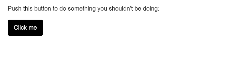
Let’s consider an example to create an animation by the use of a class-

Js File

const Demo = {
  data() {
    return {
      noActivated: false
    }
  }
}

Vue.createApp(Demo).mount('#demo')
You can also try this code with Online Javascript Compiler
Run Code


CSS File

body {
  margin: 30px;
}

button {
  background:black;
  border-radius: 4px;
  display: inline-block;
  border: none;
  padding: 0.75rem 1rem;
  margin: 20px 10px 0 0;
  text-decoration: none;
  color: #ffffff;
  font-family: sans-serif;
  font-size: 1rem;
  cursor: pointer;
  text-align: center;
  -webkit-appearance: none;
  -moz-appearance: none;
}

button:focus {
  outline: 1px dashed #fff;
  outline-offset: -3px;
}

.shake {
  animation: shake 0.82s cubic-bezier(.36,.07,.19,.97) both;
  transform: translate3d(0, 0, 0);
  backface-visibility: hidden;
  perspective: 1000px;
}

@keyframes shake {
  10%, 90% {
    transform: translate3d(-1px, 0, 0);
  }
  
  20%, 80% {
    transform: translate3d(2px, 0, 0);
  }

  30%, 50%, 70% {
    transform: translate3d(-4px, 0, 0);
  }

  40%, 60% {
    transform: translate3d(4px, 0, 0);
  }
}


OUTPUT

Transitions with Style bindings 

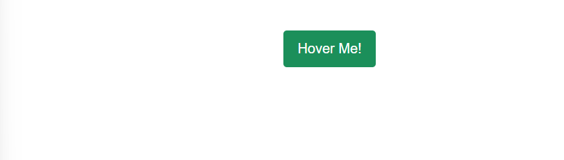
A few of the transition effects can be applied by interpolating values, and we can consider an example for the same. You have to bind a style element during which interaction coincides.

Js File

const Demo = {
  data() {
    return {
      x: 0
    }
  },
  methods: {
    xCoordinate(e) {
      this.x = e.clientX;
    }
  }
}

Vue.createApp(Demo).mount('#demo')
You can also try this code with Online Javascript Compiler
Run Code


CSS File

#demo {
  width: 100vw;
  height: 100vh;
}
.movearea {
  position: absolute;
  top: 0;
  left: 0;
  width: 100vw;
  height: 100vh;
  padding: 6vmin;
  transition: 0.2s background-color ease;
}


OUTPUT

In the above example, we have created an animation using interpolation of the axis, where we have attached it to the mouse movement. The CSS transitions change the background color according to the direction of your mouse. 

Performance

We use animations and have often observed properties involved, like perspective. Doesn't it makes you wonder, why do we use this property instead of using margin or top?

So the answer is, as web developers, we have to be utterly careful about building and creating transitions and their performance on our web applications. Our huge transitions can sometimes slow down the application if the respective properties are not used in order. We can improve the performance of our application by 

  1. Transforming and improving the Opacity 
  2. By enhancing the Hardware Acceleration

Timing

Building transitions associated with time means you are changing the state of a transition from one to another without any intermediary dependencies. We can add timings to our application in terms of seconds. For example, we can have a few simple UI transitions of around 0.1s, 0.4s, etc. 

While creating entrances and exits, the timing makes our elements more precise, making the application look better. The property makes sure the user is being guided during the entrance, and it leaves a better impression upon the exit of the application.

Easing

Now with timing, you need the easing property to make sure the transition is easing in the display, and the process is smooth. One of the common mistakes the new developers make is to use the easy option that is the ease-in property for entrances and ease-out for exits. We need to use the opposite for smooth transitions. 

Let’s observe an example of the same,

CSS file 

body {
  display: flex;
  justify-content: center;
  align-items: center;
  margin: 40px;
}

.button {
  background: #1b8f5a;
  transition: background 0.25s ease-in;
  border-radius: 4px;
  display: inline-block;
  border: none;
  padding: 0.75rem 1rem;
  margin: 0;
  text-decoration: none;
  color: #ffffff;
  font-family: sans-serif;
  font-size: 1rem;
  cursor: pointer;
  text-align: center;
  -webkit-appearance: none;
  -moz-appearance: none;
}

button:hover,
button:focus {
  transition: background 0.3s ease-out;
  background: #3eaf7c;
}

button:focus {
  outline: 1px solid #fff;
  outline-offset: -4px;
}


Js file 

const ButtonApp = {
  data() {
    return {
      message: 'Hover Me!'
    }
  }
}
Vue.createApp(ButtonApp).mount('#app')
You can also try this code with Online Javascript Compiler
Run Code


OUTPUT


Easing can improve the quality of a transition, making the process much smoother and appealing to the users. 

Frequently Asked Questions

Q1) What are Class-based animations? 
Ans: Instead of using the transition component, we can add an animation without mounting a component by simply adding a conditional class. We call this a class-based animation when we add transitions directly using a class. 

Q2) What is the use of adding Easing to our Applications? 
Ans: Easing can improve the quality of a transition, making the process much smoother and appealing to the users. 

Q3) How can you improve your transitions? 
Ans: We can improve the performance of our application by 

  • Transforming and improving the Opacity 
  • By enhancing the Hardware Acceleration

Key Takeaways

Hey everyone, so let's brief about the article describing an overview of using Transitions in your VueJs application.

  • This article covers all the sections in detail to help you give a brief overview of transitions in VueJs.
  • We have further discussed the class-based and transitions using the style bindings. 
  • Further, we have seen how we can improve the quality of our transitions and how the timing and easing of transitions matter in an application for smooth functioning.


Isn’t Web Development engaging? Building new websites and using amazing animations and different APIs, don’t be scared if you cannot grasp the hold of this vast development. We have the perfect web development course for you to make you stand out from your fellow developers. 

Happy Learning Ninjas!

Live masterclass