Table of contents
1.
Introduction
2.
AUC-ROC curve
2.1.
ROC curve
2.2.
AUC
3.
CAP curve
4.
Dataset
5.
Classification
6.
Performance evaluation
6.1.
AUCROC
6.2.
CAP
7.
Frequently asked questions
7.1.
Define CAP python?
7.2.
Define area under the ROC curve?
7.3.
Define ROC with respect to machine learning?
8.
Conclusion
Last Updated: Mar 27, 2024

AUC-ROC and CAP curves

Career growth poll
Do you think IIT Guwahati certified course can help you in your career?

Introduction

Performance measurement plays an important role in any Machine Learning project. It is very important to keep a record of how good or bad the model is. For regression models, we prefer using R2( R square) or the RMS(Root Mean Square) method. But on classification-based models, we prefer using the AUC-ROC curve or CAP curve. This method are preferred for using multi-class classification issues. In this article, we will discuss the classification-based model curves.  Let’s get started
 

.

                                         Source: Giphy

AUC-ROC curve

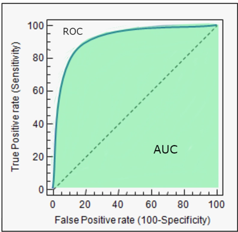
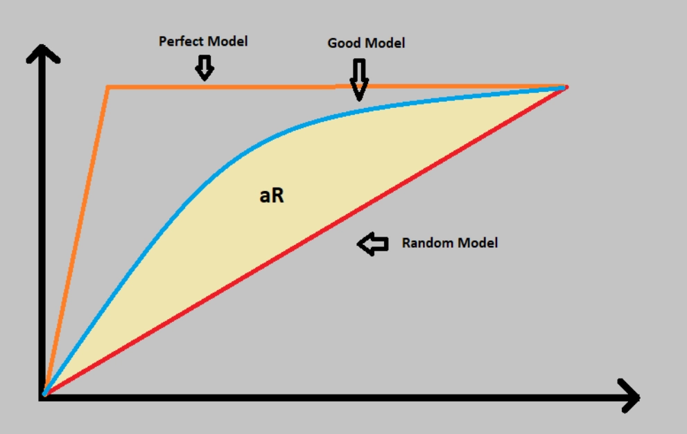
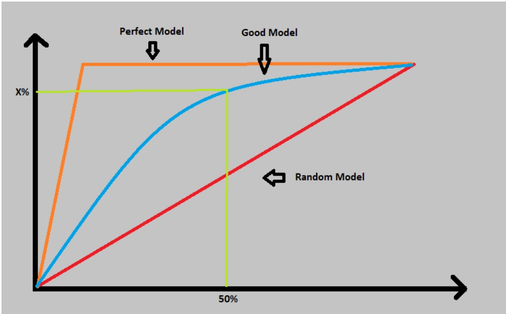
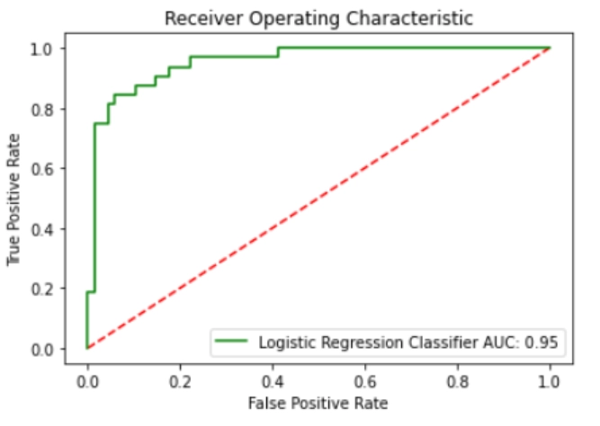
AUC-ROC refers to the Area under the curve(AUC) and receiver operating characteristics(ROC) curve. This Area under Reciever operating characteristics curve gives a measurement of various threshold levels. It is considered one of the important evaluation measures for binary classification problems. ROC gives a probability curve based on the true positive rate(TPR) against the false positive rate(FPR). And AUC plots the measure of separability of how well our model can distinguish between classes. The greater the AUC value, the good the model will be. 


                                                                                    source: link

ROC curve

ROC curve stands for receiver operating characteristic curve. This graph shows the performance of the classification model at all the classification thresholds. The graph plots using two parameters:

  • True positive rate(TPR)
  • False-positive rate(FPR)


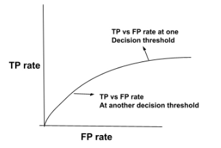
A ROC curve is able to plot between TPR and FPR at different classification thresholds. In lowering the classification thresholds, more items are identified as positive and thus helps in increasing both false and true positive rates. Now, let’s look at the figure showing TP vs FP rate at various classification thresholds. 

For evaluating the points in ROC curve, a logistic regression model is evaluated many times with different classification thresholds. But the process is very inefficient. To overcome this hit and trial method, a efficient sorting algorithm was developed known as AUC. now, let’s see about this AUC in more detail.

AUC

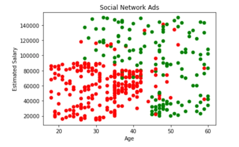
AUC curve stands for area under the ROC curve. In other words, the entire area covered under the ROC is depicted by the AUC. An aggregate measure of performance is also provided by AUC across all possible classification thresholds. One of the easiest way to determine the probability using AUC for random positive example more highly than the random negative example. Now, let’s go through an example of dataset values arranged in ascending order of left to right.


                                                                                            Source: link


The figure shown above shows all the predictions which are ranked in ascending order for logistic regression score. The random positive(green) examples are placed in the right of random negative ones(red). The range of AUC lies between 0 to 1. If any AUC predictions are 0.0 then their predictions are 100% wrong. And if the predictions are 100% correct, then the prediction is 1.0. AUC is very desirable because AUC can measure and tell how precisely the predictions are ranked irrespective of their absolute values and classification threshold chosen.

CAP curve

CAP refers to the Cumulative Accuracy Profile curve. This curve is a performance measurement for classification problems. It is used for model evaluation by comparing it with the ‘perfect’, ‘ideal’, or ‘randomized’ curve. We can identify a good model by seeing the cap in between the perfect and random curves. A good model’s cap lies very close to the perfect model curve.


                                                                                                   source: link

The two methods which are used for analyzing the performance using CAP curves are:

  • The area under the curve: the accuracy rate is calculated by using the area under the perfect model and the random model(aP), and, using the calculated area under the prediction model and random model(aR). Hence, we conclude that,

Accuracy rate(AR) = aR / aP .

Note: if the AR is higher and is very close to 1, it is considered to be a good model.


                                                                                             source: link

                                                                                              source: link

  • Plot: For plotting the graph, let’s first draw a vertical line at 50% produced till it cuts the “good models” line, and from that meeting point, draw a horizontal line till y-axis. The point which cuts the y-axis shows the percentage of positive outcomes, you are going to identify, if 50% of the population is taken.


                                                                                              source: link

Dataset

For performing the operations on the model, using the social network dataset. Here, three features are used for calculations: “age”, “estimated salary” and “purchased”. The output is in the form of either 0 or 1 which represents if the person has purchased the product or not. 

0 -> not purchased

1 -> purchased

We are predicting if any person will purchase the product or not.


Here, red circles are showing the persons who have not purchased any of the products and on the other side, green points are showing the persons who have purchased the products. 

Classification

In the classification part, we need to divide the dataset into train and test data. We have divided this dataset as, 75% train data and 25% as test data. Then logistic regression is used for training the train and test dataset. Almost 85% accuracy is observed.


Performance evaluation

AUCROC

First, we need to import roc_curve and auc from the sklearn. metrics for creating the ROC curve and also the AUC(area under the curve). First, we will calculate the probabilities of prediction using the predict_proba. The result returned will be a numpy array with two columns. Where the first column depicts probabilities of class 0 and the second column depicts probabilities of class 1. We are required to measure how well our model can distinguish between positive and negative classes, so we will use the class 1 probability to plot the ROC curve.

Here, the roc_curve will generate the ROC and the results returned are tpr, fpr, and threshold. Among these, we are concerned about the tpr and fpr because they produce the area under the curve for this model, which is represented by roc_curve. Now, let’s plot the curve and analyze the model. 


Here, the accuracy rate is 95%, which signifies that our model is performing well. 

CAP

After calculation of all the data points in the dataset, we found it is like 100. The total data points in class1 test data are 32 and the data points in class 0 are 68.

Now, let’s plot the CAP curve. First, let’s create a random model considering that class1 will increase linearly. Now, we will move towards the perfect model. A perfect model is defined as the which is able to detect all class1 data points in the same number of trials as the class1 data points. At last, we will plot the logistic regression graph

Frequently asked questions

Define CAP python?

CAP or cumulative accuracy profile is responsible for performance measurement of the classification model. These curves help to understand the nature of the classification model.

Define area under the ROC curve?

The area under the ROC curve is defined as how well any parameter can distinguish between two diagnostic groups (disease/normal).

Define ROC with respect to machine learning?

ROC stands for receiver operating characteristics. This curve represents the tradeoff between the true positive rate and the false-positive rate for binary classifiers at different classification thresholds.

Conclusion

This article provides us with a brief introduction to performance measures and methods that are used for analyzing the performance of the classification model. Keeping the theoretical knowledge at our fingertips helps us get about half the work done. To gain complete understanding, practice is a must. 
Check out this problem - First Missing Positive 

Refer to our Guided Path on Coding Ninjas Studio to upskill yourself in Data Structures and AlgorithmsCompetitive ProgrammingJavaScriptSystem DesignMachine learning, and many more! If you want to test your competency in coding, you may check out the mock test series and participate in the contests hosted on Coding Ninjas Studio! But if you have just started your learning process and are looking for questions asked by tech giants like Amazon, Microsoft, Uber, etc. You must look at the problemsinterview experiences, and interview bundle for placement preparations.

Nevertheless, you may consider our paid courses to give your career an edge over others!

Do upvote our blogs if you find them helpful and engaging!

Live masterclass