Do you think IIT Guwahati certified course can help you in your career?
Introduction
Bar plots are essential tools in data visualization, commonly used to showcase categorical data and compare different groups. In R, a powerful language for statistical analysis and graphics, creating bar plots is both simple and flexible.
This article will guide you through the process of generating bar plots in R, including simple, horizontal, stacked, and grouped bar charts. You will learn how to use the barplot() function, understand its parameters, and apply various customizations to enhance the clarity and effectiveness of your visual data representations.
Bar Charts using R
In R, bar charts can be generated using the barplot() function, offering various customization options for your plot. This function is part of R's base graphics package and is useful for creating clear and straightforward visual representations of data.
Syntax
The basic syntax for the barplot() function is:
barplot(height, names.arg = NULL, beside = FALSE, col = NULL, main = NULL, xlab = NULL, ylab = NULL)
height: A vector or matrix of values representing the heights of the bars.
names.arg: Labels for the bars.
beside: A logical value that determines if bars are plotted beside each other.
col: Colors for the bars.
main: Title of the plot.
xlab: Label for the x-axis.
ylab: Label for the y-axis.
Parameters
height: This parameter specifies the heights of the bars in the chart. For a vector, it represents the height of each bar. For a matrix, it represents multiple sets of bars.
names.arg: Provides names for each bar or group of bars, making the chart more readable.
beside: If TRUE, the bars are drawn beside each other. If FALSE, bars are stacked on top of each other.
col: Sets the colors of the bars, which can be specified using color names or codes.
main: Adds a title to the plot.
xlab and ylab: Add labels to the x and y axes, respectively.
Creating a Simple Bar Chart in R
To create a simple bar chart, you need a vector of values. Here's an example:
# Sample data
data <- c(10, 20, 15, 25, 30)


# Creating a simple bar chart
barplot(data,
        main = "Simple Bar Chart",
        xlab = "Categories",
        ylab = "Values",
        col = "blue")
Output
Explanation: This code creates a bar chart with five bars, each representing a value from the data vector. The main parameter sets the title, xlab and ylab add axis labels, and col sets the color of the bars to blue.
Creating a Horizontal Bar Chart in R
To create a horizontal bar chart, you need to use the horiz parameter in the barplot() function:
# Sample data
data <- c(10, 20, 15, 25, 30)
names <- c("A", "B", "C", "D", "E")


# Creating a horizontal bar chart
barplot(data,
        names.arg = names,
        horiz = TRUE,
        main = "Horizontal Bar Chart",
        xlab = "Values",
        ylab = "Categories",
        col = "green")
Output
Explanation: Setting horiz = TRUE changes the bars from vertical to horizontal. The names.arg parameter labels each bar, making the chart easier to interpret.
Adding Label, Title, and Color in the BarChart
Customizing bar charts with labels, titles, and colors enhances their readability and effectiveness. Here's an example:
# Sample data
data <- c(10, 20, 15, 25, 30)
names <- c("A", "B", "C", "D", "E")


# Creating a bar chart with custom labels and colors
barplot(data,
        names.arg = names,
        main = "Customized Bar Chart",
        xlab = "Categories",
        ylab = "Values",
        col = c("red", "blue", "green", "purple", "orange"))
Output
Explanation: This code sets different colors for each bar using the col parameter, and includes a title and axis labels for better understanding.
Creating Stacked and Grouped Bar Chart in R
Stacked Bar Chart
To create a stacked bar chart, use a matrix for the height parameter and set beside = FALSE:
# Sample data
data <- matrix(c(10, 20, 15, 25, 30, 5, 10, 20, 15, 10),
               nrow = 2,
               byrow = TRUE)
labels <- c("A", "B", "C", "D", "E")


# Creating a stacked bar chart
barplot(data,
        beside = FALSE,
        main = "Stacked Bar Chart",
        xlab = "Categories",
        ylab = "Values",
        col = c("cyan", "magenta"),
        legend.text = c("Group 1", "Group 2"))
Output
Explanation: Here, beside = FALSE stacks the bars on top of each other. The legend.text parameter adds a legend to differentiate between groups.
Grouped Bar Chart
For a grouped bar chart, use a matrix and set beside = TRUE:
# Sample data
data <- matrix(c(10, 20, 15, 25, 30, 5, 10, 20, 15, 10),
               nrow = 2,
               byrow = TRUE)
labels <- c("A", "B", "C", "D", "E")
# Creating a grouped bar chart
barplot(data,
        beside = TRUE,
        main = "Grouped Bar Chart",
        xlab = "Categories",
        ylab = "Values",
        col = c("cyan", "magenta"),
        legend.text = c("Group 1", "Group 2"))
Output
Explanation: Setting beside = TRUE places bars for different groups side by side, which helps in comparing categories across groups.
Here's how you can achieve each of these tasks in R using the barplot() function for creating bar plots, including adding data values on the bars, providing names for each bar, and creating a stacked bar plot.
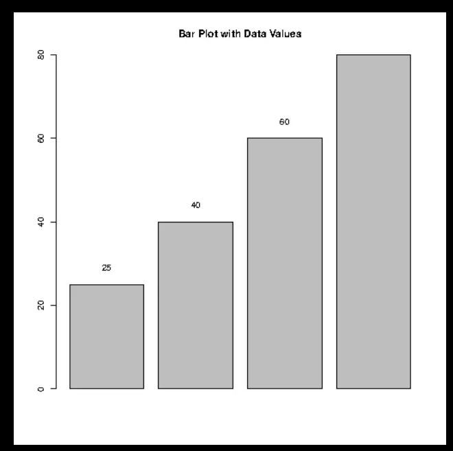
Adding Data Values on the Bars
To add data values on top of each bar, you can use the text() function in conjunction with the output from barplot(), which gives the midpoints of the bars.
# Data
values <- c(25, 40, 60, 80)
# Basic bar plot
bp <- barplot(values, main="Bar Plot with Data Values")
# Adding data values
text(bp, values + 2, labels=values, pos=3)  # pos=3 for above the bar
Output
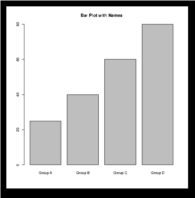
Providing Names for Each Bar
You can provide names for each bar using the names.arg parameter within the barplot() function. Here’s how you can add custom names to each bar:
# Data
values <- c(25, 40, 60, 80)
names <- c("Group A", "Group B", "Group C", "Group D")
# Bar plot with names
barplot(values, names.arg=names, main="Bar Plot with Names")
Output
Creating a Stacked Bar Plot
For a stacked bar plot, you'll need a matrix where each row represents a group and each column represents a category. The barplot() function will stack the rows on top of each other.
Each of these customizations can make your bar plots in R more informative and visually appealing, enhancing the presentation and clarity of your data analysis.
Frequently Asked Questions
What is a bar plot used for in R?
A bar plot is used to display and compare the frequency, count, or other measurements of categorical data. It represents data with rectangular bars, where the length of each bar corresponds to the value being measured.
How can I change the color of bars in a bar plot?
You can modify the color of the bars using the col parameter in the barplot() function. Colors can be specified by name (e.g., "red") or by using color codes.
What’s the difference between a stacked and grouped bar chart?
A stacked bar chart arranges bars on top of each other to display the total and distribution within each category, while a grouped bar chart places bars for different groups side by side, enabling direct comparison.
Conclusion
In this article, we covered the fundamentals of creating bar plots in R, including simple, horizontal, stacked, and grouped bar charts. We discussed the essential syntax and parameters of the barplot() function, showed how to customize your plots with labels, titles, and colors, and provided examples of various bar chart types. With these skills, you'll be equipped to effectively visualize and analyze categorical data in your projects.
You can also check out our other blogs on Code360.


 9+ registered

