Do you think IIT Guwahati certified course can help you in your career?
Introduction
We have heard of media queries a lot. But what are media queries? Let’s clear this question for you today!
Media queries target certain features, user preferences, and characteristics and then apply the styling or implement the code on the specified things.
Also, the most common media queries that are pretty much used in the coding world at the maximum are those that target viewport ranges and take under the application of custom styles.
And this gives birth to the entire idea of responsive design.
So finally got to know what media queries mean and how they workaround? Let’s take you around the CSS2 Media types now!
CSS2 Introduced Media Types
CSS2 introduced a new rule which made it easy for us to specify different media types with different style rules.
This allows you to divide your styling rules into different categories.
You can have a different set of rules for printers, a different set for handheld devices, and a different set of rules for computer screens and so on.
But these media types were never supported by devices other than the printer devices so let's look at the next level of media queries that came up with CSS3.
CSS3 Introduced Media Queries
To extend the idea of the CSS2 media types, CSS3 media queries were introduced. Unlike CSS2 media types, these do not consider individual devices. Instead, they consider the capability of an individual device.
These media queries can be used to check things like :
Height and width of the viewport
Height and width of the device
Orientation [whether the device is in landscape or portrait mode]
Screen resolution of the device.
Using these media queries, we can actually provide custom style sheets to our devices, and they can be tailored depending on the requirements. This makes media queries readily used styling tools.
Providing styling to devices is a very common task, but we need to keep in mind the browser versions that actually support this property completely. Let's have a quick look at the browser support.
Browser Support
The given table shows the browser versions that support the media queries completely.
Browser
Google Chrome
Microsoft
Edge
Mozilla
Firefox
Safari
Opera
Version
21.0
9.0
3.5
4.0
9.0
It's been a while since we have been talking about the media queries now! But we still haven't seen how we can code the media queries into our files. Let’s now have a look at the Syntax and anatomy of the media queries.
Media Query Syntax
So the Syntax to media queries is straight and simple.
We have one media type and one or more expressions, which further have either true or false as their resolving value.
Here we can see three different words that are being used, one being and then only and then not so let’s now have a quick understanding on what these words actually mean:
And: this keyword helps us to combine our media feature to a media type or some other media feature
Only: this keyword helps us to exclude the older browsers that do not use media queries with media features from applying a specific style.
Not: this keyword helps us to invert the meaning of our entire media query
The result of the expression turns out to be true only when the media type matches with the type of the device we want to display our document on. And when we get the expression as true, then all the style sheet or style rules are applied, followed by the normal cascading rules as well.
Hoping that the Syntax is clear, we will now move to the media types that are there in CSS3.
CSS3 Media Types
There are four different types of media types which are as follows :
Media Type
Description
Speech
It is used for screenreaders that “reads” the page loud
Screen
It is used for computer screens, tablets, phones, etc.
Print
It is used for printers
All
It is used for all media types
CSS3 Media Features
There are various media features available for you to use in the CSS stylesheets. In this article, we have curated these features according to their properties, let’s have a look at a few of the most used media features.
Viewport/Page Characteristics
Feature
Summary
Values
width
The width feature determines the widths of the viewport.
<length>
height
The height feature defines the height of the viewport.
<length>
aspect-ratio
The aspect-ratio feature defines the width-to-height aspect ratio of the viewport.
<ratio>
Display Quality
Feature
Summary
Values
resolution
The resolution feature defines the target pixel density of the device
<resolution>
scan
It defines the scanning process of the device, which is the way the device paints an image onto the screen.
interlace
grid
The grid features helps you to determine if the device uses a grid (1) or bitmap (0) screen
0 = Bitmap
1 = Grid
Color
Feature
Summary
Values
color
The color feature defines the color support of a device, which is expressed numerically as bits.
<integer>
color-index
The color-index value is used to define the number of values the device supports.
<integer>
monochrome
The monochrome feature is used to calculate the number of bits per pixel that a device’s monochrome supports, where zero is no monochrome support.
<integer>
Interaction
Feature
Summary
Values
pointer
The pointer feature is used to sort any-pointer but checks if the primary input mechanism is a pointer.
coarse,
fine or
none
hover
The hover features sorts out like any-hover but also checks if the primary input mechanism allows the user to hover over the elements
hover, or
none
Example
Getting a different section of CSS to implement the media queries is a way that we can use easily.
Let’s have a look and see how we can do it?
@media screen and (mid-width: 480px) { Body { Background-color: lightgreen; } }
Let’s see one more example of a menu that floats on the left side of the page if the width of the viewport is 480px or more.
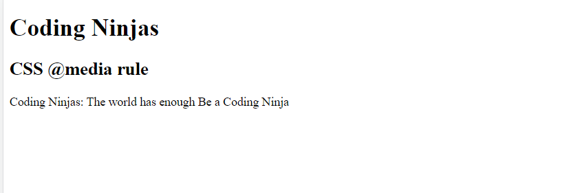
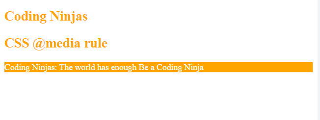
Since we have finally understood the entire concept of media queries let’s implement the learning into a live example and see how our code looks.
<!DOCTYPE html> <html> <head> <meta content="width=device-width, initial-scale=1" name="viewport" /> <title> CSS @media rule </title> <style> @media screen and (max-width: 500px) { h1, h2 { color: orange; font-size: 25px; } p { background-color: orange; color: white; } } </style> </head> <body> <h1>Coding Ninjas</h1> <h2>CSS @media rule</h2> <p>Coding Ninjas: The world has enough Be a Coding Ninja</p> </body> </html>
Output:
When the screen width is more than 500px
When the screen width is less than 500px
We have a pretty good understanding of the CSS media queries now. Let's see some frequently asked questions of the same!
Frequently Asked Questions
Question 1: Why are media queries used?
Answer: Media queries are basically used to target certain features, user preferences, and characteristics and then apply the styling or implement the code on the specified things.
Question 2: What is a media query breakpoint?
Answer: The points in a website that respond according to the device’s width
Question 3: What is media in CSS?
Answer: @media is used in media queries to apply different styles to different devices.
Key Takeaways
The article that we just went through took us through all the media queries that are present in the CSS. This article also specifies the browser versions that support media queries.
So, did you like this blog? And want to solve some interview questions for CSS? Here is a blog for you! Please have a look and also visit our platform Coding Ninjas Studio for more interview problems.
Live masterclass
Zomato Data Analysis Case Study: Ace 25L+ Roles in FoodTech
by Abhishek Soni
16 Mar, 2026
01:30 PM
Data Analysis for 20L+ CTC@Flipkart: End-Season Sales dataset
by Sumit Shukla
15 Mar, 2026
06:30 AM
Beginner to GenAI Engineer Roadmap for 30L+ CTC at Amazon
by Shantanu Shubham
15 Mar, 2026
08:30 AM
Multi-Agent AI Systems: Live Workshop for 25L+ CTC at Google
by Saurav Prateek
16 Mar, 2026
03:00 PM
Zomato Data Analysis Case Study: Ace 25L+ Roles in FoodTech
by Abhishek Soni
16 Mar, 2026
01:30 PM
Data Analysis for 20L+ CTC@Flipkart: End-Season Sales dataset


 39+ registered

