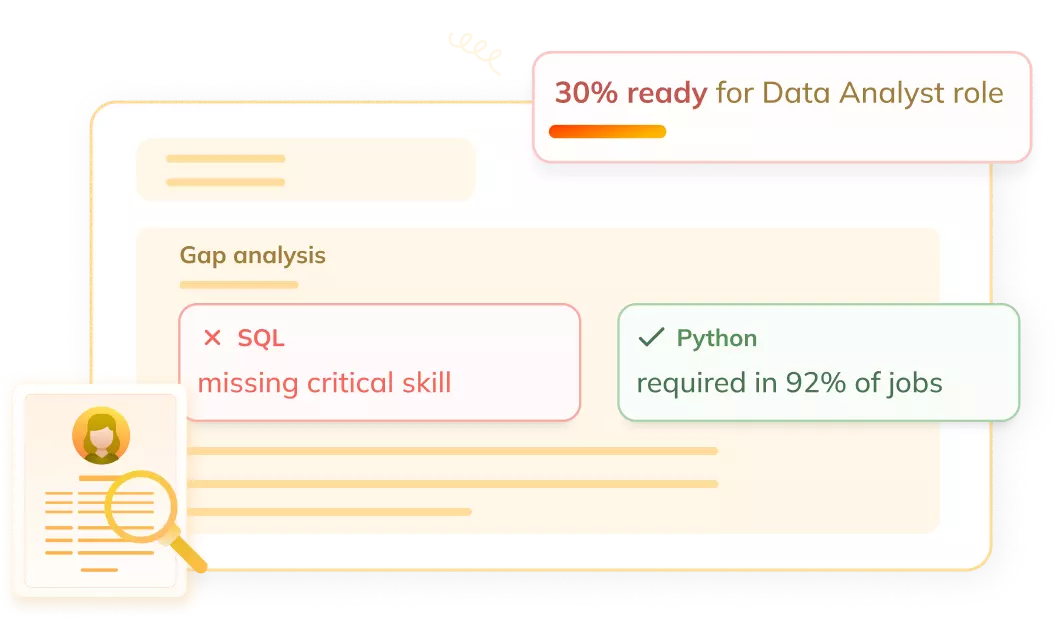
Get a skill gap analysis, personalised roadmap, and AI-powered resume optimisation.
Introduction
Time series analysis is a very important tool for understanding and predicting patterns in data that changes over time. This comprises of collection and analyzing data points at regular intervals to identify trends, seasonality, and other important features. Time series analysis is widely used in various fields like finance, economics, weather forecasting, and more.
In this article, we will discuss the basics of time series analysis, like key concepts, types of data, and visualization techniques using Python.
What are time series visualization and analytics?
Time series visualization and analytics involve graphically representing time-dependent data to identify patterns, trends, and anomalies. Visualization helps in understanding the underlying structure of the data and making informed decisions based on the insights gained. Time series analytics takes it a step further by applying statistical methods and machine learning algorithms to extract meaningful information from the data.
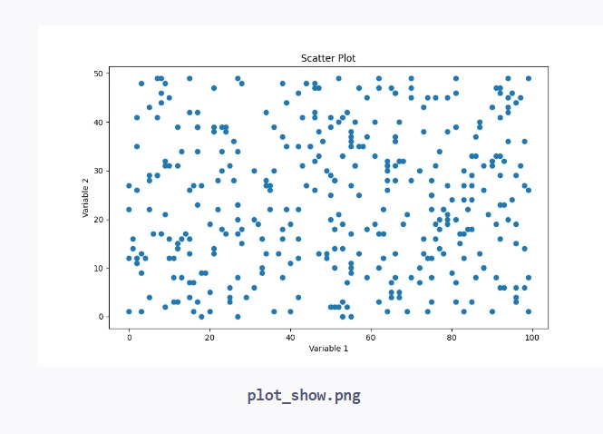
Some common techniques used in time series visualization include line plots, scatter plots, and heat maps. These plots allow us to see how the data changes over time and identify any recurring patterns or outliers. Time series analytics, on the other hand, uses methods like moving averages, exponential smoothing, and autoregressive integrated moving average (ARIMA) models to forecast future values based on historical data.
With the combination of visualization and analytics, we can gain a comprehensive understanding of time series data and make data-driven decisions in various domains like business, finance, and science.
What is Time Series Data?
Time series data is a collection of observations recorded at regular time intervals. Each observation consists of a timestamp and a corresponding value. The time intervals can be seconds, minutes, hours, days, months, or even years, depending on the nature of the data being collected.
Some common examples of time series data are:
1. Stock prices: The price of a stock recorded at different points in time, such as every minute or every day.
2. Weather data: Temperature, humidity, or precipitation values recorded hourly or daily.
3. Sales data: The number of products sold or revenue generated daily, weekly, or monthly.
Time series data has unique properties that distinguish it from other types of data:
1. Temporal dependency: The value at a given time point often depends on the values at previous time points.
2. Seasonality: Some time series data exhibits regular patterns that repeat over fixed time intervals, such as daily, weekly, or yearly cycles.
3. Trend: Time series data may show an overall increasing or decreasing trend over time.
Importance of time series analysis
Time series analysis is crucial in many domains as it helps in understanding the past behavior of a variable and predicting its future values.
Let’s see some important reasons why time series analysis is important are:
1. Forecasting: Time series analysis enables us to forecast future values of a variable based on its past behavior. This is particularly useful in business for predicting sales, demand, and revenue, which helps in planning and decision-making.
2. Identifying patterns and trends: By analyzing time series data, we can identify patterns such as seasonality, cycles, and trends. This information can be used to make informed decisions and develop strategies.
3. Anomaly detection: Time series analysis can help detect unusual or anomalous behavior in data. This is important in various fields, such as fraud detection in finance or identifying sensor failures in manufacturing.
4. Understanding relationships: Time series analysis can uncover relationships between different variables over time. For example, we can analyze how changes in advertising expenditure impact sales or how temperature affects energy consumption.
5. Optimization: By understanding the patterns and relationships in time series data, we can optimize processes and systems. For instance, analyzing traffic data can help optimize transportation systems and reduce congestion.
6. Risk management: Time series analysis is used in finance for managing risk by predicting future price movements and volatility.
Basic Time Series Concepts
To effectively work with time series data, it's important to understand some basic concepts:
1. Trend: A trend refers to the overall long-term direction of the time series. It can be increasing (upward trend), decreasing (downward trend), or stable (no trend). Trends can be linear or non-linear.
2. Seasonality: Seasonality refers to regular, predictable patterns that repeat over fixed time intervals. These patterns can occur daily, weekly, monthly, or annually. For example, sales of ice cream may show seasonality with higher sales in summer months.
3. Cyclical patterns: Cyclical patterns are similar to seasonality but occur over longer time periods and are less predictable. Business cycles and economic cycles are examples of cyclical patterns.
4. Autocorrelation: Autocorrelation measures the relationship between a time series and a lagged version of itself. It helps determine how strongly the current values of a series depend on its past values.
5. Stationarity: A time series is considered stationary if its statistical properties, such as mean and variance, remain constant over time. Stationarity is an important assumption for many time series analysis techniques.
6. Differencing: Differencing involves computing the differences between consecutive observations in a time series. It is often used to remove trends and make a time series stationary.
7. Smoothing: Smoothing techniques, such as moving averages and exponential smoothing, are used to reduce noise and highlight underlying patterns in time series data.
Types of Time Series Data
Time series data can be classified into different types based on the nature of the observations and the underlying patterns. The main types of time series data are:
1. Continuous time series: In a continuous time series, observations are recorded continuously over time, without any gaps. Examples include stock prices, temperature readings, and sensor data.
2. Discrete time series: Discrete time series consist of observations recorded at fixed time intervals, such as hourly, daily, or monthly. Examples include sales data, website traffic, and monthly revenue.
3. Univariate time series: Univariate time series involve a single variable recorded over time. For example, daily closing prices of a particular stock or monthly unemployment rates.
4. Multivariate time series: Multivariate time series involve multiple variables recorded over time. For example, a dataset containing daily stock prices, trading volumes, and market indices.
5. Stationary time series: A stationary time series has constant statistical properties over time, such as mean, variance, and autocorrelation. Examples include white noise and fluctuations around a constant mean.
6. Non-stationary time series: Non-stationary time series have statistical properties that change over time. They may exhibit trends, seasonality, or changing variance. Examples include stock prices with an upward trend or sales data with seasonality.
7. Seasonal time series: Seasonal time series exhibit regular patterns that repeat over fixed time intervals, such as daily, weekly, or yearly cycles. Examples include sales of winter clothing or electricity consumption.
8. Cyclical time series: Cyclical time series show patterns that repeat over longer time periods but are less regular than seasonal patterns. Examples include business cycles and economic cycles.
Visualization Approach for Different Data Types
1. Line Plot
A line plot is used to visualize continuous time series data, showing how the values change over time.
Note: Make sure you have the required libraries installed (`matplotlib`, `seaborn`, `pandas`, `numpy`) before running the code.
Frequently Asked Questions
What is the difference between time series analysis and other types of data analysis?
Time series analysis focuses specifically on data that is collected over regular time intervals, while other types of data analysis may not have a temporal component.
Can time series analysis be used for non-numerical data?
Yes, time series analysis can be applied to non-numerical data, such as categorical or textual data, by converting them into numerical representations or using techniques like one-hot encoding.
How do I choose the appropriate visualization technique for my time series data?
The choice of visualization technique depends on the type of data, the patterns you want to identify, and the insights you want to convey. Consider factors such as the number of variables, the presence of trends or seasonality, and the relationship between variables.
Conclusion
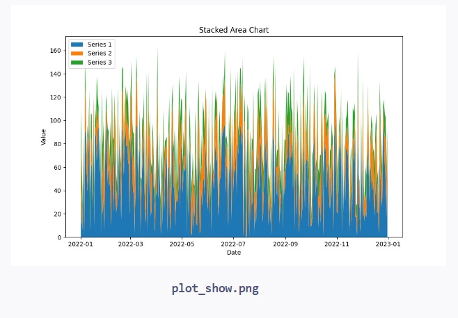
In this article, we have learned about the basics of time series analysis and visualization using Python. We discussed main concepts like trends, seasonality, and stationarity, and explored different types of time series data. We also explained various visualization techniques, like plots, scatter plots, heatmaps, and stacked area charts, with code examples to show their implementation.
You can also check out our other blogs on Code360.
Live masterclass
Prompt Engineering: Must-have GenAI Skill for 30L+ Roles at Amazon
by Anubhav Sinha
16 Jul, 2026
12:30 PM
Using Netflix Data to Master Power BI
by Ashwin Goyal
13 Jul, 2026
12:30 PM
Top GenAI Skills to crack 30L+ CTC at Amazon & Google
by Sumit Shukla
14 Jul, 2026
11:30 AM
JioHotstar Sports Analytics using IPL Dataset
by Prerita Agarwal
15 Jul, 2026
12:30 PM
Prompt Engineering: Must-have GenAI Skill for 30L+ Roles at Amazon


 9+ registered

