Do you think IIT Guwahati certified course can help you in your career?
Introduction
Matplotlib is a Python library that is used to create static and animated visualization. It provide a module named mplot3d toolkit which is used for creating three dimensional plots and visualization such as 3D line plot, scatter plot, surface plot, and wideframe plots.
In the article “3D Scatter Plots in Matplotlib”, we will create Matplotlib 3D scatter plots using the scatter3D() method and customize the 3D scatter plots by customizing the color, marker, axis, rotation, and animation.
3D Scatter Plot
The 3D scatter plots in Matplotlib is a mathematical graph or three-dimensional plot that is used to chart the data characteristics and explore the relationship between the dimensional data. Python provides a toolkit, mplot3d, used to generate the 3D scatter plots.
The scatter3D() is the method in the mplot3d toolkit, which is used to create the 3D scatter plot. The representation of the 3D scatter plot in Matplotlib to understand the visualization is:
Syntax of scatter3D
The syntax of the scatter3D method in Python to create the 3D scatter plot:
scatter3D(x, y, z, zdir='z', s=20, c=None, depthshade=True, *args, data=None, **kwargs)
Here is the explanation of the parameters in the scatter3D method syntax:
x, y, and z: These are three arrays whose elements show the data points according to which the coordinates will be plotted.
zdir: This parameter shows the axis direction for the z parameter. By default, it is ‘z’.
s: It is an optional parameter that shows the marker size in points.
c: It is the list of colors that shows the marker colors.
depthshade: This is the optional parameter, which is a boolean value that shows whether to shade the scatter markers to give the appearance of depth.
data: It is an optional parameter that shows the indexable object.
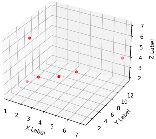
Creating 3D Scatter Plots in Matplotlib
In this section, we will create a simple 3D scatter plot using the scatter3D method in Python. Here is the code for the same:
Python
Python
# Importing necessary libraries from mpl_toolkits.mplot3d import Axes3D import numpy as np import matplotlib.pyplot as plt
# Creating a, b, and c data points a = np.random.randint(70, size = (50)) b = np.random.randint(70, size = (50)) c = np.random.randint(70, size = (50))
# Using scatter3D method ax.scatter3D(a, b, c, s = 50, color = 'blue', marker = '+')
# Labelling for the x, y, and z axes ax.set_xlabel('X - Axis') ax.set_ylabel('Y - Axis') ax.set_zlabel('Z - Axis')
# Setting title of the plot plt.title("Simple 3D Scatter Plotting in Python")
# using show() method showing the plotting plt.show()
You can also try this code with Online Python Compiler
In the above code, we used the figure() and add_subplot() methods to show the figure and axis. Then, we created three arrays of 11 sizes (x, y, and z) for the data points on the graph. The main function scatter3D method is then used for creating the 3D scatter plot with the arguments x, y, x, s = ‘50’, color = ‘blue’, and marker = ‘+’. Then the set_xlabel, set_ylabel, and set_zlabel methods are used for labelling purposes, the title() method is also used for setting the title of the plot, and the show() method is used to show the plotting.
Customization of 3D Scatter Plots in Matplotlib
In this section of the article “3D Scatter Plots in Matplotlib”, we will customize 3D scatter plots using various considerations such as color, marker, and axis.
Color Customization
3D scatter plots can be customized using several color methods and parameters. So first let's see about those important methods and parameters before directly customizing the 3D scatter plot.
Depthshade
It is a parameter which is supposed to be passed in the scatter3D method in Python. Depthshade shows whether to shade the scatter markers or not as it is a boolean value (true or false). By default, the value of depthshade is true.
Colorbar
Colorbar is a method in Python that creates a colormap and plots the colorbar. Here is the syntax of colorbar() method:
plt.colorbar(scatter_plot)
In the above syntax, only one argument is passed which is the created 3D scatter plot and this function will create a colormap for the 3D scatter plot.
Facecolor
The set_facecolor is a method and facecolor is a parameter in Python which is used to change the inner and outer background color of the pyplot respectively because the background of the pyplot is white by default. Here is the syntax for set_facecolor method and facecolor parameter:
Now lets see how a 3D scatter plot can be customized using these color methods and parameters. Here is the code for the same:
Python
Python
# Importing necessary libraries from mpl_toolkits import mplot3d import numpy as np import matplotlib.pyplot as plt
# Creating a, b, and c data points a = np.random.randint(60, size = (50)) b = np.random.randint(60, size = (50)) c = np.random.randint(60, size = (50))
First, the necessary libraries are imported, like mplot3d, numpy, and pyplot.
Then, the outer background color of the pyplot is changed to coral using the facecolor() method.
The scatter3D() method is used with color variables like color, depthshade, and cmap for customizing the color of the 3D scatter plot.
The colorbar() method enhances the understanding of data plots by passing the scatter_plot parameter.
Lastly, the show() method is used to show the pyplot.
Marker Customization
3D scatter plots can be customized using markers that represent the data points. So first let's see about those important parameters before directly customizing the 3D scatter plot.
Marker Size
In Python, ‘s’ is a parameter that defines the size of the marker which is supposed to be passed in the scatter3D method. Here is an example of using the ‘s’ parameter in the scatter3D method.
axe.scatter3D(x, y, z, s = 70)
In the above syntax, the parameter ‘s’ is passed with the value 70 where the value of ‘s’ shows the size of the marker.
Marker Style
The ‘marker’ is a parameter which is used to define the style of the marker and that is supposed to be passed in the scatter3D method. Any character value can be passed in the parameter and that character will be shown on the marker on the pyplot. Here is an example of using the ‘marker’ parameter in the scatter3D method:
scatter_plot= ax.scatter3D(a, b, c, s = 50, marker = '+')
In the above syntax, the parameter ‘marker’ is passed with the character value ‘+’ where the value of ‘marker’ shows the style of the marker.
Marker Color
The ‘color’ and ‘edgecolor’ parameters change the color of the marker and the edge color of the marker in the 3D scatter plot. Here is an example of using the ‘color’ and ‘edgecolor’ parameter in the scatter3D method:
axe.scatter3D(x, y, z, s = 70, color = 'blue', edgecolor = 'red')
In the above example, ‘color’ parameter is passed with the value ‘blue’ and the ‘edgecolor’ parameter is passed with the value ‘red’.
Marker Customization Example
Now lets see how a 3D scatter plot can be customized using these marker parameters. Here is the code for the same:
Python
Python
# Importing necessary libraries from mpl_toolkits import mplot3d import numpy as np import matplotlib.pyplot as plt
# Creating x, y, and z data points x = np.random.randint(80, size = (50)) y = np.random.randint(80, size = (50)) z = np.random.randint(80, size = (50))
# Using scatter3D method axe.scatter3D(x, y, z, s = 70, color = 'blue', edgecolor = 'red')
# Setting title of the plot plt.title("3D Scatter Plotting with Customized Marker")
# using show() method showing the plotting plt.show()
You can also try this code with Online Python Compiler
First, the necessary libraries are imported, like mplot3d, numpy, and pyplot.
Then, the figure and add_subplot methods are called for the figure and axis.
Then, three arrays for x, y, and x data points are created.
The scatter3D() method is used with marker variables like s for customizing the color of the 3D scatter plot.
Lastly, the show() method is used to show the pyplot.
Axis Customization
3D scatter plots can be customized using axis limits and axis ticks. So first let's see about those important methods before directly customizing the 3D scatter plot.
set_zlabel() method
In Python, The set_zlabel() method can be used to label the z-axis of the plot. Here is the syntax of the set_zlabel() method:
The legend() method is used to add the legend point in the pyplot. But if the legend method is not being used, the Matplotlib will configure the legend by itself. Here is the syntax of legend() method in Matplotlib:
ax.legend()
Axis Customization Example
Now lets see how a 3D scatter plot can be customized using these legend and set_zlabel() method. Here is the code for the same:
Python
Python
# Importing necessary libraries from mpl_toolkits.mplot3d import Axes3D import numpy as np import matplotlib.pyplot as plt
# Creating a, b, and c data points for first a = np.random.randint(80, size = (50)) b = np.random.randint(80, size = (50)) c = np.random.randint(80, size = (50))
# Creating d, e, and f data points for second d = np.random.randint(80, size = (50)) e = np.random.randint(80, size = (50)) f = np.random.randint(80, size = (50))
# Using scatter3D method ax.scatter3D(a, b, c, s = 50, color = 'green', marker = '*', label = 'First') ax.scatter3D(d, e, f, s = 50, color = 'blue', marker = '+', label = 'Second')
# Using the legend() method ax.legend()
# Labelling for the x, y, and z axes ax.set_xlabel('X - Label') ax.set_ylabel('Y - Label') ax.set_zlabel('Z - Label')
# Setting the title using title() method plt.title("3D Scatter Plot with Customized Axis")
# using show() method showing the plotting plt.show()
You can also try this code with Online Python Compiler
First, the necessary libraries are imported, like mplot3d and pyplot.
Then, the figure and add_subplot methods are called for the figure and axis.
Then, three arrays for a, b, c, d, e, and f data points are created for the first and second label.
The scatter3D() methods are used with marker variables like s for customizing the color of the 3D scatter plot.
The legend() method adds a legend to the plot.
Lastly, the show() method is used to show the pyplot.
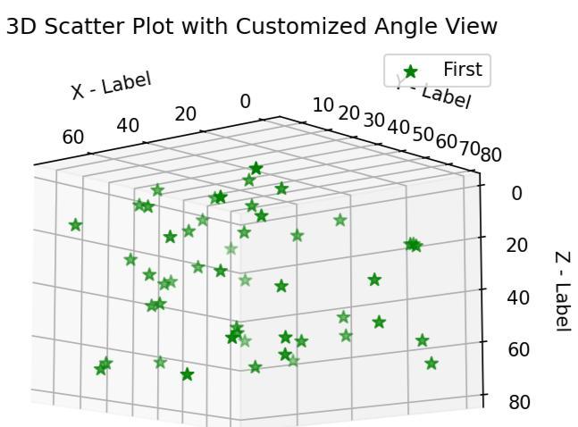
Rotation of 3D Scatter Plot
The 3D scatter plot can be visualized using a different perspective where the view_init() method can be used to view the angle of the created 3D scatter plot. Here is an example for using view_init() method:
In the above syntax, two parameters are passed where the first parameter is ‘elevation_angle’ that specifies the elevation angle of the z plane. The second parameter is ‘azimuth_angle’ which specifies the azimuth angle of the z plane.
Here is the code where the 3D scatter plot is customized using the view_init() method to change the view angle:
Python
Python
# Importing necessary libraries from mpl_toolkits.mplot3d import Axes3D import numpy as np import matplotlib.pyplot as plt
# Creating a, b, and c data points for first a = np.random.randint(80, size = (50)) b = np.random.randint(80, size = (50)) c = np.random.randint(80, size = (50))
# Using scatter3D method ax.scatter3D(a, b, c, s = 50, color = 'green', marker = '*', label = 'First')
# Using the legend() method ax.legend()
# Labelling for the x, y, and z axes ax.set_xlabel('X - Label') ax.set_ylabel('Y - Label') ax.set_zlabel('Z - Label')
# Setting the title using title() method plt.title("3D Scatter Plot with Customized Angle View")
# Using view_init() method to change the view angle ax.view_init(-190, 50)
# using show() method showing the plotting plt.show()
You can also try this code with Online Python Compiler
The figure and add_subplot methods are called for the figure and axis.
Then, three arrays for a, b, and c data points are created.
The scatter3D() methods are used with marker variables like s for customizing the color of the 3D scatter plot.
The legend() method adds a legend to the plot.
Then, the view_init() method is used to change the view angle of the created 3D scatter plot.
Lastly, the show() method is used to show the pyplot.
Animation in 3D Scatter Plot
The animation can also be done in a 3D scatter plot where the method FuncAnimation can be used which allows for robust data visualization and exploration. Here is the syntax of the FuncAnimation method in Python:
In the above syntax, the parameters passed in the FuncAnimation method are:
fig: This parameter shows the figure object for drawing and resizing.
func: This parameter is a function that calls itself each time.
frames: The frames is an optional parameter which is a data source that can be passed to the func and the frame of the animation.
init_func: The init_func is also an optional parameter which is a function that can be used to draw a clear frame.
fargs: It is an optional parameter which is an additional argument that needs to be passed in the func function.
save_count: The save_count is an integer value that is passed in the method for the number of values from frames to cache.
cache_frame_data: The cache_frame_data is an optional parameter which is a boolean value (true or false) that can be used to control the caching of the data.
Frequently Asked Questions
How 2D scatter plot can be plotted in Python?
To plot 2D scatter plots, Python provides a Matplotlib library which is used for data visualization, where the scatter() method is used which takes the numpy arrays as the arguments.
What is depthshade in Python?
The depthshade is an optional parameter in the scatter3D method, which is a boolean value (true or false) that determines for shading of the scatter markers which gives the appearance of depth.
What is the Numpy Library?
Numpy is the library provided by Python that basically works on array operations, and Numpy arrays are similar to the Python lists, which results in faster execution time than the generic Python lists.
What is the colorbar() method in Python?
The colorbar() method in Python is used to enhance the understanding of data plots by visually separating dimensions over a range of values. The colorbar() method is used for customizing the 3D scatter plots in Matplotlib.
Conclusion
Python provides the Matplotlib library by which the 3D scatter plot can be plotted on the graph. Python provides a toolkit, mplot3d, which is used to generate the 3D scatter plots. In 3D scatter plots in Matplotlib, the plot can be customized by color, markers, and axes.
We hope this article help you to enhanced knowledge. Here are more articles that are recommended to read:


 6+ registered