Do you think IIT Guwahati certified course can help you in your career?
Introduction
Hey, ninja! In this article, we will talk about bootstrap panels and wells. In bootstrap, panels are used to place DOM(Document Object Model) components in a bordered box or a <div> container with padding around their content. The wells in Bootstrap cause the content to appear sunken or inset when placed inside a box.
You can use bootstrap panels and wells to attract the reader's attention to the specific content of your website. They provide padding and background colour to the container or box. Let us begin by learning about the bootstrap panels and wells in greater detail.
Bootstrap Panels
Bootstrap panels are a feature of the Bootstrap framework that allows developers to create a box-like container for content on a web page. These panels can be used to group and organize content in a visually appealing and consistent manner. They can be customized with different colours, borders, and padding to match the overall design of a website. Bootstrap panels can include a heading, footer, and other elements such as buttons or forms. They are typically created using HTML, CSS, and JavaScript.
How to Create Bootstrap Panels
Bootstrap panels can be created by adding the .panel class to any container or block element along withthe .panel-default class. The .panel-body class is used to give a panel a body. The content in the panel usually has a heading, body, and footer parts.
Here is an example of how to create a basic Bootstrap panel using HTML:
In this example, the outer div element has a class "panel" and "panel-default", which Bootstrap provides to create the basic panel structure. The inner div element with the class "panel-heading" is used to create the panel heading, and the innermost div element with the class "panel-body" is used to create the panel body, where the content goes.
You can also use different classes, such as "panel-primary" or "panel-success," to change the panel's colour.
Additionally, you can also add a footer to the panel by adding a div element with a class "panel-footer" within the outer div.
The page contains a container element with a panel element inside, which has a ".panel-default" class to style it as a default Bootstrap panel. The panel also has a ".panel-body" element with the text "Simple Panel".
Output
Panel with Heading and Footer
Following is an example of a panel containing a header and a footer.
Example
<!DOCTYPE html>
<html lang="en">
<head>
<title>Panel Example</title>
<meta charset="utf-8">
<meta name="viewport" content="width=device-width, initial-scale=1">
<link rel="stylesheet" href="https://maxcdn.bootstrapcdn.com/bootstrap/3.4.1/css/bootstrap.min.css">
<script src="https://ajax.googleapis.com/ajax/libs/jquery/3.6.1/jquery.min.js"></script>
<script src="https://maxcdn.bootstrapcdn.com/bootstrap/3.4.1/js/bootstrap.min.js"></script>
</head>
<body>
<div class="container">
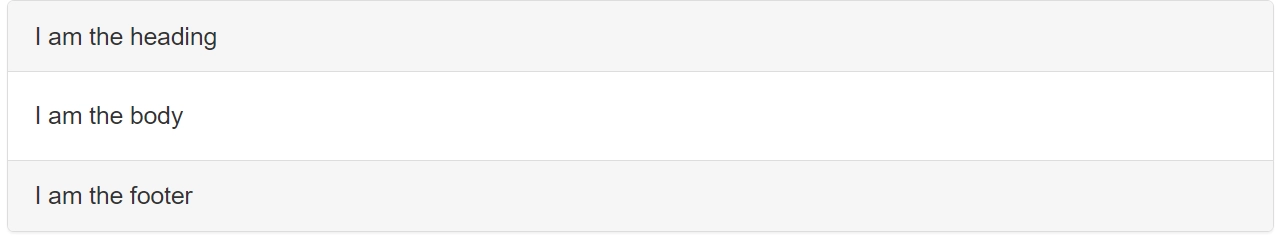
<div class="panel panel-default">
<div class="panel-heading">I am the heading</div>
<div class="panel-body">I am the body</div>
<div class="panel-footer">I am the footer</div>
</div>
</div>
</body>
</html>
Explanation of the Code
The page contains a container element with a panel element inside, which has a ".panel-default" class to style it as a default Bootstrap panel. The panel has three parts: a ".panel-heading" element with the text "I am the heading," a ".panel-body" element with the text "I am the body," and a ".panel-footer" element with the text "I am the footer."
Output
Panel Group with Contextual State Classes
Following is an example of a panel containing state classes.
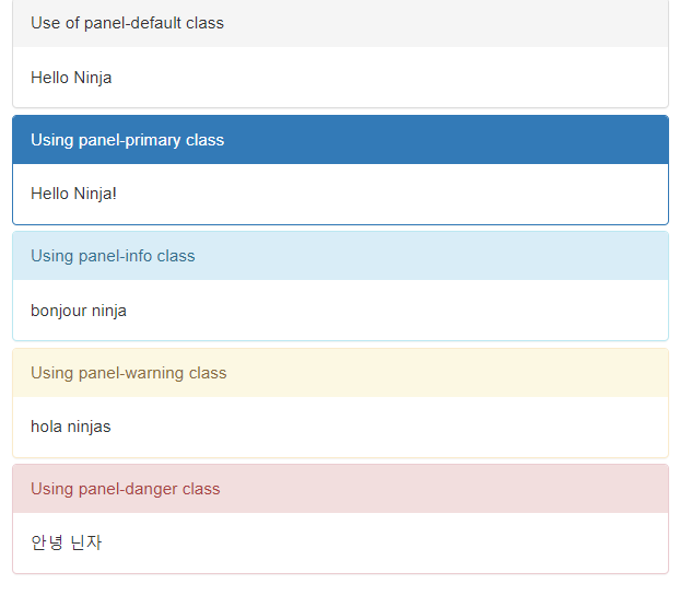
This code creates a container with a ".panel-group" class and multiple panels with various classes such as ".panel-default", ".panel-primary", ".panel-info", ".panel-warning", and ".panel-danger". Each panel consists of a heading and a body. The different classes determine the visual styling of each panel, such as the background colour and text color.
".panel-default" sets the default styling for a panel with a neutral background.
".panel-primary" sets the styling for a panel with a blue background.
".panel-info" sets the styling for a panel with a light blue background.
".panel-warning" sets the styling for a panel with a yellow background.
".panel-danger" sets the styling for a panel with a red background.
Output
Panel with Tables
Following is an example of a panel containing tables.
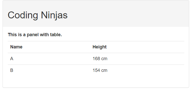
This HTML code creates a web page with a Bootstrap panel group. It includes a container element with a ".panel-group" class and a panel element inside. The panel element has a ".panel-default" class to style it as a default Bootstrap panel. The panel has two parts: a "panel-heading" element with the heading "Coding Ninjas" and a "panel-body" element with a table. The table is created using the ".table" class inside the panel. The example table has two columns with headers "Name" and "Height" and two rows of data with names and heights.
Output
Panels with List Groups
Following is an example of a panel containing list groups.
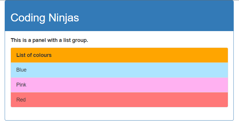
This HTML code creates a container element and a class ".panel-group" inside it. The "panel-group" groups a set of panels together in a single component. The body of the panel contains an unordered list with the class ".list-group". The list-group class is a Bootstrap class used to create a list of items with a specific style. The list items are styled with different background colors using the "style" attribute and the "background-color" property. The panel has a heading with the title "Coding Ninjas," followed by a list-group containing a list of colours. The list items are styled with different background colors and texts ("Blue," "Pink," and "Red").
Output
Let us now talk about bootstrap wells.
Bootstrap Wells
Bootstrap wells serve as containers to hold content on a web page and add visual interest to it. They are used to highlight specific content, group related elements together, and create a visually appealing layout. It creates a sunken or inset effect on a web page with a grey background to draw readers' attention to specific content on a web page. Bootstrap wells also help to add padding and a rounded border around the content they hold. Additionally, they are responsive to different screen sizes, ensuring a consistent look and feel across devices.
It helps to give the content inside the box depth and separation from the rest of the page. The well class is typically used to group related content and make it stand out from the surrounding content. It can be applied to any HTML element but is most commonly applied to the <div> element.
The bootstrap wells are available in three sizes: normal, small, and large. The size of the well can be changed by using classes like .well-sm for small, .well for normal, and .well-lg for large. These affect the padding and modify the size of a well. You can also change the background of wells by adding the background property to the CSS.
How to Create Bootstrap Wells
To create a "well" in Bootstrap, you can use the class "well" within a div element.
Here is an example:
<div class="well">
    <p>This is some text inside the well.</p>
</div>
You can also use the ".well-lg" and ".well-sm" classes to create larger or smaller wells, respectively:
Here is an example:
<div class="well well-lg">
    <p>This is a large well.</p>
</div>
<div class="well well-sm">
    <p>This is a small well.</p>
</div>
You can adjust the padding and margin around the well by applying CSS styles to the "well" class.
Let us look at some working examples of bootstrap wells to understand them better.
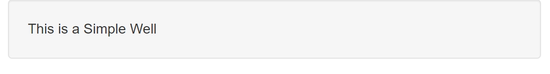
This code creates a "container" div and a basic well using the ".well" class of bootstrap inside it. The text "This is a Simple Well" is displayed in the well.
Output
Wells of Different Sizes
Following is an example showing wells of different sizes.
Example
<!DOCTYPE html>
<html lang="en">
    <head>
        <title>Well Example</title>
        <meta charset="utf-8">
        <meta name="viewport" content="width=device-width, initial-scale=1">
        <link rel="stylesheet" href="https://maxcdn.bootstrapcdn.com/bootstrap/3.4.1/css/bootstrap.min.css">
        <script src="https://ajax.googleapis.com/ajax/libs/jquery/3.6.1/jquery.min.js"></script>
        <script src="https://maxcdn.bootstrapcdn.com/bootstrap/3.4.1/js/bootstrap.min.js"></script>
    </head>
    <body>
        <div class="container">
            <div class="well well-sm">Well of the smallest size</div>
            <div class="well">Well of normal size</div>
            <div class="well well-lg">Well of the largest size</div>
        </div>
    </body>
</html>
Explanation of the Code
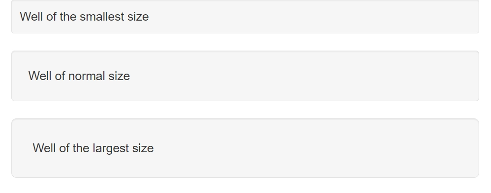
This code creates wells of three different sizes. There is a container div with three nested well divs. Three classes, ".well-sm", ".well", and ".well-lg", are used for this purpose. These classes are used in Bootstrap to set the size of the wells, with "well-sm" being the smallest, "well" being the default size, and "well-lg" being the largest size.
Output
Wells with Custom Backgrounds
Following is an example of bootstrap wells that we customized using CSS.
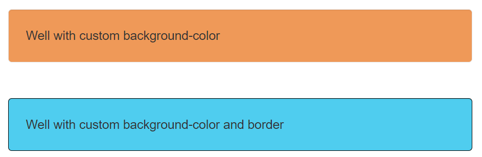
This HTML code has a container div with two nested well divs. The first well has an inline style that sets the background color to "rgb(239, 153, 88)". The second well has an inline style that sets the background color to "rgb(79, 205, 239)" and the border color to "black." These styles will override any default styles set by the Bootstrap CSS.
Output
Let us now answer some frequently asked questions.
Frequently Asked Questions
What is Bootstrap?
Bootstrap is a free and open-source CSS framework that aims to be a mobile-first front-end web development framework. It contains CSS and JavaScript-based interface components and design templates like forms, buttons, navbars, and many more.
What is a panel in Bootstrap?
A panel is a bordered box used to put DOM components into a container with padding around their content.
What is a well in Bootstrap?
The Bootstrap well is a round, bordered, and padded box used to draw attention toward specific content on a webpage.
How do I change the background colour of a well?
The background colour of a well can be changed by using CSS to set the background property to a colour of your choice.
Do bootstrap 4 support panels and wells?
Bootstrap 4 doesn't support panels and wells. It introduced a new card component built with a flexbox for efficiency.
Conclusion
In this article, we learned about Bootstrap wells and panels. We learned about their uses and how to implement them. We also looked at some examples of bootstrap panels and wells.
To learn more about Bootstrap, you can refer to the following articles.


 5+ registered