


Introduction
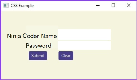
In this blog, we will be learning about JavaFX UI Controls as they can also be modified using Cascading Style Sheet (CSS). JavaFX UI Controls is a fascinating and informative Concept to come up with such guys; sit tight as we are going to begin our journey of JavaFX UI Controls from now onwards.
JavaFX UI Controls
The JavaFX UI controls are developed using scene graph nodes. As a result, the controls may make use of the JavaFX platform's aesthetically appealing characteristics. Because the JavaFX APIs are entirely implemented in Java, the JavaFX UI controls may be readily integrated into your existing Java applications.
The user interface components are the ones that are actually displayed to the user for interaction or information exchange. The layout of the UI components on the screen is defined by the layout. Behavior is the UI element's behavior when an event occurs on it.
However, the package JavaFX.scene.control contains all of the introductory classes for UI components such as Button, Label, and so on. Each class represents a single UI control and offers specific style methods for it.
The UI control classes extend the Control class with extra variables and methods to enable regular user interactions in a natural manner. Using Cascading Style Sheets(CSS), you may apply a custom style to your UI components. You may need to extend the Control class to build a bespoke UI component for some unique jobs or utilize the Skin interface to specify a new skin for an existing control.
Every Manage is represented by a class; you may build a manager by instantiating its class.
User Interface Components in JavaFX Applications
Button: A JavaFX UI component that is used to generate a labeled button for improved user interaction. The application's operation is controlled by the button.
Label: Using the label in the JavaFX program, we may show introductory text on the screen.
TextField: TextField is used in the JavaFX application javafx.scene.control. TextField is used to allow the user to enter text into the JavaFX application form.
Checkbox: The technology learned checkbox is used when the user wants to pick between several options, such as languages known. It is mainly used to elicit a response from the user.

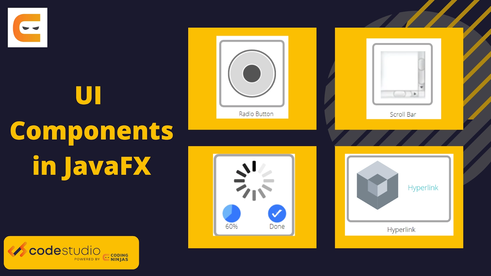
RadioButton: We use RadioButton when we want the user to choose only one choice from all the available possibilities. The radio button can be selected or deselected. The radio button allows users to select only one choice from the group.

Password field: The password field is utilized when the user is required to enter a password in the JavaFX application form. The user's password entered in the password field is not displayed on the screen, but it is represented by black field circles.
ProgressIndicator: Instead of displaying analog progress to the user, it displays digital progress so that the user can see the proportion of work completed.

ProgressBar: It may be utilized in JavaFX applications by utilizing the JavaFX.scene.control class. ProgressBar is a class. When we want to display a user the progress of a certain task, we use ProgressBar.
ScrollBar: When it is necessary to scroll between application pages, the scroll bar is employed.

Menu: Menus are commonly used in JavaFX applications to present different options within the program.
Slider: When a user wishes to move around a range of values and choose one of them, the slider is used in conjunction with a pane to move as needed.
Tooltip: The JavaFX ToolTip class is used to give the user information about any component. It is mostly used to offer information about the text fields or password fields in the application.
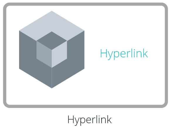
Hyperlink: It may be utilized in JavaFX applications through the JavaFX.scene.control class. HyperLink. Using HyperLink, we may refer to any webpage in our JavaFX application.
JavaFX Application Layouts
Layouts are used as a container for numerous UI components in the JavaFX application. Layouts are regarded as the parent container. The layout specifies how components are placed. The Java.scene.layout package contains all of the classes for configuring the layout.
BorderPane: In the JavaFX application, the BorderPane is used to position nodes on the left, right, top, bottom, and center of the screen.
FlowPane: This panel is used to organize the notes based on the horizontal space available. Suppose the horizontal space is smaller than the width of the node. It advances to the next line.
GridPane: GridPane is used in the JavaFX application to arrange components in the form of rows and columns.
VBox: VBox is a layout component that arranges all of its child nodes (components) in a vertical column, on top of each other. The class javafx.scene.layout.VBox represents the JavaFX VBox component.
Pane: In the JavaFX application, the base class pane is shared by all layout classes.

StackPane: Nodes in the stack pane in the JavaFX application are arranged in the shape of a stack. The nodes in the Stack Pane are placed on top of one another, much as in a stack. The initial node added is at the bottom of the stack, and the following node is added on top of it.
The StackPane is represented by the class StackPane from the package javafx.scene.layout. This class has only one attribute called alignment. This attribute indicates the node alignment within the stack pane.
HBox: Hbox is a part of the JavaFX framework and is present inside the javafx.scene.layout package. Hbox is used as the layout in the JavaFx applications and the children or the nodes of hbox are arranged in the horizontal column.


 18+ registered

