


Introduction
A loading indicator is a visual animation used to signal processing or loading but does not indicate how long an activity will take to complete. In this article, we will discuss it in more detail. We will see how to display a modal curtain and a changing indicator.
The Loading Indicator
A loading indicator is displayed to notify the user that loading is in progress and that the UI is currently unresponsive. Longer load times are caused by, for example, Poor network conditions. The framework automatically shows the loading indicator after a configurable delay from the start of the server request and hides it when the response processing is complete.
The loading indicator default appears at the viewport's top after a short delay. You can turn off the display, change the delay, and customize the appearance of your display. The theme targets the element inside the element. The default theme should also be disabled.
HTML
<body>
  <!-- application root level element omitted -->
  <!-- "the framework removes "display: none" when indicator shown -->
  <div class="v-loading-indicator first"
       style="display: none;">
  </div>
</body>
The loading indicator can be configured from Java by accessing the configuration object from the user interface. An easy way to do this is with a PageConfigurator; the changes are already applied to the first response.
Java
public class AppShell implements AppShellConfigurator, VaadinServiceInitListener {

    // other implementation omitted
    @Override
    public void serviceInit(ServiceInitEvent serviceInitEvent) {
        serviceInitEvent.getSource().addUIInitListener(uiInitEvent -> {
            LoadingIndicatorConfiguration conf = uiInitEvent.getUI().getLoadingIndicatorConfiguration();

            // disable default theme -> loading indicator will not be shown
            conf.setApplyDefaultTheme(false);
        });
    }
}
A configuration object can be used to configure the delay before the "step" display changes. By default, the indicator is displayed with a delay of 300ms and is prefixed with the class name. There are two additional delays that can be configured. After a delay, the class names second and third are set. You can use this to change the style of the loading indicator after a certain amount of time has passed.
Java
public class AppShell implements AppShellConfigurator, VaadinServiceInitListener {

    @Override
    public void serviceInit(ServiceInitEvent serviceInitEvent) {
        serviceInitEvent.getSource().addUIInitListener(uiInitEvent -> {
            LoadingIndicatorConfiguration conf = uiInitEvent.getUI().getLoadingIndicatorConfiguration();

            // disable default theme -> loading indicator will not be shown
            conf.setApplyDefaultTheme(false);

            /*
             * Delay for showing the indicator and setting the 'first' class name.
             */
            conf.setFirstDelay(300); // 300ms is the default

            /* Delay for setting the 'second' class name */
            conf.setSecondDelay(1500); // 1500ms is the default

            /* Delay for setting the 'third' class name */
            conf.setThirdDelay(5000); // 5000ms is the default
        });
    }
}
Displaying a Modal Curtain
To demonstrate an alternative to the default loading indicator design, this example shows how to display a loading indicator that simply obscures the UI. Dimming is animated to avoid screen flickering. A blackout will start if the server-side round trip exceeds 0.5 seconds (300 ms delay configured in Java + 200 ms animation delay).
In addition to CSS, you must explicitly disable the default theme via Java.
CSS
.v-loading-indicator {
  position: fixed; /* Occupy full screen even if scrolled */
  top: 0;
  left: 0;
  right: 0;
  bottom: 0;
  /* Eat mouse events when visible, it doesn't prevent scrolling */
  pointer-events: auto;
  /* Animated with delay to prevent flashing */
  animation: fadein 0.3s ease-out 0.2s normal 1 both;
  z-index: 2147473647;
}
@keyframes fadein {
  0% {
    background: rgba(0,0,0,0);
  }
  100% {
    background: rgba(0,0,0,.5); /* Darkens the UI */
  }
}
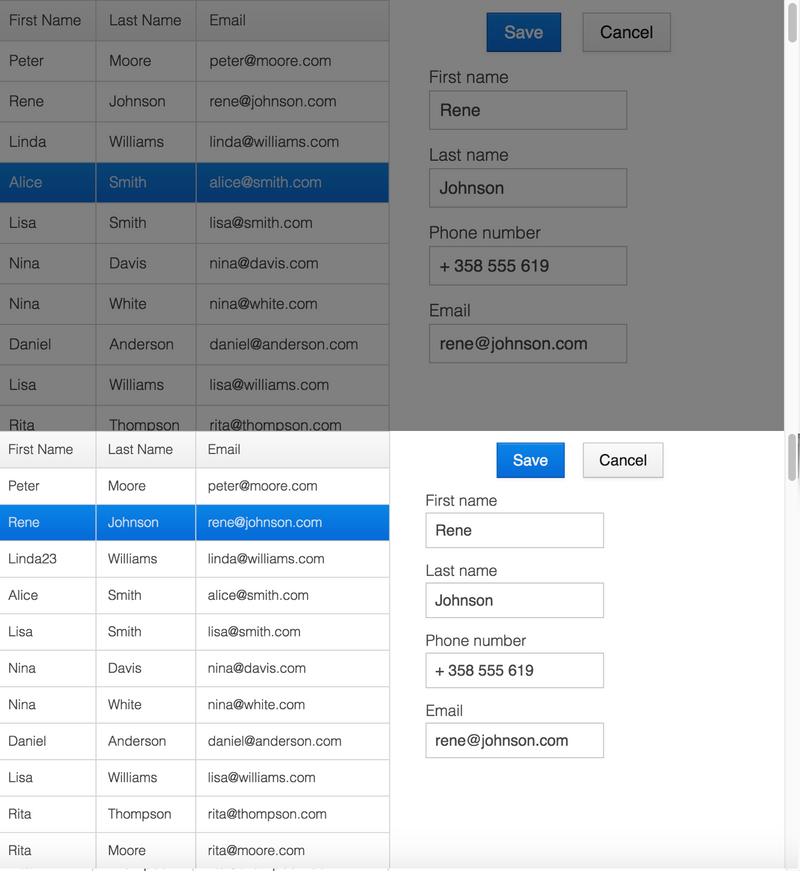
The images below show the application with the modal curtain visible when loaded (top image) and normally (bottom image).
Displaying a Changing Loading Indicator
When the loading indicator is displayed, it will be prefixed with the class name. After the second and third configurable delays, it gets second and third class names, respectively. You can use these class names in styling to reflect the user's wait time in your appearance.
The following style snippet shows how to create an animation that changes color while the user is waiting.
In addition to CSS, you must explicitly disable the default theme via Java.
CSS
.v-loading-indicator {
  position: fixed;
  top: 0;
  left: 0;
  right: 0;
  bottom: 0;
  pointer-events: auto;
  z-index: 2147473647;
}
.v-loading-indicator:before {
  width: 75px;
  height: 75px;

  position: absolute;
  top: 50%;
  left: 50%;

  margin: -38px 0 0 -38px;

  border-radius: 100%;
  animation: bouncedelay 1.2s infinite 0.4s ease-in-out both;
  content: "";
}

.v-loading-indicator.first:before {
  background-color: skyblue;
}

.v-loading-indicator.second:before {
  background-color: salmon;
}

.v-loading-indicator.third:before {
  background-color: red;
}

@keyframes bouncedelay {
  0%, 80%, 100% {
    transform: scale(0);
  } 40% {
    transform: scale(1.0);
  }
}


 9+ registered

