Do you think IIT Guwahati certified course can help you in your career?
Introduction
How easy would it be to design your UI by just dragging and dropping items to their proper place? 😱 Vaadin Designer exactly gives you this superpower. In this blog, you will learn how to work with Vaadin Designer, its installation, and get started with the Designer. So what are you waiting for? Let's dive right into the super excellent blog on using Designer. 😃😃😃😃
Designer
Vaadin Designer is a graphical tool for building complex UI by dragging and dropping items on a blank space. Using this Designer, we always have the end UI in front of us. Thus we are always in control. Any change that is made on the canvas is instantly reflected on the live preview. We will dive deep into the details of the Designer in later sections.
Features
Vaadin Designer offers a ton of features to enhance our UI-building experience. Let's go through the most important features this designer has to offer.
Feature
Description
Layout Editing
Offers flexbox controls for handling vertical and horizontal layouts.
WYSIWYG
Drag and Drop web components
Sizing and Spacing panel
It allows setting height, width, margin and padding using CSS values.
Pallet with snippets and components
Pre-built snippets for components
Viewport Controls
To figure out the responsiveness of the design.
Component hierarchy
It allows changing components hierarchy using the drag and drop method.
Browser or device preview
One-click preview on the specified device
Easy integration with the project
It can work directly with the designs in Java Project and connect seamlessly with the backend data.
Installation
In this section, we will learn how to install the plugin in IntelliJ IDEA IDE, get your trial license and get the application up and running.
Let's go through the steps one by one:
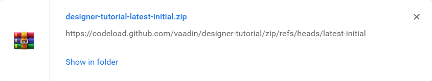
✅ Step 1: Download an Empty Vaadin Project
To start this tutorial, we need an empty project. You can create your own project or download one from the link. Extract the zipped folder and import it as a Maven project into the IntelliJ IDE.
✅ Step 2: Open IntelliJ
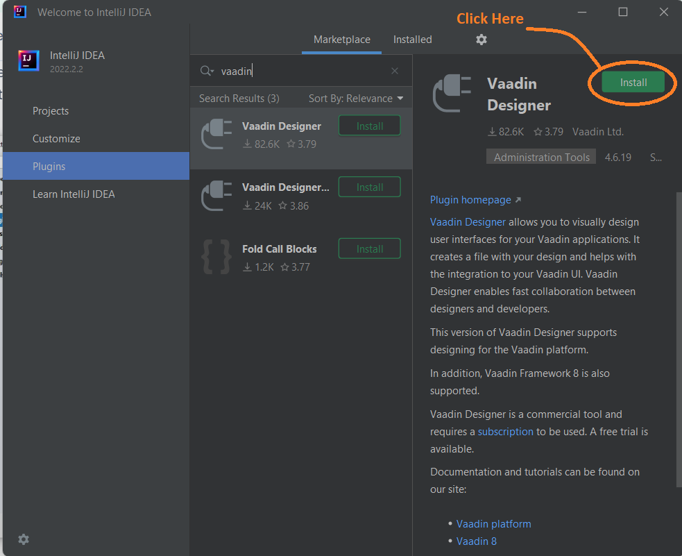
✅ Step 3: Go to the plugins section
✅ Step 4: Search for “Vaadin”
✅ Step 5: Install the plug-in as shown below
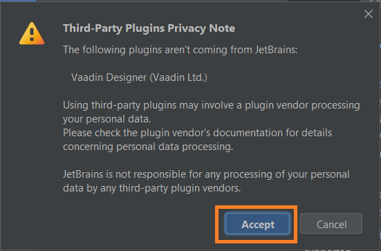
✅ Step 6: Accept the warning
✅ Step 7: Restart the IDE
✅ Step 8: Log in to Vaadin to Start your free trial, or if you already have the subscription, use it to sign in to vaadin
Build Main View
It's time we start some hands-on with the view-building part. Let's go through the steps needed to build our first view.
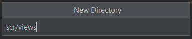
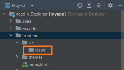
✅ Step 1: Create a new views directory in the frontend folder
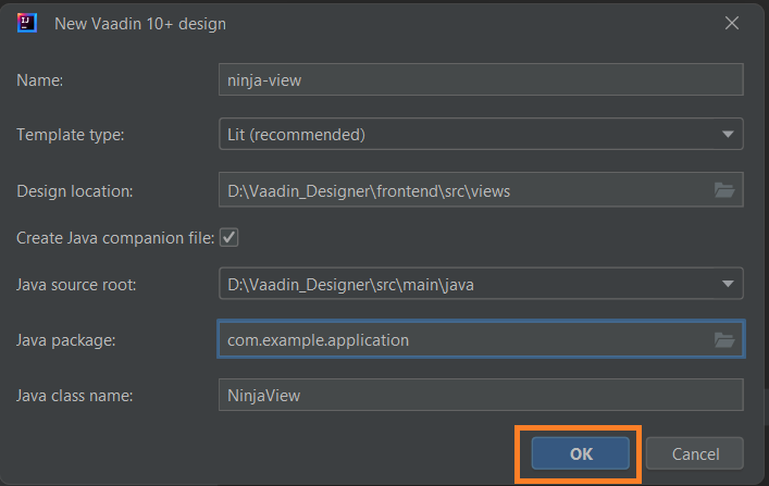
✅ Step 2: Right-click on the views folder and follow New > Vaadin 10+ Design
✅ Step 3: Configure the dialogue box, ensure the template type is 'Lit', the checkbox is ticked, and the java package is set to com.example.application
✅ Step 4: Click OK
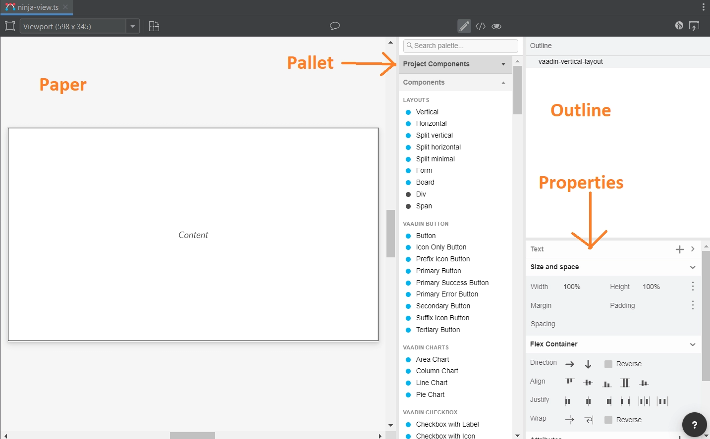
UI Details
The designer UI has four main parts. These are
❄️Paper: The main blank space where we will design components.
❄️Pallet: It contains all the tools for drag and drop action.
❄️Outline: Shows all the components used and their hierarchy.
❄️Properties: It controls all the properties of the component selected.
Creating Main Layout
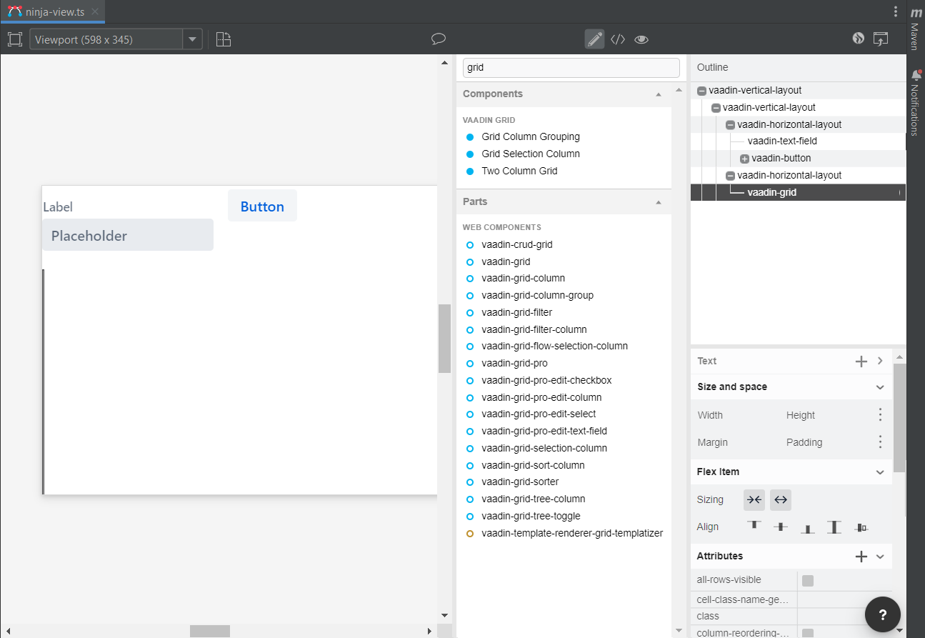
Our main layout consists of a vertical root view, and two horizontal views consisting of the text box, a button, and a grid. I will look similar to the image below after getting completed.
Adding Components
Let's add the views and components: ⭐Select a ‘vaadin-vertical-layout’ component and drag it into the outline box.
⭐Drag two horizontal layout components into the vertical one.
⭐Add the text box, button and grid from the pallet by dragging and dropping them at the right place.
Now we have our basic design of the component ready. We will configure it in the next section.
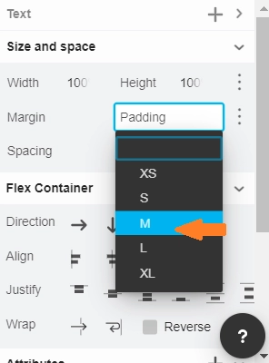
Configuring Padding in Main Layout
The UI looks cluttered. To make things more spread out, select the root view from the properties section, select the padding and set it to 'M'.
Configuring Text Box and Button
Let's go through the steps needed to give names to the text box and button.
⭐Select the 'vaadin-text-field' from the outline panel. Go to the label from the properties panel and erase it. Next, find the placeholder and replace it with 'Enter Name…'.
⭐Select the ‘vaadin-button’ from the outline panel. Go to the ‘Text’ property and change it to ‘Add Contact’.
The UI should look similar to the image shown below.
Fixing Grid Size
We want to fill the entire screen with the grid to utilize maximum space. To do so, select the ‘vaadin-horizontal-layout’ from the outline panel and then set the width and height to 100%.
Follow the same technique for ‘vaadin-grid’ as well. We should now have our component looking as shown in the image below.
Get Application Up and Running
Our designing part is now complete, and we have to get now it to run. We already built the ninja-view design with the companion java file. Now to make the view accessible, add the @Route annotation.
Steps
⭐Open the ‘NinjaView.java’ file from the src/main/java/com.example.application location.
⭐Add the @Route annotation and import it as shown in the code below.
@Tag("ninja-view")
@JsModule("./src/views/ninja-view.ts")
@Route("")
public class NinjaView extends LitTemplate {


    /**
     * Creates a new NinjaView.
     */
    public NinjaView() {
        // You can initialise any data required for the connected UI components here.
    }


}
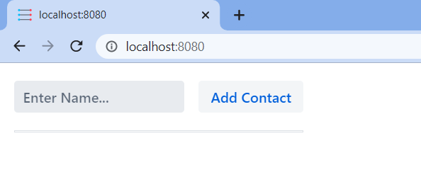
⭐The route annotation will map to ‘http://localhost:8080/’.
Running the Project
To run the project, click the green play button beside the 'Application' class from the Application.java file. See the image below for reference.
Finally, the UI design opens at localhost and looks like the image below.
Designing
We went through the sample design to familiarise you with the tools. Let's now go through these tools one at a time.
✅Adding Components
We can add components by dragging them from the Pallet into the canvas or the outline area. The component is selected by default, and we can directly start working with them.
✅Editing Properties
The properties view has all the properties related to a component. It is good practice to give each of your components an ID. The java code can use it to add logic such as event listeners and on-click handlers. You can even add a new property by clicking on the plus button.
✅Text Panel
The text panel is available for all components. To add text, click on the plus button from the property view.
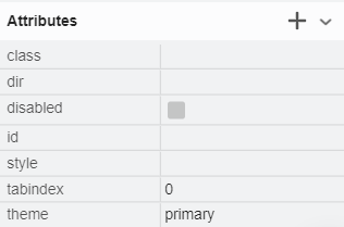
✅Theme Property
The theme property is available in the properties panel and helps apply Vaadin Themes. For example, let's change the button's theme to 'primary'.
Result
Frequently Asked Questions
What is Vaadin Plugin?
An open-source Java UI library, Vaadin is used to build complex web user interfaces. Developers can build attractive web applications in plain Java using its component-based API. You don't have to worry about developing JavaScript, CSS, or markup languages with Vaadin or client-server communication (XHR, WebSockets).
What is Maven?
A maven is a tool that facilitates build automation, mainly used for Java projects. It addresses two phases of software building: the process of building software and its dependencies. In Vaadin, its Maven Plugin contains configuration for almost every configuration property.
What companies use Vaadin?
For the most pleasing experience and a significant emphasis on developers' efficiency, well-known and Fortune-100 companies prefer Vaadin. PUMA, Liferay, Volkswagen, Bank of America, Rockwell Automation, Motorola, and Dell are a few businesses that use Vaadin.
Conclusion
Congratulations, you made it to the end of the Vaadin Designer article. In this blog, you learned about Vaadin Designer. All the important topics related to the Vaadin Designer were covered in detail. We went through the designing aspects of the Designer tools and made a sample UI to learn the concepts in detail and got hands-on experience with designing.


 8+ registered

