Do you think IIT Guwahati certified course can help you in your career?
Introduction 👨🎓
GWT (Google Web Toolkit) is an open-source Java framework for making software development easy. Google provides GWT for developing browser-based, complex Ajax applications. We can even develop Rich Internet Applications (RIA) in Java using GWT, which will then be compiled into Javascript and cross-browser compliant.
Advantages of GWT🧐
Javascript projects are hard to maintain when compared to Java projects. But we need Javascript to run the browser's RIA(Rich Internet Application). So GWT combines both Java and Javascript.
GWT is almost similar to the swing package of Java and AWT(Abstract Window Toolkit).
Each browser has its own set of problems; therefore, supporting all of them in the market is challenging. So, GWT solves this problem by creating optimized Javascript code for each browser.
This was all about GWT; now, let's go through one of its widgets, the GWT DatePicker widget.
GWT DatePicker Widget🎯
For representing the standard date picker, we use the DatePicker widget. Using this widget you can add a calender to your application, ask the user to enter dates according to them, etc.
Class Declaration
We can use the following code to declare a GWT DatePicker class (com.google.gwt.user.datepicker.client.DatePicker),
The GWT DatePicker class comes equipped with the following CSS (Cascading Style Sheets) Style rules.
.gwt-DatePicker{}
.datePickerMonthSelector {}
.datePickerMonth {}
.datePickerPreviousButton {}
.datePickerNextButton {}
.datePickerDays {}
.datePickerWeekdayLabel {}
.datePickerWeekendLabel {}
.datePickerDay {}
.datePickerDayIsToday {}
.datePickerDayIsWeekend { }
.datePickerDayIsFiller {}
.datePickerDayIsValue {}
.datePickerDayIsDisabled {}
.datePickerDayIsHighlighted {}
.datePickerDayIsValueAndHighlighted {}
Although users may choose to override the CSS according to their requirements.
Constructors of GWT DatePickerWidget🧑🏻💻
The GWT DatePicker comes equipped with various constructors. Let us discuss some of these in this section. The DatePicker Widget consists of two constructors-
This is also used to create a new date picker in a specified calendar view and model.
Methods of GWT DatePicker Widget 📝
The GWT DatePicker also consists of various class methods. Let us look at the GWT DatePicker class methods-
HandlerRegistration addHighlightHandler (HighlightHandler <java.util.Date> handler) - This method is used for adding highlight event handler to the date picker.
HandlerRegistration addShowRangeHandler(ShowRangeHandler <java.util.Date> handler) - This method is used for adding show range handler to the date picker.
HandlerRegistration addShowRangeHandlerAndFire(ShowRangeHandler <java.util.Date> handler) -This method is used for adding the show range event handler to the date picker and starting the handler for the current view immediately.
HandlerRegistration addValueChangeHandler(ValueChangeHandler <java.util.Date> handler)- This method is used for adding value change event handler to the date picker.
protected void setup() - This method is invoked to construct the date picker.
void setStyleName(java.lang.String styleName) - To set the specified style name to the date picker this setStyleName method is invoked.
void setCurrentMonth(java.util.Date month) - Sometimes users need only one specified month to be displayed, so to show the given month, this setCurrentMonth method is called.
protected void refreshAll() - This method is used to refresh all the components of the date picker widget.
void onLoad() - This method is called as soon as the widget gets attached to the browser's document.
boolean isDateVisible(java.util.Date date) - This method is called as soon as the widget gets attached to the browser's document.
boolean isDateEnabled(java.util.Date date) - This method is used to check if the date visible is enabled or not.
protected CalendarView getView() - This method is used to get the associated calendar view for the current date picker widget.
java.lang.String getStyleOfDate(java.util.Date date) - Like CalendarView getView() method, this method is used to fetch the style associated with the date.
protected CalendarModel getModel() - To get the calendar model associated with the date picker, one can use this method.
protected MonthSelector getMonthSelector() - This method is used to know which month selector model is associated with the date picker.
java.util.Date getLastDate() - This method returns the last visible date.
java.util.Date getHighlightedDate() - This method returns all the highlighted dates if they exist. Highlighted dates are those dates on which the mouse hovers).
java.util.Date getFirstDate() - We can also get the first date shown by the date picker by using this getFirstDate method.
java.util.Date getCurrentMonth() - This method returns the name of current month which is visible in date picker.
java.util.Date getValue() - This method returns the selected dates, or if no date is selected, this method will return NULL.
USE - This method is used for adding specified style names to the dates specified, even if those dates are transient.
Inherited Methods💻
The GWT Button class inherits the following Java classes,
java.lang.Object
com.google.gwt.user.client.ui.Widget
com.google.gwt.user.client.ui.UIObject
com.google.gwt.user.client.ui.Composite
java.lang.Object
GWT DatePicker Widget Example👩💻
In this section, we will go through the simple steps to show the usage of the GWT DatePicker widget. Here you need to modify files ‘GWTProjectOne.gwt.xml’, ‘GWTProjectOne.css’, ‘GWTProjectOne.html’, and ‘GWTProjectOne.java’ by changing the code with the below code.
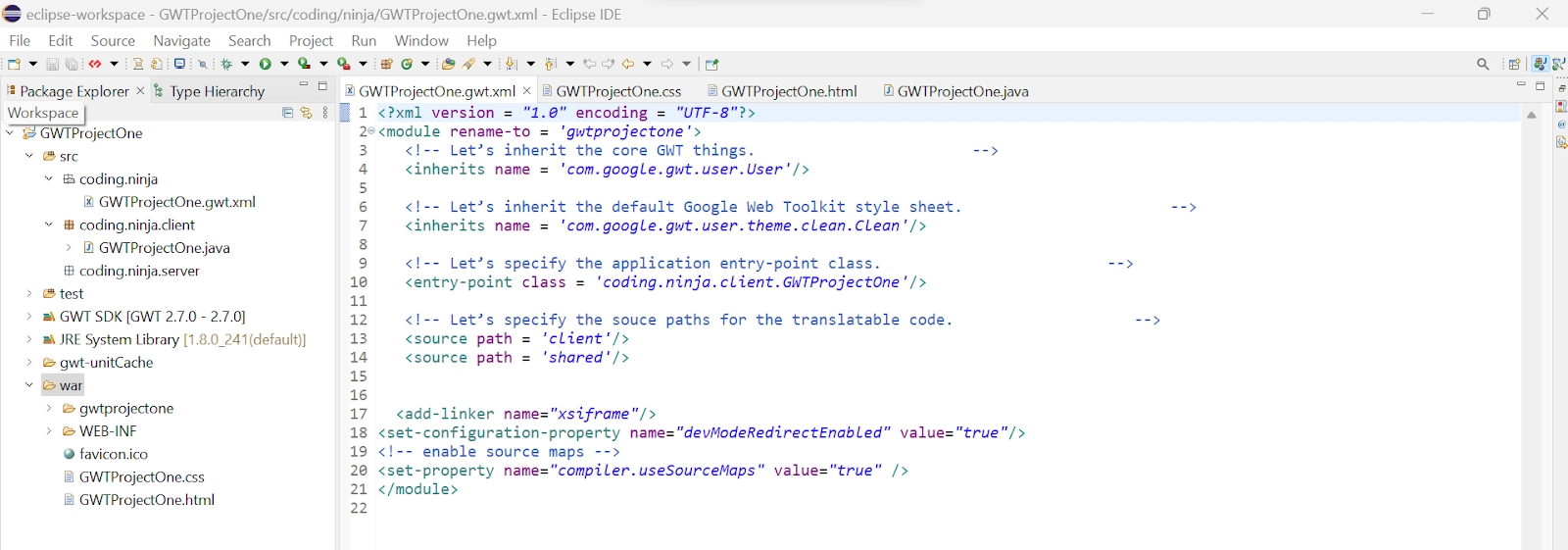
The Eclipse IDE and file structure will look something like this -
GWTProjectOne.gwt.xml
<?xml version = "1.0" encoding = "UTF-8"?>
<module rename-to = 'gwtprojectone'>

   <!-- Inherit the core Web Toolkit stuff. -->
   <inherits name = 'com.google.gwt.user.User'/>

   <!-- Inherit the default GWT style sheet. -->
   <inherits name = 'com.google.gwt.user.theme.clean.Clean'/>

   <!-- Specify the app entry point class. -->
   <entry-point class = 'com.codingninjas.client.GWTProjectOne/>

   <!-- Specify the paths for translatable code. -->
   <source path = 'client'/>
   <source path = 'shared'/>
</module>
package com.codingninjas.client;
import java.util.Date;
import com.google.gwt.core.client.EntryPoint;
import com.google.gwt.event.logical.shared.ValueChangeEvent;
import com.google.gwt.event.logical.shared.ValueChangeHandler;
import com.google.gwt.i18n.client.DateTimeFormat;
import com.google.gwt.user.client.ui.Label;
import com.google.gwt.user.client.ui.RootPanel;
import com.google.gwt.user.client.ui.VerticalPanel;
import com.google.gwt.user.datepicker.client.DateBox;
import com.google.gwt.user.datepicker.client.DatePicker;

public class GWTProjectOne implements EntryPoint {
   public void onModuleLoad() {
      // Create a date picker using DatePicker() constructor
      DatePicker date = new DatePicker();

      // Create a label date text
      final Label date_text = new Label();

      // Set text box value according to used’s selection
      date.addValueChangeHandler(new ValueChangeHandler<Date>() {
         @Override
         public void onValueChange(ValueChangeEvent<Date> event) {
            Date date_selected = event.getValue();
            String date_to_string =
            DateTimeFormat.getFormat("dd/MM/yyyy").format(date_selected);
            date_text.setText(date_to_string);
         }
      });

      // Set the default value of DatePicker
      date.setValue(new Date(), true);

      // Create new label
      Label lb = new Label("Date Picked:");

      // Create horizontal root panel.
      VerticalPanel vp = new VerticallPanel();

      // Set spacing between the widgets
      vp.setSpacing(20);

      // Adding widgets to the root panel
      vp.add(lb);
      vp.add(text);
      vp.add(date);

      RootPanel.get("DatePickerContainer").add(vp);
   }
}
You can also try this code with Online Java Compiler
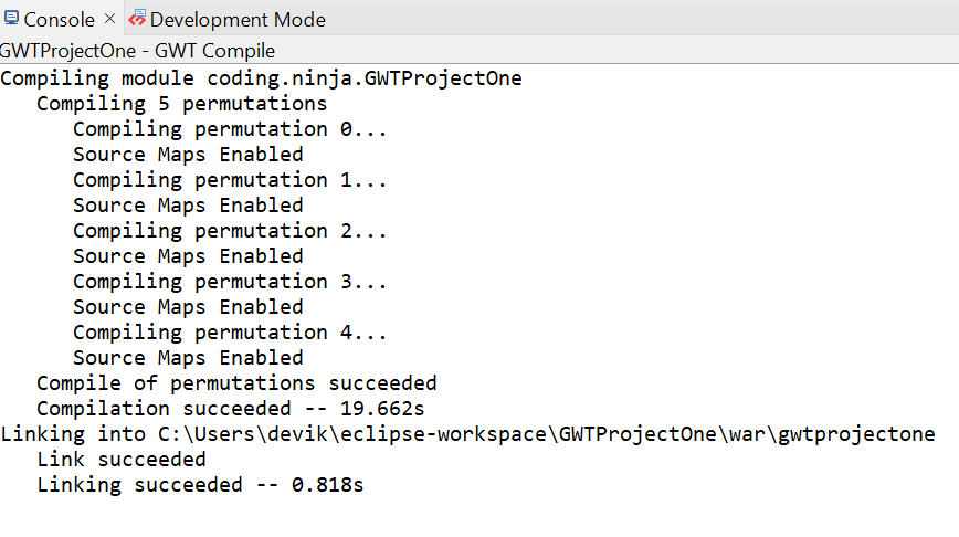
After modifying all the files, right-click the project, go to GWT, and select the compile button; then, you will see one dialog box where you have again clicked the compile button.
And after clicking it, you will see the following output in the console.
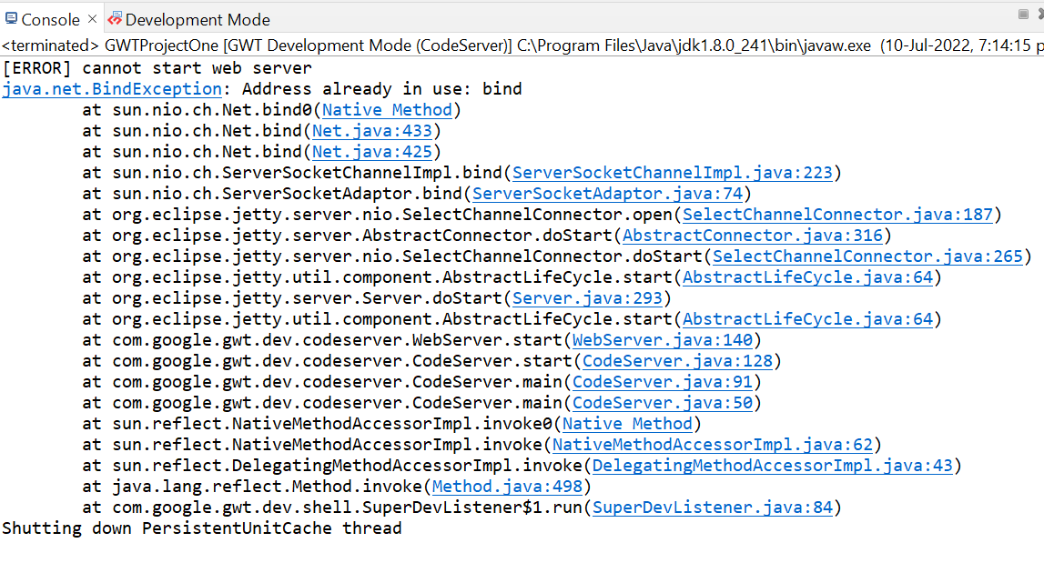
Now click on the dropdown button of the run button and select the project you want to run that is, in our case, GWTProjectOne.
After clicking, you will see the following outputs in the console and development mode tab.
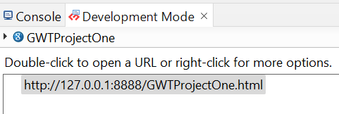
After clicking on the link in development mode, you will see the output of the code.
Output
We hope you have completely understood the GWT DatePicker Widget. 😁
Frequently Asked Questions
What is GWT?
GWT is a development toolkit used to create and improve sophisticated browser-based apps. It is almost similar to the swing package of Java and AWT.
What is Smart GWT?
Smart GWT is a GWT-based framework that combines its rich UI components with a Java Server Framework for developing high-quality online applications. Smart GWT has the most extensive and diverse set of UI components..
What are the benefits of using GWT?
An open-source Java software development platform, Google Web Toolkit (GWT) makes it simple to create AJAX apps. You can use the Java development tools to develop and debug AJAX apps with GWT.
What is a GWT client?
GWT contains many HTTP client classes that simplify making custom HTTP requests to your server and optionally processing a JSON- or XML-formatted response.
What is a widget class?
For the vast majority of user-interface objects, the widget serves as the foundation class. The widget adds support for getting events straight from the browser and adding them to panels.
Conclusion
In this blog, we went through GWT DatePicker Widget. We saw class declaration, CSS style rules, constructors, and inherited methods. At last, we will see an example of the GWT DatePicker Widget, and if you would like to explore more, check out our articles on-


 8+ registered

