

Introduction
We know that pictorial representations are the best way to visualize a data set. Yes, that's why we are here to learn about surface charts. Right? So let's know about surface charts. We will understand where we use these surface charts, how many types of surface charts are there, and how to create one. Don't worry. Surface Charts are not as scary as they look. At the end of this article, you will learn that it's pretty simple.
Surface Chart
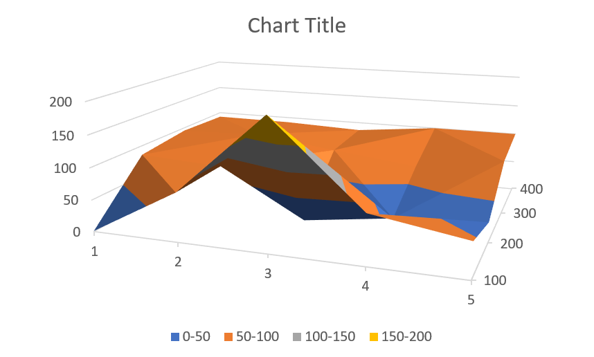
A surface chart plots the data set on a 3D map where the colors and the patterns represent the data in the same range. This chart is visually similar to the topographical map, which is used to visualize the elevation of any area. It displays a set of three-dimensional data as a mesh surface. It comes in very handy when we need to find the optimum value of the combinations of two different variables.
Surface Charts are constructed from three different variables. Two of them are independent variables, and one is dependent on the other two. The independent variables are put on the horizontal axes, and the dependent variable is placed on the vertical axis. Now, the surface chart represents a functional relationship between the variables.
Use of Surface Chart
Surface Charts can have many applications in different fields. It may be presented to visualize the metrics to make the investors understand. A surface Chart reduces a person's efforts to make data-driven decisions and is mainly used to find the optimum results when comparing two or more parameters.
Types of Surface Chart
Different types of Surface Chart that we can make in MS Excel are as follows:
-
3-D Surface: The data is displayed in a 3-D perspective in this chart.
-
Wireframe 3-D surface: This chart uses lines in place of surfaces to connect the data points

-
Contour: This is the top view of the 3-D surface chart. It is a 2-D representation of the 3-D surface chart.

-
Wireframe contour: This contour-type chart uses lines.

Making a Surface Chart
We have discussed enough Surface Charts. Now, let's come to our main objective, i.e., learning to make a surface chart. In this tutorial, we will be using MS Excel to insert a surface chart in our excel sheet.
First of all, we need a data set in the form given below.
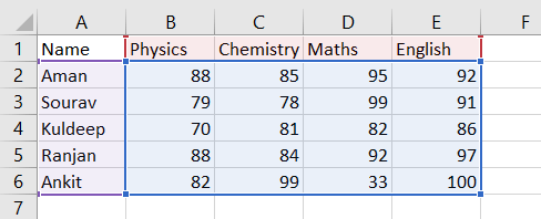
We know that there are two parameters in a surface chart, so we need to make sure there are two parameters before making a surface chart. Here the two parameters are name and subject. And the data that we are analyzing are the marks scored by them in the respective subjects. We need to follow the below-given steps to insert a surface chart in our excel sheet.
-
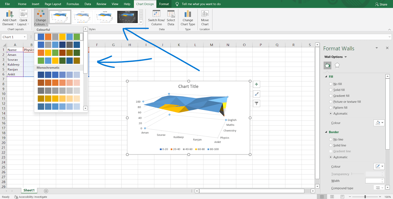
Select the data set and click on the surface chart from the Insert tab. The option to insert a surface chart may be in different locations in different versions of excel so try to find the surface chart option by clicking on every chart option. There will be four options in the surface chart tab. We can select the type of surface chart that we need.

-
We will get a surface chart inserted into our excel sheet. Now, we can use it as needed.

-
We can change the chart type by clicking on 'Change Chart Type.'

-
We can change the chart's color or design.
-
We can change the layout of the chart directly without much effort.

- There are many more options to customize the chart. You are free to explore them by yourself. It's the best way to learn things.

 5+ registered