

Introduction
It is well-known that a pictorial representation of data is the best way to present the data set. A thermometer Chart is one such way to represent data in visual form. In this article, we will discuss the thermometer chart and how to make it. So let's do it !!
Thermometer Chart
A thermometer chart visualizes a measured value compared to the target value. It can be used to track the progress against the target value with time. It can be added to the dashboard to visualize the percentage of target achieved or represent the employees' performance metrics. A typical thermometer chart looks like this.
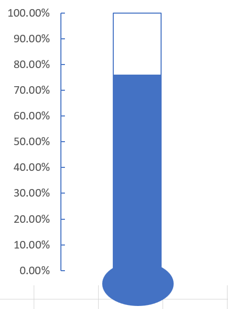
In the image above, you can see a percentage marker on the left-hand side to know the per cent of work done and how much more is to be done to achieve the target. This chart was visually made it look like a thermometer and hence the name. Now, let's learn how to make a thermometer chart in Excel.
Creating Thermometer Chart
Note: We have used MS Excel in this tutorial
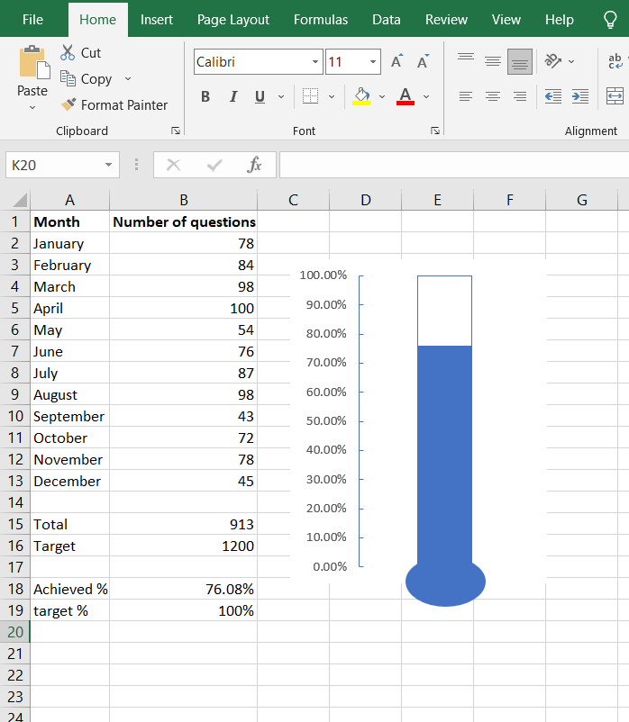
First of all, we need to prepare the data set for which we will make the thermometer chart. The data-set should look something like this.
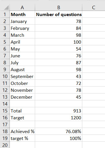
Here we have marked the number of questions we have solved on Coding Ninjas per month. And then, we have calculated the total number of questions solved in the whole year. Along with this, we have also marked the target number of questions that we wanted to solve. We have calculated the number of solved questions in percentage in the achieved % cell.
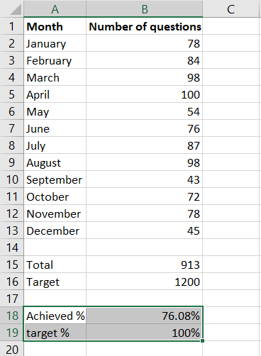
Now, we need to follow the below-given steps, and in the end, we will get a beautiful thermometer chart which will show us our achieved target for the whole year.
-
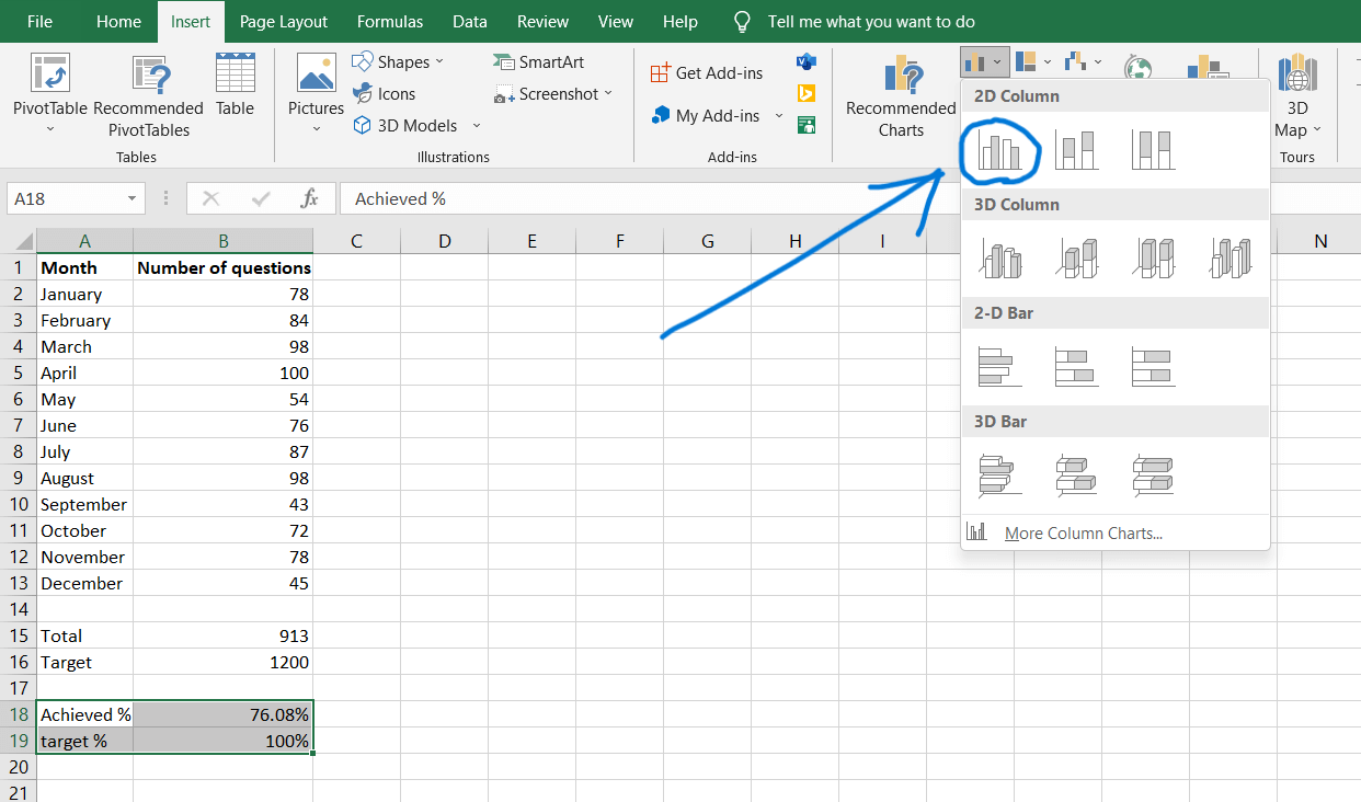
Select these cells and click on the Insert tab.
-
Click on the clustered column chart icon. This will insert a chart in your excel sheet, which we will modify to make the thermometer chart.
-
Click on the "Switch Row/Column" icon.
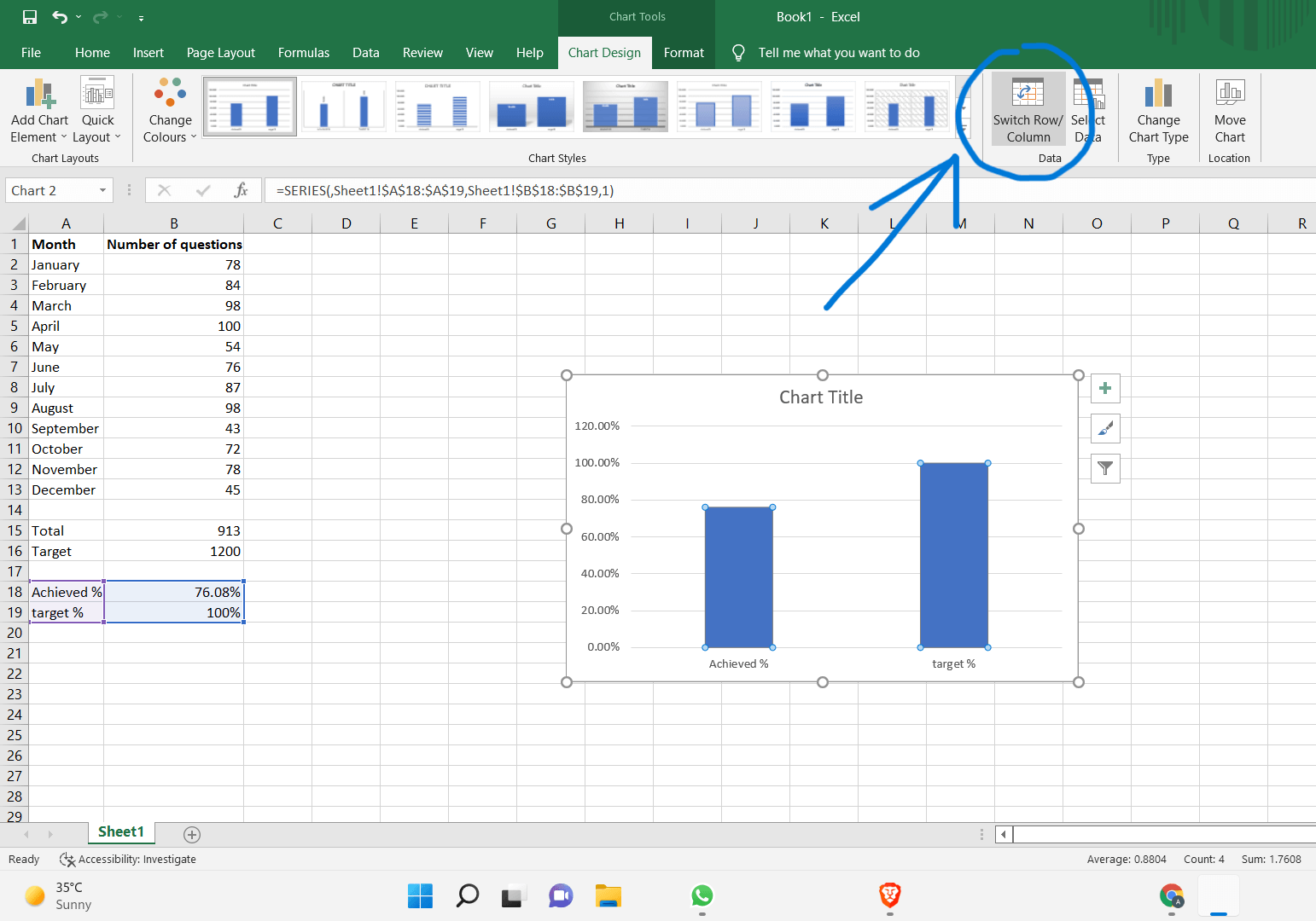
-
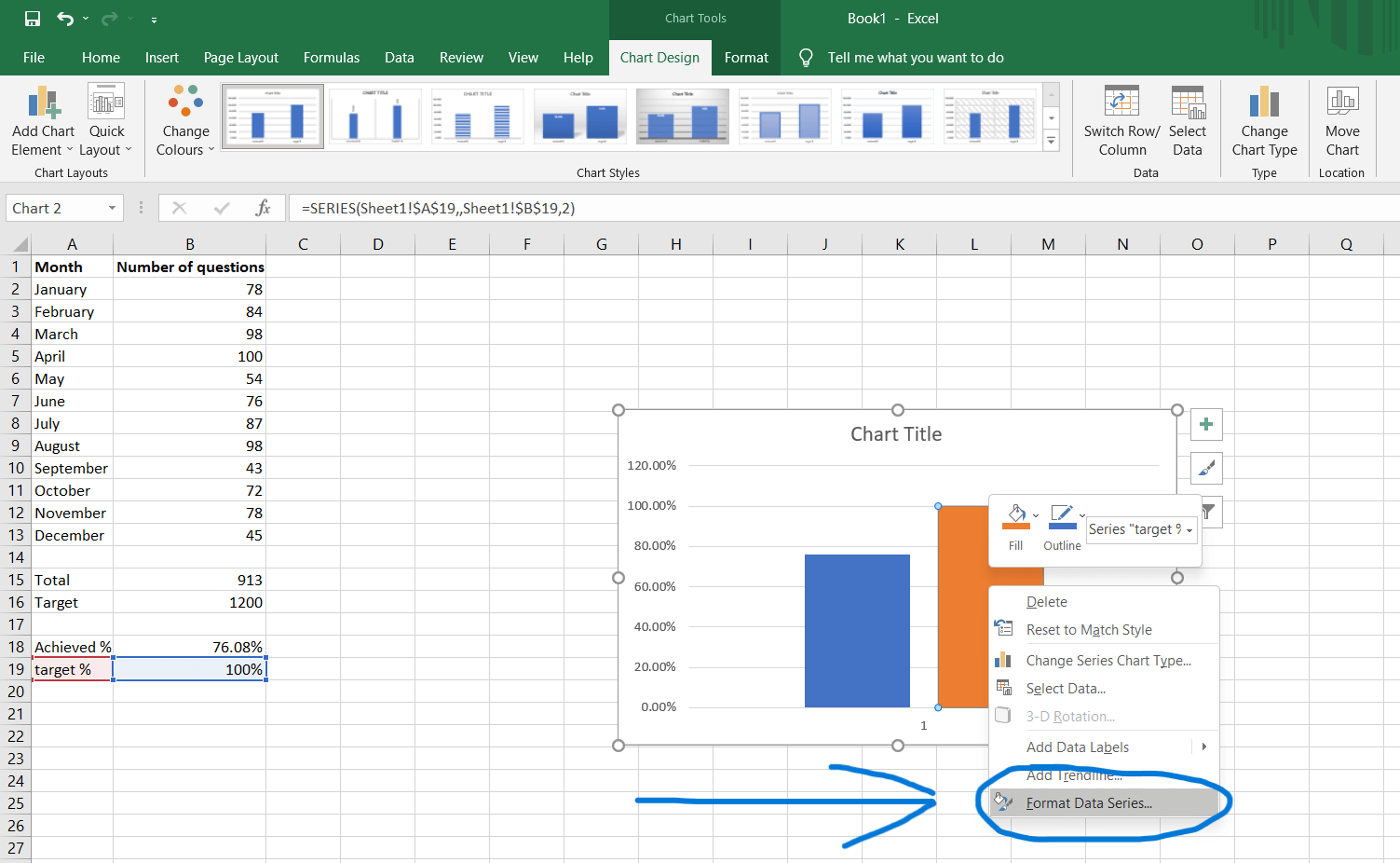
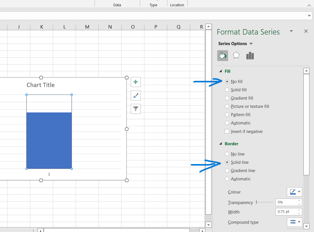
Right-click on the 100% bar graph and click on format data series.
-
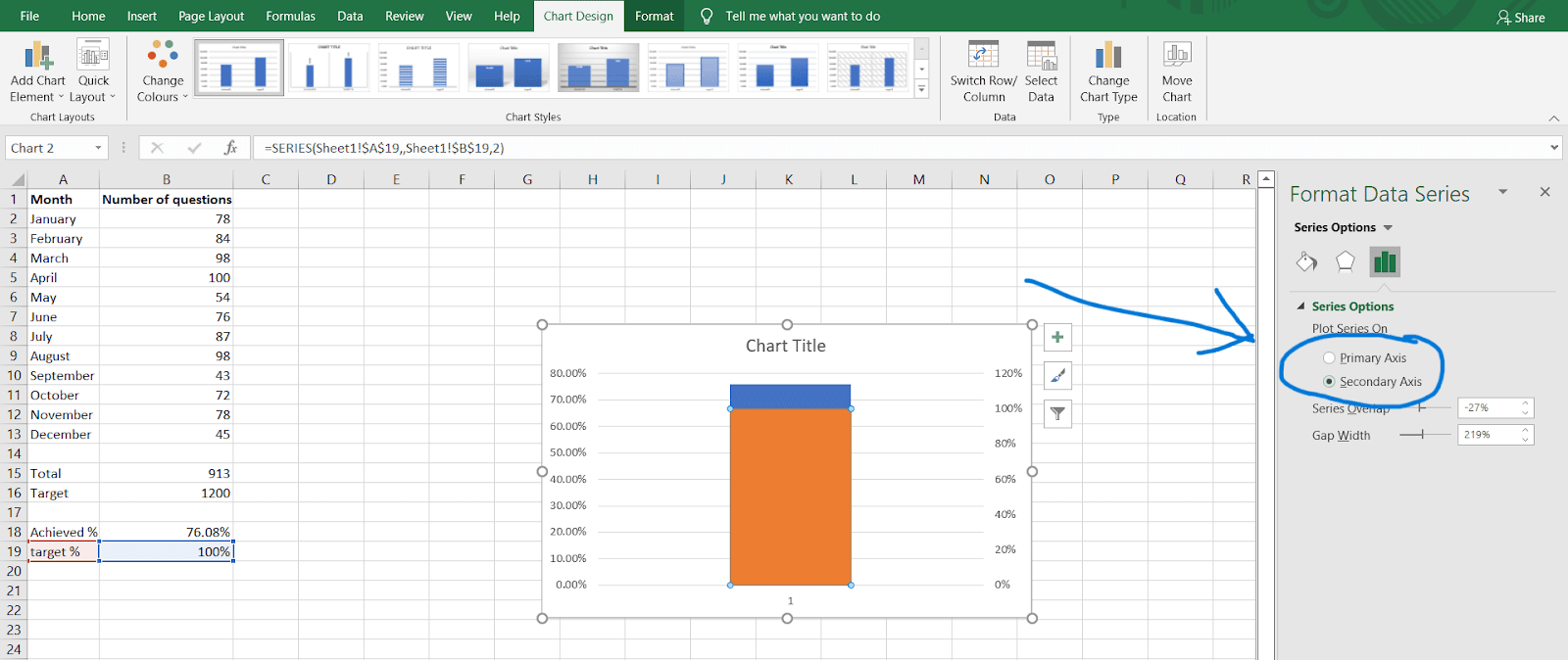
Click on the Secondary axis. This will merge the two bars into one.
-
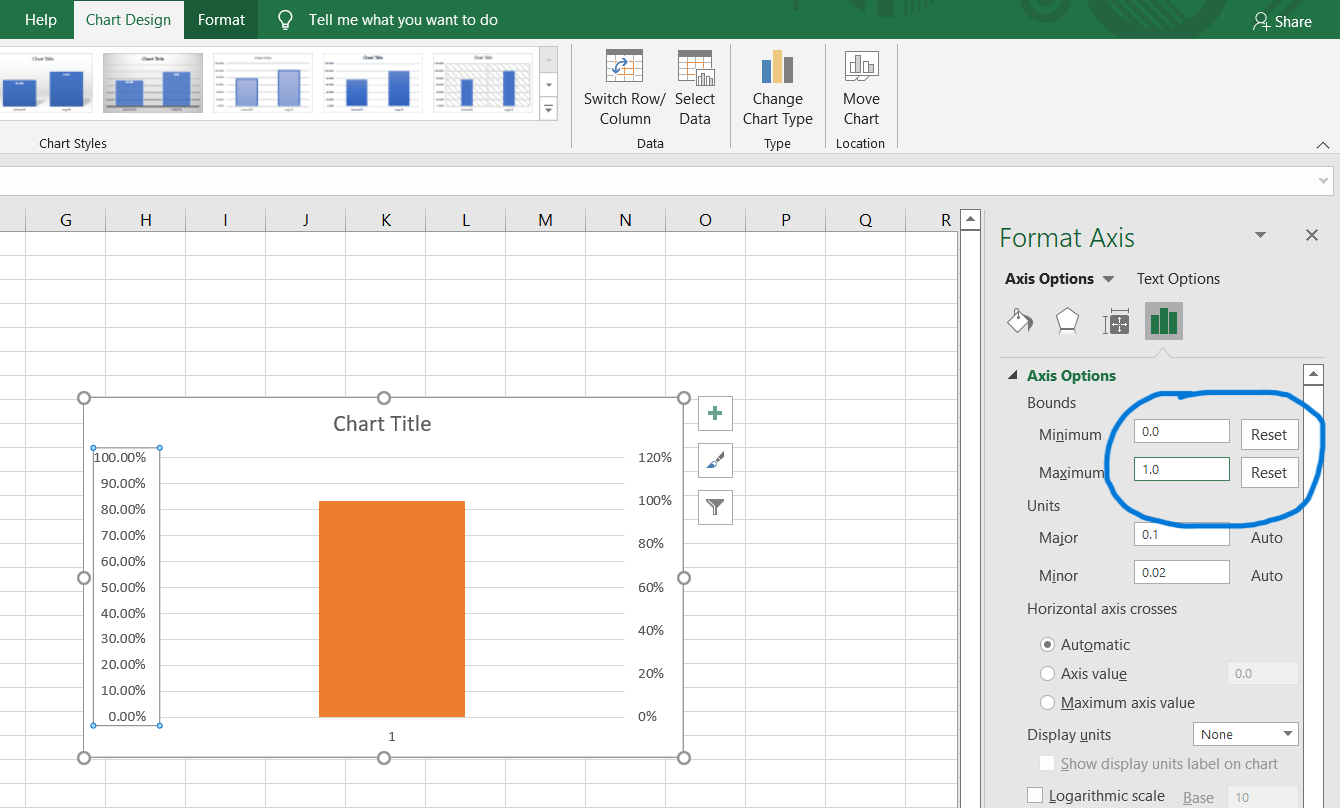
Right-click on the left-hand side axis and click on "format axis." In the format axis tab, set the minimum to "0.0" and maximum to "1.0" in the bounds section. Even if the values are the same as required, change them manually so that you see the "Reset" button beside them. These options determine the range of the values of the axis. If the achieved percentage is low, the axis may adjust the maximum capacity of the axis to be lower than 100%, but we don't want that. So we fix the 0 to 100% limit by adjusting these values manually.
-
Delete the axis on the right-hand side as it is unnecessary, and then right-click on the bar graph and click on "Format Data Series."

-
Set the Fill to "No Fill" and border to "solid line" so that the target bar graph becomes transparent and we get an outline on it.
-
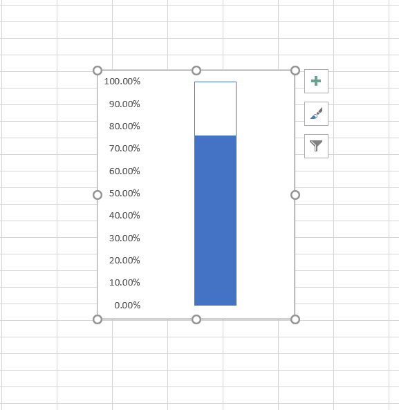
Delete the chart title, x-axis denotation, and grid lines and adjust the width of the chart to make it look like a thermometer. After doing this, the graph will look something like this.
-
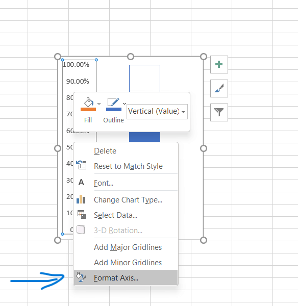
Right-click on the y-axis and click on "format axis."
-
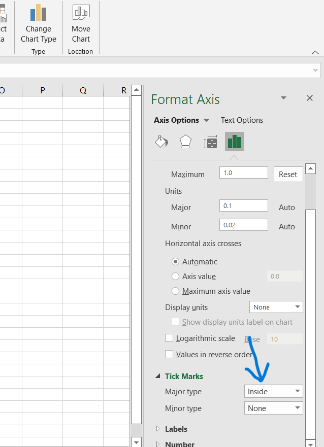
In the "Tick Marks" section, set the Major type to "Inside." This shows a dashed line in the inside direction to mark the current level of work done.
-
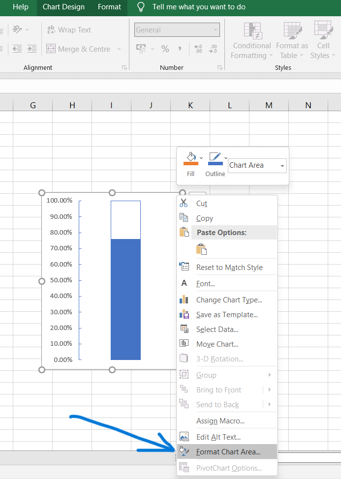
Right-click on the chart, click on "Format Chart Area," and set borderline to "no-line."
-
Insert a circle from the shapes section and place it right below the chart to look like a thermometer.
Voila!! Your thermometer chart is ready.

 13+ registered