Do you think IIT Guwahati certified course can help you in your career?
Introduction
Hi Ninja🥷! Let’s learn an exciting topic today. You may have seen date pickers on many websites and apps and wondered how they are created. Well, let's see.
Here we will be using a special type of Java framework called Vaadin. It helps a lot in specifying different types of dates and internationalisation of the same. So without any further delay let's dive into the topic directly.
Date Picker
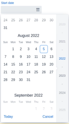
Date Picker is an input field allowing the user to enter a date by typing or selecting from a calendar overlay.
We enter the date directly using the keyboard in the current area format or through the date picker overlay. The overlay opens when we click the field or enter any input when the field is highlighted.
Features of the Common Input Field
Date Picker contains all Text Field and shared input field features. We can input and edit text using Text Field. Text Field also supports Prefix and suffix components, such as icons.
Date Format
We can configure the date picker to display dates and parse user input in a specific format.
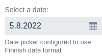
Using Java Locales (Java Only)
The vaadin-date picker, by default, displays and parses dates using the user’s areas. Alternatively, setting a specific area ensures that all users consistently see the same format.
The date format based on the area depends on the specific browser implementation and might not be reliable when expecting a particular pattern. For more control over the date format, keep reading.
<!-- Coding Ninjas -->
<!-- Sample code for reference →

Locale finnishLocale = new Locale("fi", "FI");
DatePicker datePicker = new DatePicker("Select a date:");
datePicker.setLocale(finnishLocale);
Output:
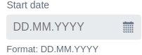
Custom Date Formats (in Java Only)
The vaadin-date picker permits us to configure a custom date format pattern that defines precisely how dates should be displayed and how we should parse user input. We can provide additional parsing formats to support entering dates in different formats. Parsing is tried first with the primary format, then by other parsing formats in the order provided.
<!-- Coding Ninjas -->
<!-- Sample code for reference →
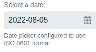
// Setting up date picker with a single format `yyyy-MM-dd` to
// display dates and parse input of user
// Custom date formats are defined using the date pickers internationalisation API
DatePicker.DatePickerI18n singleFormatI18n = new DatePicker.DatePickerI18n();
singleFormatI18n.setDateFormat("yyyy-MM-dd");
DatePicker singleFormatDatePicker = new DatePicker("Select a date:");
singleFormatDatePicker.setI18n(singleFormatI18n);
// Setting up a date picker with a primary format and other formats of parsing
//We always display Date using the format(primary) `yyyy-MM-dd`
// When parsing the input of user, the date picker first tries to match the
// input with the specified format(primary) `yyyy-MM-dd`, then `MM/dd/yyyy`, and
// finally `dd.MM.yyyy`
DatePicker.DatePickerI18n multiFormatI18n = new DatePicker.DatePickerI18n();
multiFormatI18n.setDateFormats("yyyy-MM-dd", "MM/dd/yyyy", "dd.MM.yyyy");
DatePicker multiFormatDatePicker = new DatePicker("Select a date:");
multiFormatDatePicker.setI18n(multiFormatI18n);
Output:
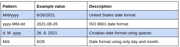
A custom date format sample is a string containing specific symbols that specify how and where we should display a part of the date (day, month, or year). We recognise the following symbols as parts of the date in a pattern:
Other characters, such as separators (e.g., /, ., -) or spaces, may be used in a sample.
Examples:
Custom date patterns take precedence over the area configured in the date picker. When using both simultaneously, we use the custom date pattern to display and parse dates.
Using Custom Functions (Web Component Only)
We can configure the custom functions to display and parse the date using the standalone web component.
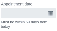
We can restrict the valid input range of Vaadin-Date Picker by describing min and max values. Dates earlier than the min and after the max are disabled in the overlay. We can use a helper text to inform the user about the accepted range.
<!-- Coding Ninjas -->
<!-- Sample code for reference -->
<vaadin-date-picker
  .min="${this.today}"
  .max="${this.upperLimit}"
  label="Appointment date"
  helper-text="Must be within 60 days from today"
></vaadin-date-picker>
Output:
Custom Validation
Date Picker supports custom validation by limiting the options to Monday through Friday.
The initial position parameter of Vaadin-Date Picker defines which date is focused in the calendar overlay when we open the overlay. The initial default position is the selected or current date.
We use this feature to minimise the need for unnecessary navigation and scrolling when the user’s input is expected to be within a specific time.
When we focus on the field, the overlay automatically opens. We can prevent it by having the overlay only open when the toggle button or the up/down arrow keys are pressed. Note that the behaviour is not affected on touch devices.
To disable the days earlier than the start date in the end date picker, we should handle the selection in the early date picker and alter the range in the end date picker.
Best Practices
Picking vs Typing
The calendar overlay is functional only when the users choose a date close to the present day or when information such as day of the week, week number, valid dates, and so on can help them choose the best option.
Typing the date in the input space can be faster and more direct for days well into the past or future and known dates such as birthdays. Because of this, it is essential to verify that the user can enter dates according to their area.
Instead of a Date Picker, we can use individual input fields for day, month, and year, to improve the usability of small touch devices.
We prefer helpers to placeholders, as they can always be seen. Fields with placeholders are even less noticeable than empty fields, so they are often surpassed. We use placeholders when space is limited, e.g., when we use Vaadin-Date Picker as a filter in a data grid header.
Frequently Asked Questions
What is the use of a vaadin-date picker?
We use a date picker to choose a specific date. The dates can also be customised like we make a custom date picker for office meetings or any personal events. We can also standardise the dates by internationalising them.
What is Vaadin?
Vaadin, a web framework of Java, is used for building web applications and websites. It can be used to build reliable web apps with great UI/UX. It is an open source web application development platform designed especially for Java.
Is vaadin free?
Yes, it is available for both free as well as commercial use. We can use it mostly for free as it is an open-source development platform. We can also use it for commercial purposes at a very nominal rate.
Conclusion
Congratulations you made it to the end of the vaadin-date picker article. Vaadin, a Java web framework, includes a set of Web Components, and tools that help developers implement modern web graphical user interfaces (GUI) using the popular programming language, Java, only (instead of HTML and JavaScript), TypeScript only, or a combination of both.
We hope this blog increased your knowledge regarding the Vaadin-Date picker. We recommend you to visit our articles on different topics of Vaadin, such as
But suppose you have just started your learning process and are looking for questions asked by tech giants like Amazon, Microsoft, Uber, etc. In that case, you must look at the problems, interview experiences, and interview bundle for placement preparations.
Nevertheless, you may consider our paid courses to give your career an edge over others!
Upvote our Hibernate and Spring Integration blog if you find it helpful and engaging!


 9+ registered

