Do you think IIT Guwahati certified course can help you in your career?
Introduction
In this article, we will discuss vaadin button, Styles, danger/error variants,size variants, miscellaneous style variants, buttons with image, buttons with icons, hidden vs disabled, error on click, multiple click, focus, auto focus, button labels, ARIA in labels, button in forms.
Users can take actions with the Button component. It supports both text labels and icons, and it comes in a variety of distinct style variations.
Vaadin Button
Using the Button component, users may perform actions. It has a range of distinctive style options and supports both text labels and icons.
import com.vaadin.flow.component.button.Button;
import com.vaadin.flow.component.html.Div;
import com.vaadin.flow.component.html.Paragraph;
import com.vaadin.flow.component.orderedlayout.FlexComponent;
import com.vaadin.flow.component.orderedlayout.HorizontalLayout;
import com.vaadin.flow.router.Route;


@Route("basic-button")
public class ButtonBasic extends Div {
    private int counter = 1;

    public ButtonBasic() {
        Button button = new Button(" temp button");
        Paragraph information = new Paragraph(informationText());
        button.addClickListener(clickEvent -> {
            counter += 1;
            information.setText(informationText());
        });

        HorizontalLayout horizontalLayout = new HorizontalLayout(button, information);
        horizontalLayout.setAlignItems(FlexComponent.Alignment.BASELINE);
        add(horizontalLayout);
    }

    private String informationText() {
        return String.format("Clicked %d times", counter);
    }
}
You can also try this code with Online Java Compiler
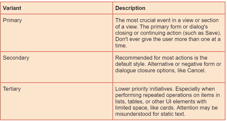
acts that could be dangerous, like those that could destroy or lose data.
Only when the harmful action is the most likely course of action, such as the positive Delete action in a deletion confirmation box, should primary danger buttons be used.
Actions connected to current faults can additionally make use of secondary and tertiary versions (such as resolving them or viewing their details).
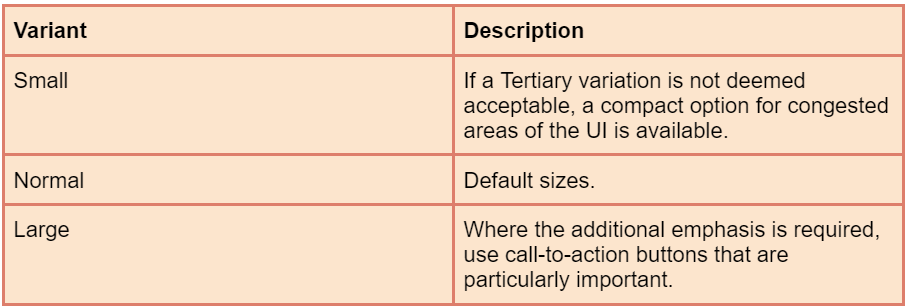
Size Variants
For Button instances whose size needs to be different from the default, the following size options are available:
import com.vaadin.flow.component.button.Button;
import com.vaadin.flow.component.button.ButtonVariant;
import com.vaadin.flow.component.html.Div;
import com.vaadin.flow.component.orderedlayout.HorizontalLayout;
import com.vaadin.flow.router.Route;


@Route("sizes-button")
public class ButtonSizes extends Div {
    public ButtonSizes() {
        Button largeButton = new Button("Small");
        largeButton.addThemeVariants(ButtonVariant.LUMO_LARGE);

        Button normalButton = new Button("Normal");

        Button smallButton = new Button("Large");
        smallButton.addThemeVariants(ButtonVariant.LUMO_SMALL);

        HorizontalLayout horizontalLayout = new HorizontalLayout(largeButton, normalButton, smallButton);
        add(horizontalLayout);
    }
}
You can also try this code with Online Java Compiler
The Tertiary Inline variation, which is helpful for embedding a Button as a part of text content or another component, removes any white space from the label's surrounding area. But it must not be mistaken with a Link.
import com.vaadin.flow.component.button.Button;
import com.vaadin.flow.component.button.ButtonVariant;
import com.vaadin.flow.component.html.Div;
import com.vaadin.flow.router.Route;

@Route("tertiary-button-inline")
public class ButtonTertiaryInline extends Div {
    public ButtonTertiaryInline() {
        Button tertiaryInlineButton = new Button("Inline Tertiary");
        tertiaryInlineButton.addThemeVariants(ButtonVariant.LUMO_TERTIARY_INLINE);
        add(tertiaryInlineButton);
    }
}
You can also try this code with Online Java Compiler
In addition to text, buttons may also feature icons on either side of the text:
Recommendations for use:
Use only a few icons. The use of icons in addition to the text should be considered against the additional visual noise this causes because it might be challenging to express the majority of activities with icons in a reliable manner.
The majority of times, icon-only buttons should be used for actions that are repeated and have extremely widespread, widely recognized icons (such as a cross for close) (for example, in lists and tables).
Using the aria-label attribute, icons-only buttons must offer screen readers a text alternative.
import com.vaadin.flow.component.button.Button;
import com.vaadin.flow.component.button.ButtonVariant;
import com.vaadin.flow.component.html.Div;
import com.vaadin.flow.component.icon.Icon;
import com.vaadin.flow.component.icon.VaadinIcon;
import com.vaadin.flow.component.orderedlayout.HorizontalLayout;
import com.vaadin.flow.router.Route;

@Route("icons-button")
public class ButtonIcons extends Div {
    public ButtonIcons() {
        Button plusButton = new Button(new Icon(VaadinIcon.PLUS));
        plusButton.addThemeVariants(ButtonVariant.LUMO_ICON);
        plusButton.getElement().setAttribute("aria-label", "Add item");


        Button closeButton = new Button(new Icon(VaadinIcon.CLOSE_SMALL));
        closeButton.addThemeVariants(ButtonVariant.LUMO_ICON);
        closeButton.getElement().setAttribute("aria-label", "Close");

        Button arrowLeftButton = new Button("Left", new Icon(VaadinIcon.ARROW_LEFT));

        Button arrowRightButton = new Button("Right", new Icon(VaadinIcon.ARROW_RIGHT));
        arrowRightButton.setIconAfterText(true);

        HorizontalLayout horizontalLayout = new HorizontalLayout(closeButton,plusButton,arrowRightButton, arrowLeftButton);
        add(horizontalLayout);
    }
}
You can also try this code with Online Java Compiler
It is preferable to either disable or hide buttons that reflect user-inaccessible actions. A dimmed version of a disabled button is displayed, and it is not included in the focus order (such as when interactive UI elements are focused using the tab key).
Hidden Vs Disabled
In order to decrease UI clutter, hiding an unavailable action completely is frequently preferable to disabling a button. This, however, can be troublesome in some circumstances:
Even if the form clearly displays the presence of one or more invalid fields, the user may become confused if a button is hidden when they expect it to be there, such as at the end of a form.
Toggling a hidden button's visibility can result in unintended changes to the arrangement of other elements because a hidden button takes up no room in the user interface.
Showing an error on click
Unavailable actions can be set up to display an error message when the button is clicked as an alternative to being hidden or disabled (using a Notification or an adjacent inline text element). Although this method is the most accessible, users who anticipate that unavailable actions will be distinguished from available actions may become frustrated.
Prevent multiple clicks
When a button is clicked, it can be designed to automatically disable it.
This is particularly helpful for tasks that require some time to complete. This avoids the need for specific click handling while the action is being processed, and it also lets the user know that the action was received and is being handled successfully.
Focus
The focus ring is only displayed when the button is focused via the keyboard or programmatically, much like input fields.
Auto Focus
When the UI in which they appear is rendered, buttons may immediately get keyboard attention.
Button button = new Button(" new Button");
button.setAutofocus(true);
You can also try this code with Online Java Compiler
we can use Enter or Space to activate a focused button.
Button labels
The label should explain what is being done, especially using active verbs like "View details" rather than merely "Details."
When there may be any misunderstanding, be sure to include the verb's object as well. For example, use "Save changes" rather than "Save."
The words "Save changes" rather than "Yes" should be used in button groups that indicate options, such as the buttons on a confirm dialogue, as the latter causes the user to read the question being posed and increases the chance that the user will choose the incorrect option.
Labels should not exceed three words or 25 characters, whichever is shorter.
When an activity is not immediate but needs to be completed in several steps, use the ellipsis (...). This is helpful, for instance, when a Confirm Dialog is used to confirm an action before it is carried out, such as with the "Delete" command.
Aria Labels
For accessibility technologies (AT) like screen readers, a separate label can be provided using the aria-label attribute. This is crucial, for instance, for buttons that merely have an icon and no visible label.
Separate aria-labels for buttons with ordinary, visible labels might also help the AT user by adding additional context that might otherwise be challenging to understand. The aria-label of the buttons in the example below indicates which email address will be deleted.
import com.vaadin.flow.component.button.Button;
import com.vaadin.flow.component.orderedlayout.FlexComponent;
import com.vaadin.flow.component.orderedlayout.HorizontalLayout;
import com.vaadin.flow.component.orderedlayout.VerticalLayout;
import com.vaadin.flow.component.textfield.EmailField;
import com.vaadin.flow.router.Route;

@Route("label-buttons")
public class ButtonLabels extends VerticalLayout {
    public ButtonLabels() {
        EmailField emailField = new EmailField("Primary email address");
        emailField.setValue("codingninjas@example.com");

        EmailField secondaryEmailField = new EmailField("Secondary email address");
        secondaryEmailField.setValue("ninjas@example.com");

        Button clearPrimaryEmail = new Button("Remove", event -> {
            emailField.setValue("");
        });
        clearPrimaryEmail.getElement().setAttribute("aria-label", "Remove primary email address");
        Button clearSecondaryEmail = new Button("Remove", event -> {
            secondaryEmailField.setValue("");
        });
        clearSecondaryEmail.getElement().setAttribute("aria-label", "Remove secondary email address");

        HorizontalLayout horizontalLayout1 = new HorizontalLayout(emailField, clearPrimaryEmail);
        HorizontalLayout horizontalLayout2 = new HorizontalLayout(secondaryEmailField, clearSecondaryEmail);
        horizontalLayout1.setAlignItems(FlexComponent.Alignment.BASELINE);
        horizontalLayout2.setAlignItems(FlexComponent.Alignment.BASELINE);
        horizontalLayout2.getStyle().set("margin-top", "0");
        setPadding(false);
        add(horizontalLayout1, horizontalLayout2);
    }
}
You can also try this code with Online Java Compiler
Buttons for selection-specific actions should be located apart from "global," non-selection-specific actions, preferably below the list of selectable items, in lists of selectable items (as in a Grid) that offer actions appropriate to the selected item. The global "Add user" action is distinguished from the selection-specific actions under the Grid in the example below.
Frequently Asked Questions
In Vaadin, how can I create a button?
Button new Button("Normal Button") = normalButton; addClickListener(myClickListener) for normalButton; The button that Vaadin uses when you don't provide any styles is the standard default Vaading normal button, which is the next size up from the tiny button.
Is Vaadin a GWT based?
The Vaadin framework is well-known to GWT programmers. Vaadin created a complete application framework using GWT. Along with the Errai framework, it is one of the main GWT-based frameworks and offers several intriguing features including add-ons, themes, and connectors with other Java frameworks like Spring.
Define Vaadin plugin?
An open source Java UI library called Vaadin is used to build complex web user interfaces. Developers can build attractive web applications in plain Java by using its component-based API. You don't have to worry about developing JavaScript, CSS, or markup languages with Vaadin, or about client-server communication (XHR, WebSockets).
Conclusion
In this article, we have extensively discussed the introduction to vaadin button, boards, responsive, rows-columns, column wrapping, column spans, breakpoints, breakpoint specific styling.
After reading about the Vaadin button, are you not feeling excited to read/explore more articles on the topic of file systems? Don't worry; Coding Ninjas has you covered. If you want to check out articles related to Vaadin refer to these links


 9+ registered

