


Introduction
Do you know that Vaadin was previously named IT Mill Toolkit? In May 2009, the name was changed to Vaadin Framework, and from that time onwards, that name never changed and, it is still known as Vaadin. On 2010, a directory was opened in the name of Vaadin, and a channel was added. This channel was added so that the distribution of add-on components to the core Vaadin Framework could be made possible, whether free or at cost.

There are several components of Vaadin-Design System Resources which make it quite easy to operate, and therefore, it is now one of the most preferred platforms used for web development. In this blog, we will discuss every such component of Vaadin-Design System Resources in detail.

Vaadin-Design System Resources
When we see Vaadin-Design System Resources, the first thing that comes to mind is these resources are used for system designing.

This category of components, that is, Vaadin-Design System Resources, covers file modules, namely, Foundation, Figma Libraries, Custom Themes, Theme Editor, and CSS Utility Classes. All these modules will be discussed in this blog further.
Foundation
The Foundation Module of Vaadin-Design System Resources includes the very basic and common resources that can be used for designing the system.
These resources include Typography, Color, Size and Space, Shape, Elevation, Interaction, and Utility Classes. You can always use CSS Custom Themes and Properties to apply each resource mentioned above in a consistent manner, that is, throughout the application. These properties are imported automatically, and you need no Java Code to implement these. All these resources will be discussed in this blog ahead.
🌀 Typography
The term Typography can be broken into two- Type and Graphy. This clearly means that Typography is the art of presenting the content of the application. It includes the complete font family, that is, font type, font size, font color, background color, etc., and Line Height.
By font here, we mean Headings, body, and all UI text. The font size ranges from XXS to XXXL. Line Height denotes the spacing between the lines.
🌀 Color
The various color options available to us are Modes and Palette.
Modes specify whether the user wants UI to be in the light or dark mode.
Palette is further divided into Base, Grayscale, Primary, Error, Success, and Text.
You can use the table below to see what other options Palette has to offer.
Categories |
Sub-Categories |
Description |
| Base |
|
It is the main background color. |
| Grayscale | 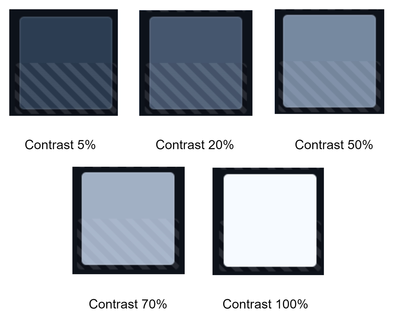 |
It is applied on top of the main background color. |
| Primary | 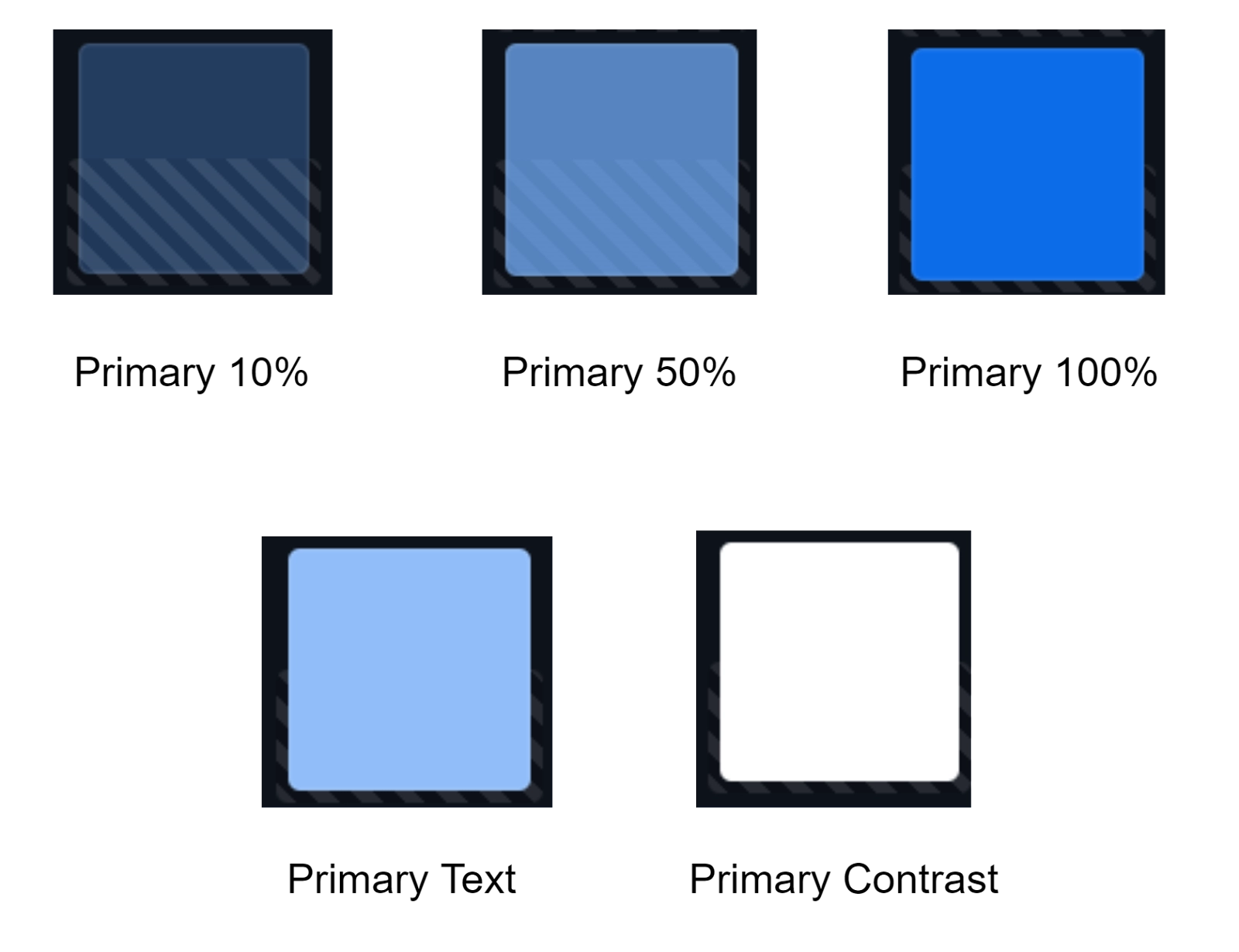 |
It is used to bring attention to some elements of UI. |
| Error |  |
It is most often a red color used to display loss. |
| Success |  |
It is most often a green color used to display completion. |
| Text | 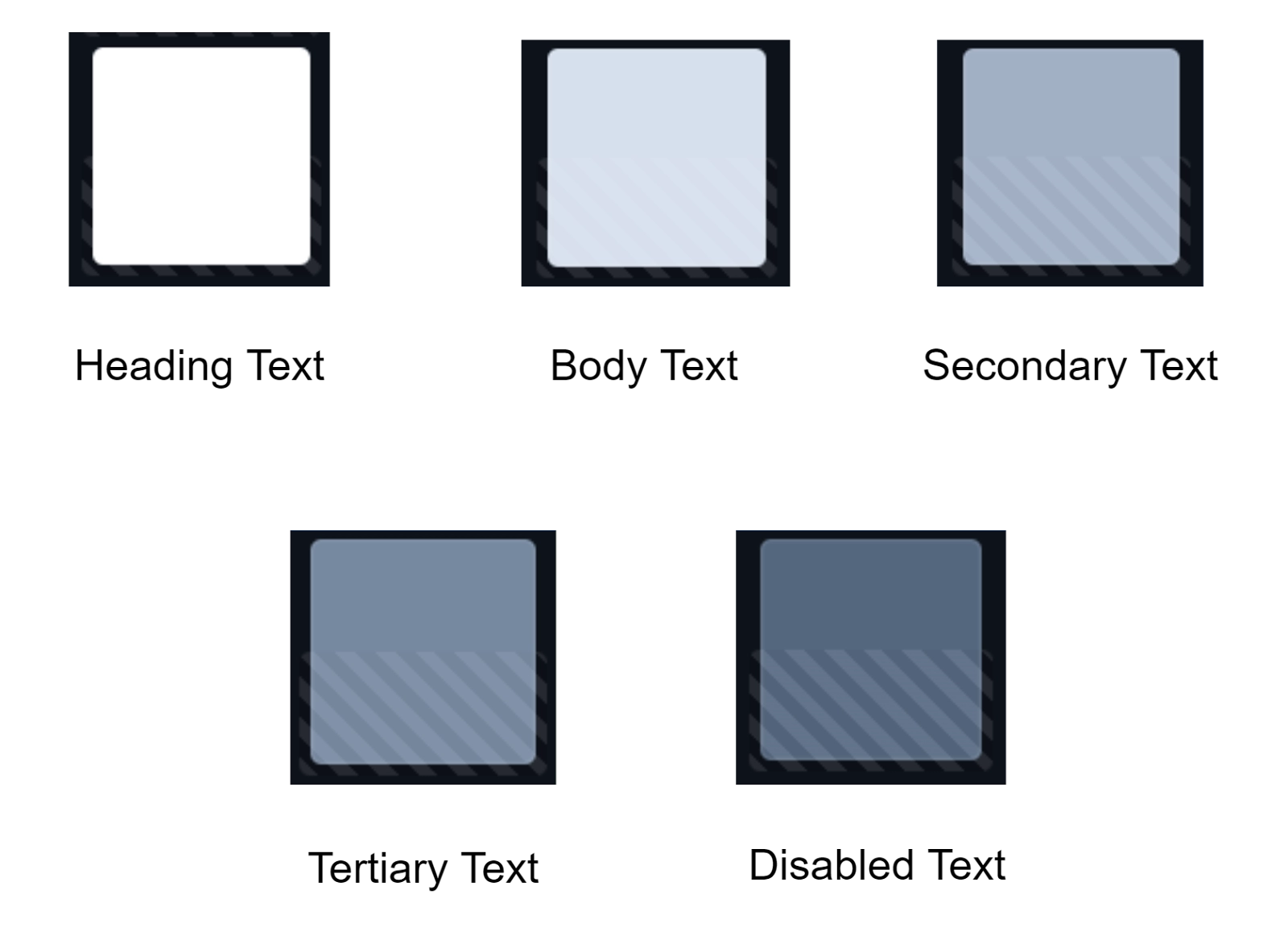 |
Its sub-categories show some default contrast settings. |
🌀 Size and Space
The size property of the foundation module of Vaadin-Design System Resources is used to adjust the sizing of regular elements that could be present in an application, such as buttons, text fields, and list items. The options available for such elements are:
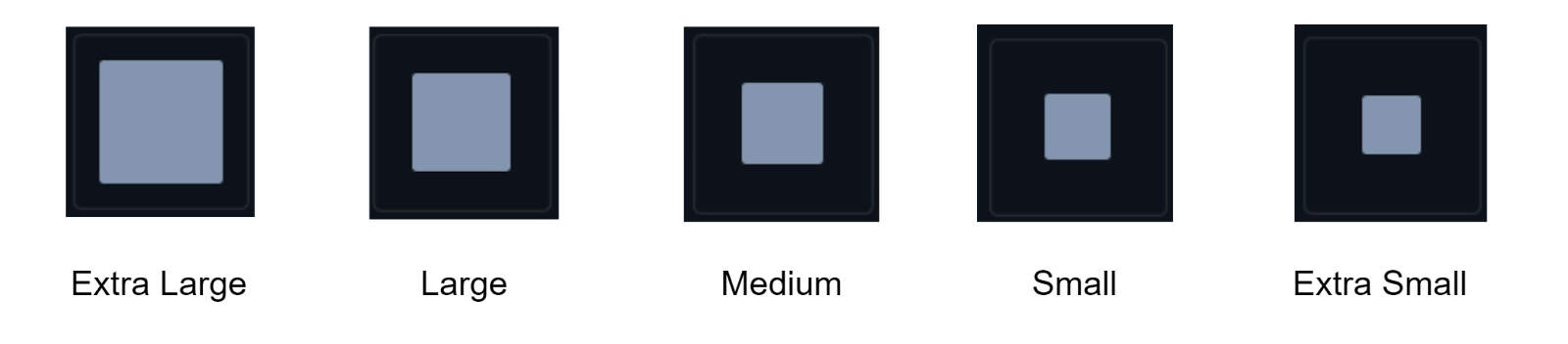
Usually, the standard size which we use is Medium.
The Space property determines the spacing between the components present in the UI. There are various options made available to us. You can refer to the image below for that.

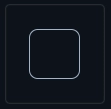
🌀 Shape
The Shape resources are used for the adjustment of the visual style of component shapes. The Border Radius is one such property that usually determines the shape. The values are defined as em by default, and so they scale up with the font size. The three categories of Border Radius that are made available to us by Vaadin-Design System Resources are mentioned in the table below.
Icon |
Shape Type |
Description |
 |
Large |
This is the second type of Box Shadow. Elements that have to be present above most of the elements in UI but below the elements of Extra Large Box Shadow are placed using this elevation. For Example: Dialogs |
|
Medium |
The Medium Box Shadow Type is used to depict conceptual overlays and comes third in the category of Box Shadow Type. For Example: Select Bar and Menu Bar |
|
Small |
The Small Box Shadow Type is used to place such elements in the application, which should be below most of the elements in UI. For Example: Tooltips |
🌀 Elevation
The word Elevation basically refers to the act of advancement or being upgraded. In the case of Vaadin-Design System Resources, it is no different. Elevation resources are used to indicate such elements which are placed on top of other present elements in the UI. Basically, those elements are stacked on top of every other element. You can apply different levels of elevation using the box-shadow feature of the Foundation Module of Vaadin-Design System Resources. To know more about such a feature, refer to the table below.
Icon |
Box Shadow Type |
Elevation Description |
 |
Extra Large |
This type comes first in the types of Box Shadow. Elements that are on top of the stack, that is, above all other content, are placed using this elevation. For Example: Notifications |
|
Large |
This is the second type of Box Shadow. Elements that have to be present above most of the elements in UI but below the elements of Extra Large Box Shadow are placed using this elevation. For Example: Dialogs |
|
Medium |
The Medium Box Shadow Type is used to depict conceptual overlays and comes third in the category of Box Shadow Type. For Example: Select Bar and Menu Bar |
|
Small |
The Small Box Shadow Type is used to place such elements in the application, which should be below most of the elements in UI. For Example: Tooltips |
|
Extra Small |
Elements that should be present closest to the background of the application are placed using this Box Shadow type. For Example: Cards |
🌀 Interaction
Interaction resources include those resources which are used for communication purposes. This communication can happen between the system and the user. A very common example of this Interaction property is the Clickable Cursor.
The clickable cursor is one of the best ways in which a user can interact with the application. For some pointer devices, basically, a mouse can be configured in such a way that it can be adapted by your application’s target audience. There are two approaches that can be used whenever there is a need for a cursor. You can either follow the web approach or choose to take the desktop approach.
🌀 Utility Classes
There are several Utility classes made available to us in Vaadin- Design System Resources. These are, namely, Accessibility, Backgrounds, Borders, Box Shadow, Flexbox & Grid, Layout, Sizing, Spacing, and Typography. You will learn them in a separate module in this blog further.
Figma Libraries
Figma is a popular design tool that makes design implementation easy for developers. Designers create pixel-perfect UI designs and sample prototypes, using those in addition to the official Vaadin Figma libraries, developers are able to design with less difficulty. The Vaadin Figma Libraries contain components that use default Lumo styling and can be adapted to suit the user’s branding and vision.
Custom Themes
The easiest way to provide a customized look and feel for your entire application is to use a custom theme. Once any custom has been made, it is subjected to be used in multiple applications. You can store that custom theme that you have created and use them as per your requirements.
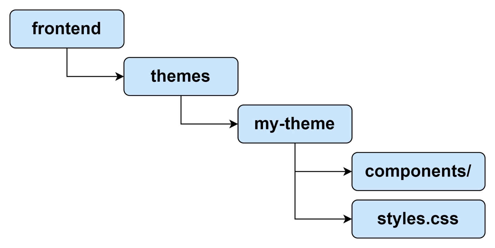
🌳 Theme Folder Structure
The Theme Folder Structure is made to be used in a single application. It is implemented as a folder structure inside the frontend or themes. The minimal structure required for such an implementation is shown in the following image.
🌳 Applying a Custom Theme
Using @theme annotation on a class that implements AppShellConfigurator can help you apply a different theme. There will only be one such class in any application, and all configuration annotations will be defined in that class. All the custom themes that have been configured will be stored in that class. Changes are picked automatically once you reload the application. We will use an example here of a String Boot Class whose application configuration class is given below.
@Theme("my-theme")
public class Application extends SpringBootServletInitializer
                         implements AppShellConfigurator {
  ...
}
🌳 Master Style Sheet
The term ‘master’ itself signifies that it is something superior. When you want to apply a custom theme globally, you need to use master style sheets with an extension styles.css. Any custom theme, when applied to any application, gets loaded automatically as global CSS. At the very instance, when a user decides to use that theme in a complete application, it becomes Master Style Sheet. Style Sheets other than Vaadin Component Styles do not get loaded automatically. To include them in the Master Style Sheet folder, you need to use the CSS @import statements given below.
@import 'other-styles.css';
html, :host {
  --lumo-border-radius-m: 0.5em;
  --my-brand-color: purple;
}
.application-header {
  background: white;
  border-bottom: 1px solid gray;
}
🌳 Vaadin Component Styles
As the name suggests, this property of Vaadin-Design System Resources lets you design the components of Vaadin. The styling of components is internal and isolated from the global CSS styling. The most common way to customize the styles of Vaadin components is by using available built-in themes and by injecting custom CSS into the shadow DOM of the components. The structure used to make such an implementation is given below.

🌳 Other Theme Assets
When we say other theme assets, we are referring to assets such as fonts, images, and icons which are often needed in addition to the style sheets. These assets are put in the theme folder as desired, that is, they can be included in the root or in the sub-folders. The structure used to include two images in the image subfolder and also a font file in the theme root is given below.

🌳 Document Root Style Sheet
Certain styles are placed in a special style sheet inside the theme folder root called document.css. The purpose is to make sure that styles are always applied to the document root and not to the shadow root of that application. A document root style sheet is mainly needed to make @font-face declarations that are not supported inside any web component shadow DOM. In such cases, themes are going to be used inside some nested applications.
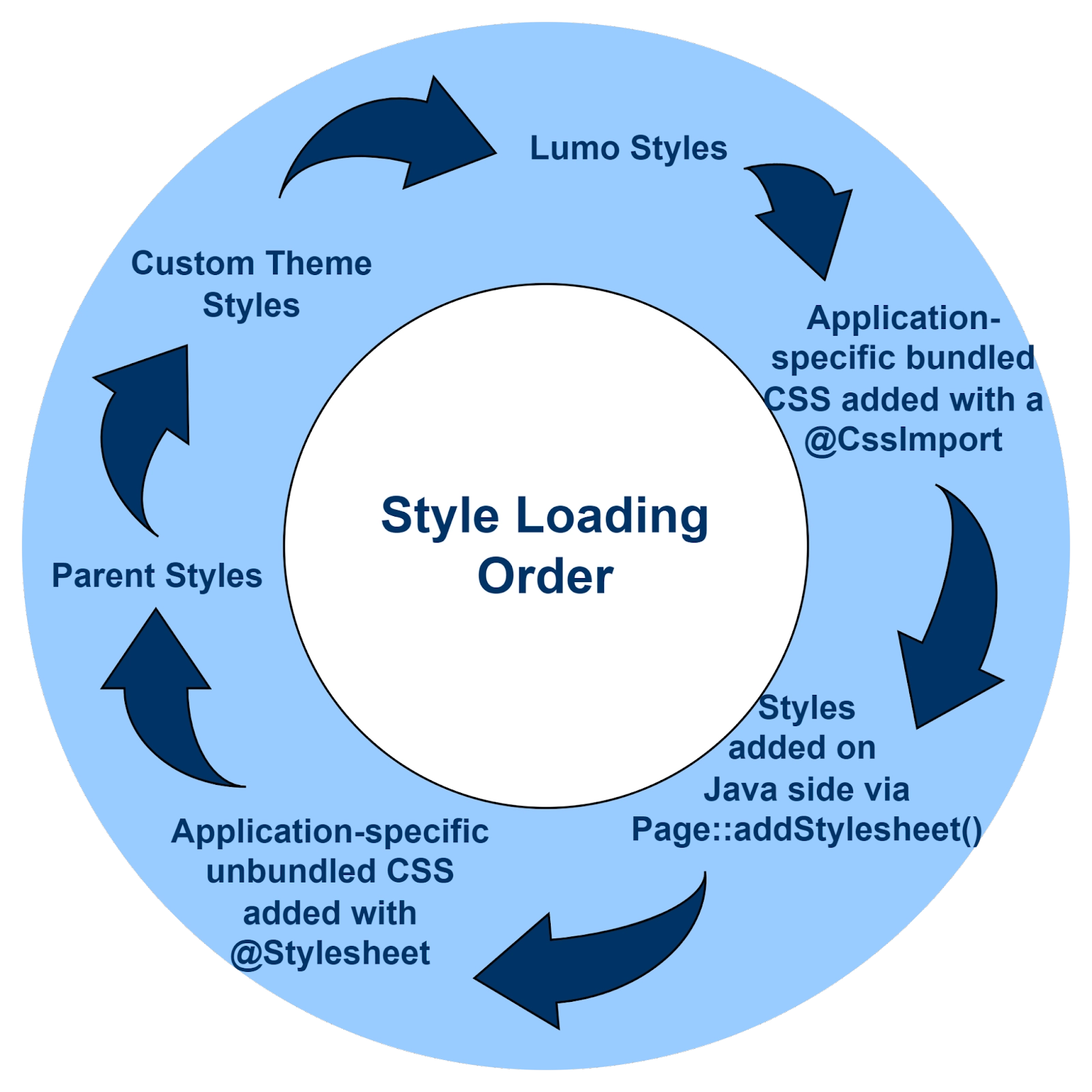
🌳 Style Loading Order
When a custom style is being used, CSS gets loaded in a Vaadin application in the order mentioned below.
Theme Editor
Vaadin provides you with an online theme editor that allows its user to visualize and create different customized themes, that too on top of the Lumo theme. An example of an online editor screen is given below.

Online Theme Editor
In the newer versions of Vaadin, instead of putting using HTML imports and <custom-style>, every CSS command will be placed in the custom theme’s document root style sheet. The extension for which is given below.
frontend/themes/my-theme/document.cssThe CSS commands which were put in <dom-module> elements such as ‘button-style’ and ‘text-field style’ will now be placed in corresponding component style sheets under the extensions frontend/themes/my-theme/components/vaadin-button.css and frontend/themes/my-theme/components/vaadin-text-field.css respectively.
CSS Utility Classes
There is a list of CSS Utility Classes that Vaadin-Design System Resources has to offer. All these classes can be used as per the requirements of the user. These are, namely, Accessibility, Backgrounds, Borders, Box Shadow, Flexbox & Grid, Layout, Sizing, Spacing, and Topography. We will know more about each of these in this blog further.
🍂 Accessibility
As you can assume from the name itself, the accessibility class is used to determine the accessibility of the application. The Java Class used for the implementation of such a class is LumoUtility.Accessibility.
🍂 Backgrounds
It includes all the classes that can be used to apply a background color. The sub-categories of classes include Base, Transparent, Contrast, Primary, Error, and Success.
All these sub-categories are similar to the ones we have studied in the color property of the Foundation Module of Vaadin-Design System Resources. You can refer to that module in this blog above.
🍂 Borders
The Borders class is used to determine the type of border that is to be used in an application. All these borders are present under the Java class LumoUtility.Border. A few examples of class options given to us are shown below.
Further, more customizations can be done by making changes in the Border Color and Border Radius.
🍂 Box Shadow
This class is used for applying a Box Shadow. All these box shadow options are made available to us under the Java class LumoUtility.BoxShadow. These options are, namely, Extra Small, Small, Medium, Large, and Extra Large.
All these sub-categories are similar to the ones we have studied in the box shadow property of the Foundation Module of Vaadin-Design System Resources. You can refer to that module in this blog above.
🍂 Firebox & Grid
These Firebox & Grid classes are used for general flexbox and grid layouts. The table below shows all the sub-categories of classes along with their Java classes, respectively, and examples to depict what that class actually does.
Property |
Java Class |
Examples |
| Align Content | LumoUtility.AlignContent |  |
| Align Items | LumoUtility.AlignItems |  |
| Align Self | LumoUtility.AlignSelf |  |
| Justify Content | LumoUtility.JustifyContent | 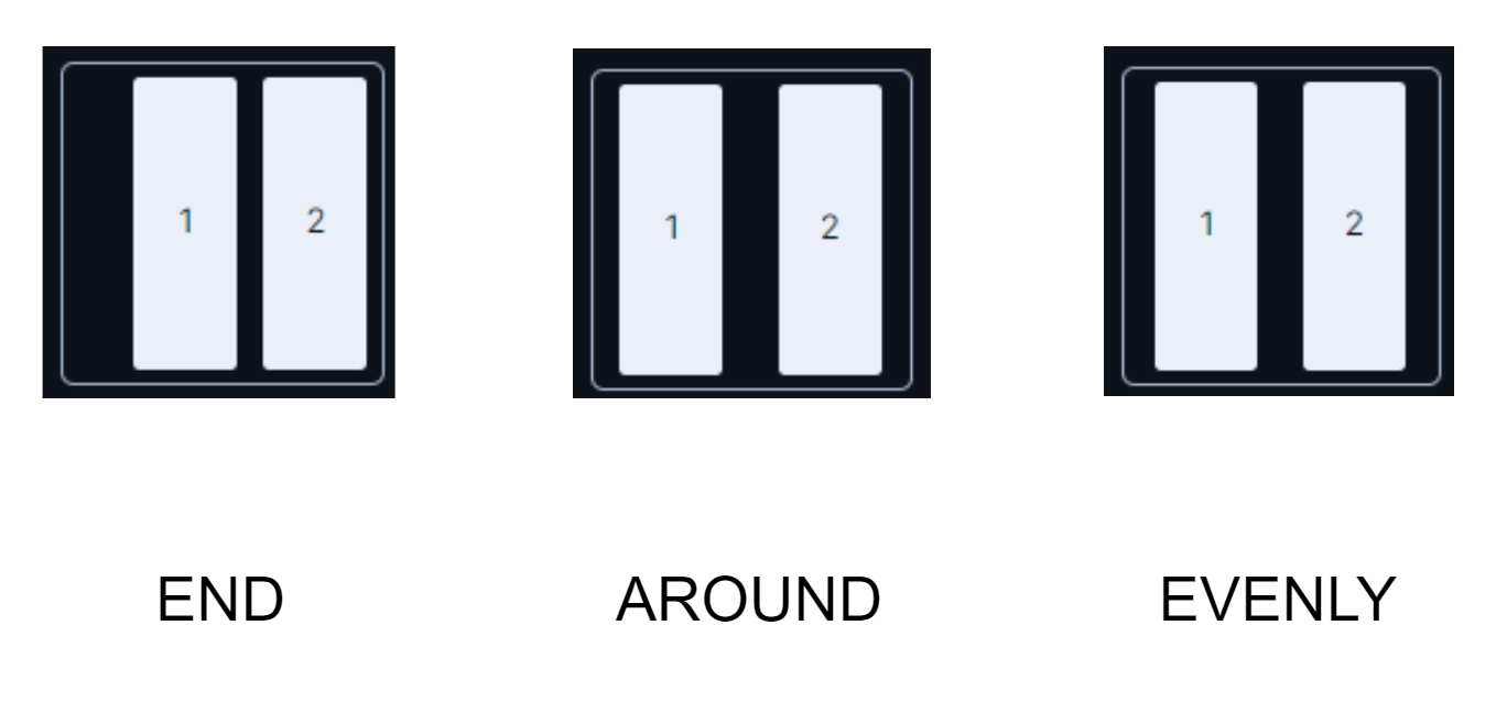 |
| Flex | LumoUtility.Flex |  |
| Flex Direction | LumoUtility.FlexDirection |  |
| Flex Grow | LumoUtility.FlexGrow |  |
| Flex Shrink | LumoUtility.FlexShrink | 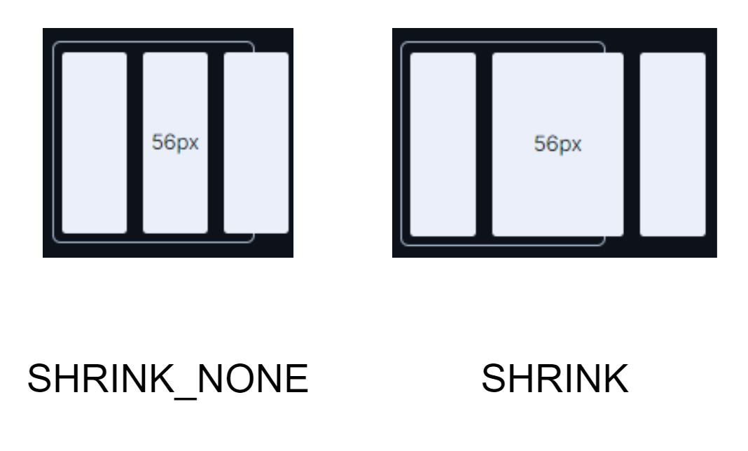 |
| Flex Wrap | LumoUtility.FlexWrap | 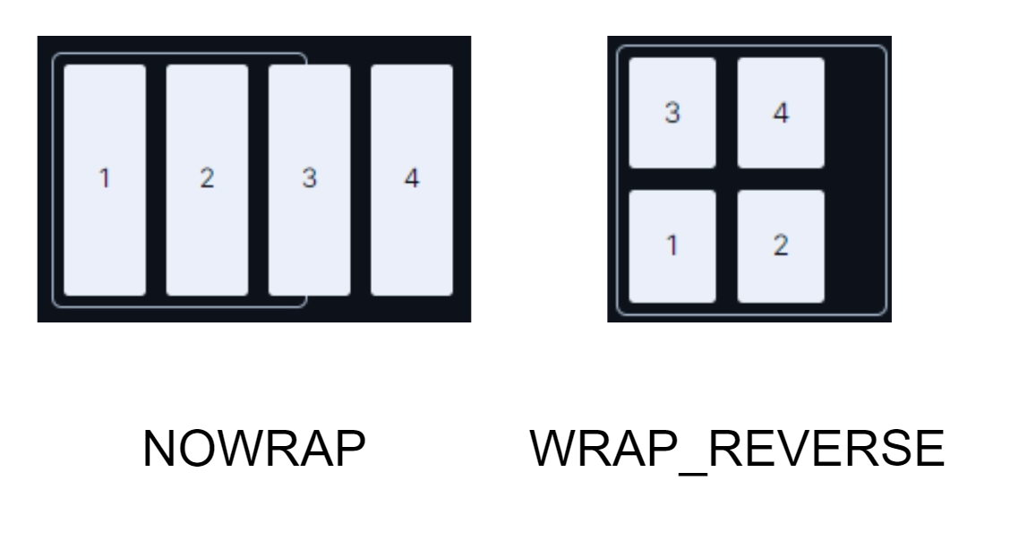 |
| Gap | LumoUtility.Gap | 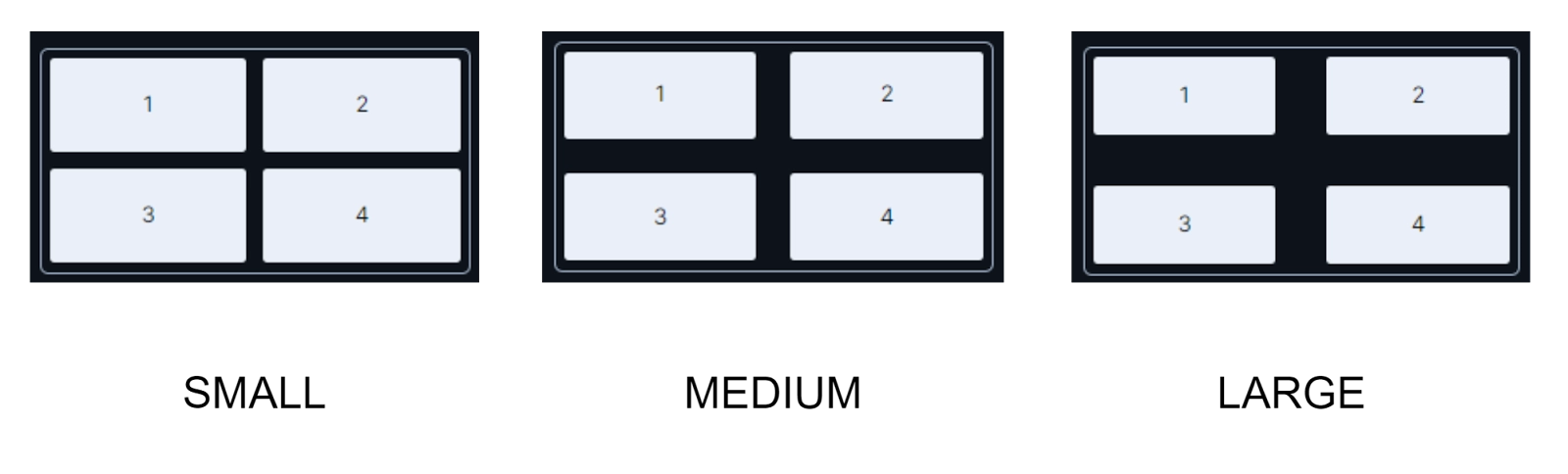 |
| Column | LumoUtility.Column |  |
| Row | LumoUtility.Row | 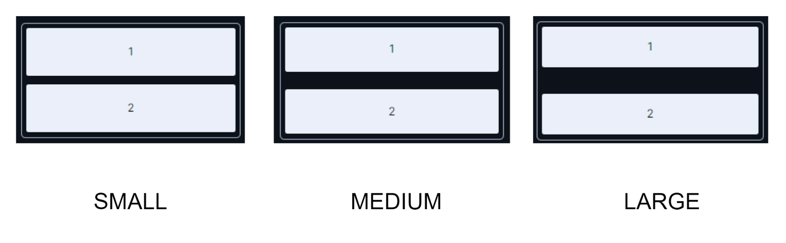 |
| Grid Columns | LumoUtility.Grid.Column | 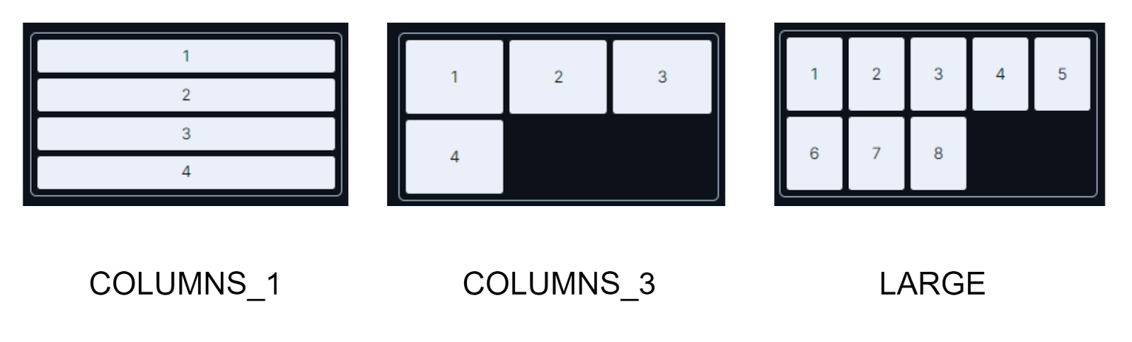 |
| Grid Rows | LumoUtility.Grid.Row | 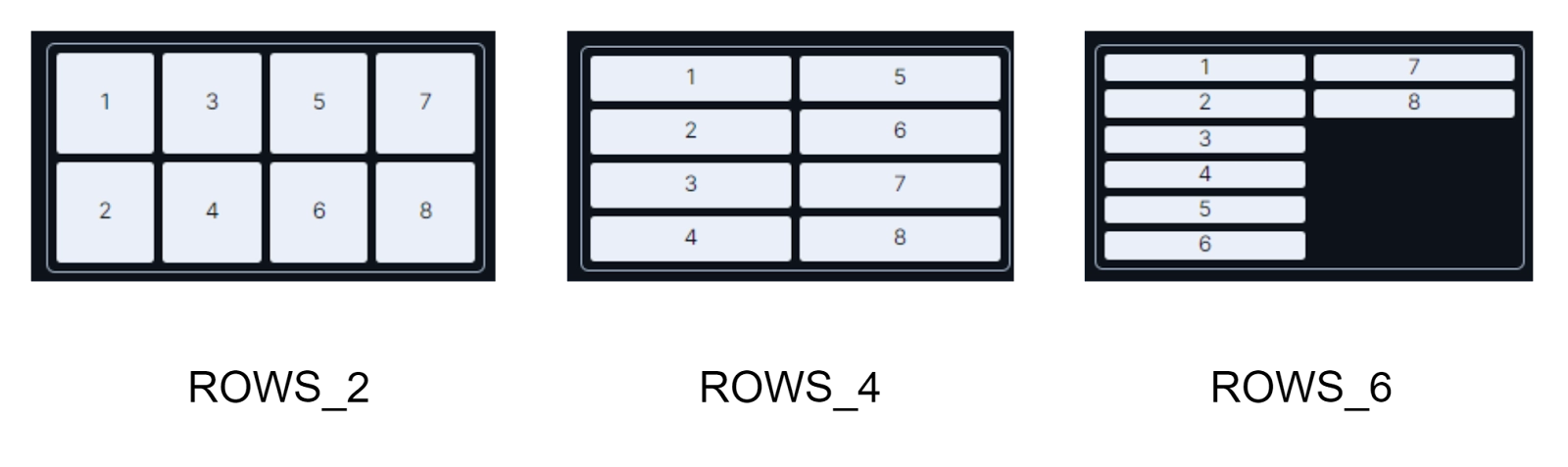 |
| Spanning Columns | LumoUtility.SpanningColumns | 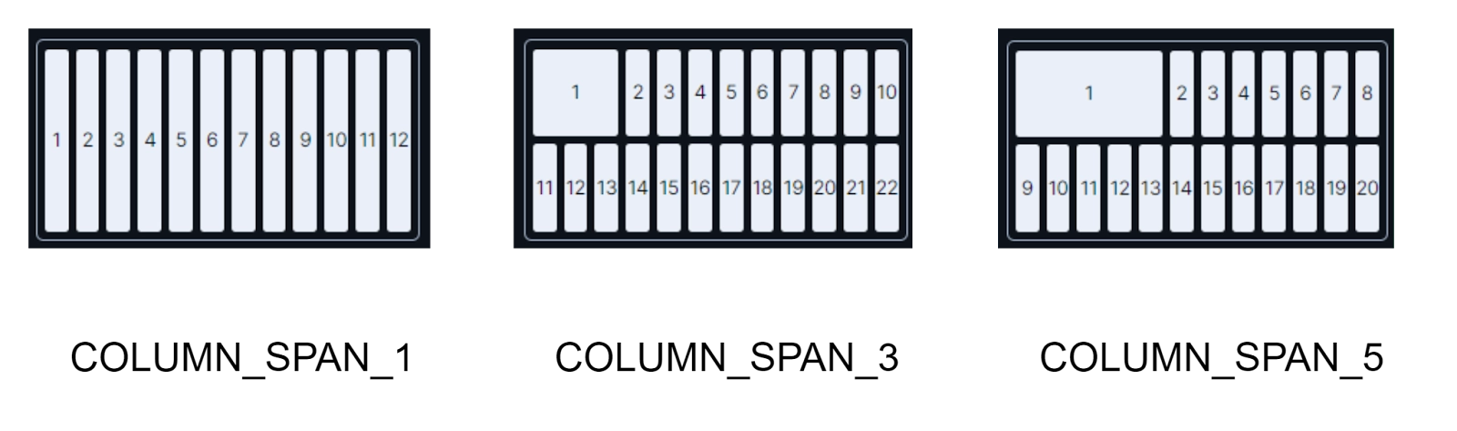 |
| Spanning Rows | LumoUtility.SpanningRows | 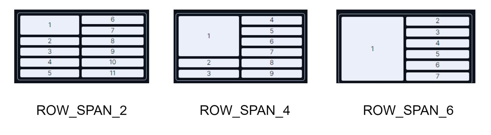 |
🍂 Layout
The Layout classes are used for casual layout purposes. There are various sub-categories of classes available, such as Box Sizing, Display, Overflow, and Position.
The Box Sizing property specifies if the element’s border and padding will be considered as its part or not. This property is made available to us under the Java class LumoUtility.BoxSizing.
The Display property will mention the type of element, whether it is inline or block, and how its components will be laid. This property is made available to us under the Java class LumoUtility.Display.
The Overflow property determines the overflow behaviour of the elements. This property is made available to us under the Java class LumoUtility.Overflow.
The Position property tells us the position of the element. This property is made available to us under the Java class LumoUtility.Position.
🍂 Sizing
The Sizing classes deal with the Height and Width of the elements present in the UI, and also the size of the icons. The respective Java classes for each of these are given below in the table.
Property |
Java Class |
| Height | LumoUtility.Height |
| Width | LumoUtility.Width |
| Icon size | LumoUtility.IconSize |
🍂 Spacing
This Spacing class includes each and every type of spacing that can be present in an application, whether it be margins, padding, or spacing between the elements. There are separate classes for each of these properties.
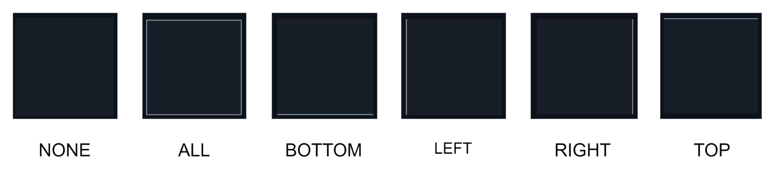
The Margin Class under LumoUtility.Margin Java class is sub-divided into Uniform, Bottom, Left, Right, Top, Inline End, Inline Start, Horizontal, and Vertical. An example of each of these is shown below in the image.
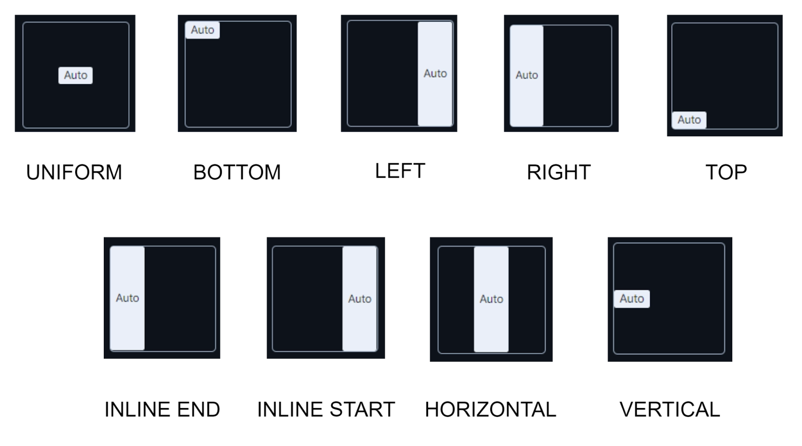
The Padding Class under LumoUtility.Padding Java class is sub-divided into similar options, that are, Uniform, Bottom, Left, Right, Top, Inline End, Inline Start, Horizontal, and Vertical, and have similar effects.
🍂 Typography
It includes all the classes that can be used to make changes in the content of the application. The sub-categories of classes include font options such as Font size, Font type, Font color, Font weight, etc., and Line Height. All these sub-categories are similar to the ones we have studied in the Typography property of the Foundation Module of Vaadin-Design System Resources. You can refer to that module in this blog above.


 8+ registered

