


Introduction
Vaadin is a web application development platform for Java that encourages developers to use Java as their programming language to develop various User Interfaces (UIs) without the compulsion of direct usage of HTML and JavaScript.
The platform includes a set of web components, a Java-based web framework, and a set of tools enabling the implementation of modern web Graphical User Interfaces (GUI). The implementation can be done using Java only, TypeScript only, or both.
There are several Visualization and Interaction components of Vaadin which make it quite easy to operate, and therefore, it is now one of the most preferred platforms used for web development. In this blog, we will discuss one such component of Vaadin, that is, Vaadin-Avatar, in detail.
Vaadin-Avatar
Any kind of graphical representation of an object or an entity, that is, either a person or an organization can be called as Vaadin-Avatar. A few very simple examples with their codes are mentioned below in the table.
Vaadin-Avatar |
Respective Code |
|
Avatar Basic = new Avatar(); |
 |
Avatar avatarName = new Avatar(name); |
 |
Avatar avatarImage = new Avatar(name); avatarImage.setImage(pictureUrl); |
Properties of Vaadin-Avatar
There are three properties of Vaadin-Avatar, namely, name, abbreviation, and image. You can refer to the content below to learn more about these properties.
🍁 Name
The Name is such a component that is added by the developer itself. It has nothing to do with the Avatar as a property. It will be used for backend purposes only.
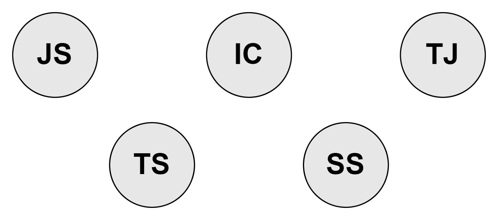
For Example, a list of names stored in a database is given below.
Employee’s Name |
John Smith |
Taylor Swift |
Isabel Christ |
Sia Sharon |
Thomas Jonathan |
🍁 Abbreviation
When you set a name, Vaadin-Avatar automatically generates and displays an abbreviation of the name specified by the user. For example, John Smith would be abbreviated as JS, and Taylor Swift would become TS.
It is such a property that can be set manually and cannot exceed more than three characters. A few examples of abbreviations are shown in the image below.
🍁 Image
Vaadin-Avatar provides you with the possibility to use different display images, such as profile pictures, company logos, or any image of your choice. But, keep in mind that abbreviations will not be shown if you use images.
A few examples of Images used in Vaadin-Avatar are shown below.
Vaadin-Avatar Group
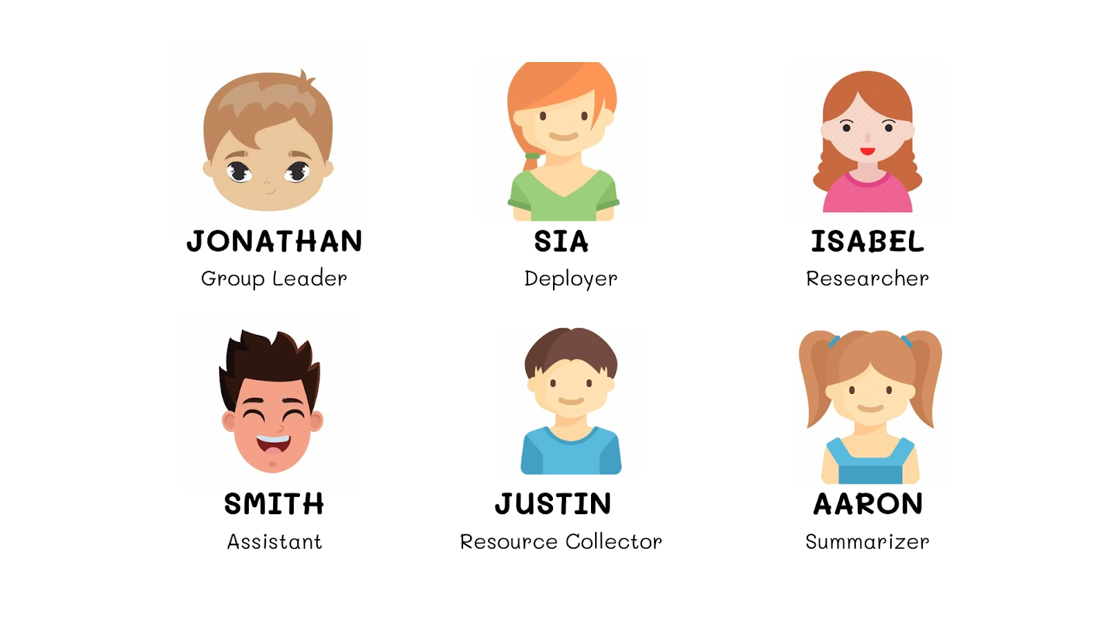
As the name implies, Avatar Group is used to group multiple Avatars in a bunch. These groups are used to show that there are several users using or viewing the same page together. The groups are mostly used in the creation of projects, for example, to display the members of the team, to show which members are working in that module, etc.
Maximum Number of Items
Whenever a group is created, the maximum number of items that should be displayed is specified during the creation. Items that can be displayed are added in the overflow count and are displayed that way. The names are displayed in the manner of a list when you click on that overflow count. The list opened will display the items in the form of abbreviations or images as specified by the developer.
Background Color
Vaadin-Avatar provides you with seven different colors, by default, that you can use. These colors are set using a color index. For every color, there is a specified color index and that index can be used anytime a developer want to use any background color.
The usage of different background colors is useful in many cases, for example, when you want to differentiate certain members of a group for various purposes, when you want to create groups within a group, etc., especially during a collaborative work.
The Java Code to set any background color is mentioned below for your reference. This code is used under the extension ‘AvatarGroupBgColor.java’.
AvatarGroup avatarGroup = new AvatarGroup();
for (Person person : people) {
  String name = person.getFirstName() + " " + person.getLastName();
  AvatarGroupItem avatar = new AvatarGroupItem(name);
  avatar.setColorIndex(colorIndex++);
  avatarGroup.add(avatar);
}
Internationalisation (il8n)
Internationalisation covers all of Avatar’s Texts and Group Texts. These are texts are configurable. You can use the information below for your reference.
🔥 Avatar Texts
Avatar Texts come with fewer complications. These are the default names and have only one property, that is, anonymous.
🍄 anonymous property
As the name suggests, under this property, names are used by default and are not specified by the developer’s end. These are shown on hover in a tooltip and can be announced by the screen readers when any Avatar is focused.
Text Used: Anonymous
🔥 Avatar Group Texts
Avatar Group Texts include a few more properties other than anonymous. You can refer to the information below for more understanding.
🍄 anonymous property
This property of Vaadin-Avatar is the same as the anonymous property of Avatar Texts. Under this property, names are used by default and are not specified by the developer’s end. These are shown on hover in a tooltip and can be announced by the screen readers when any Avatar is focused.
Text Used: Anonymous
🍄 activeUsers.one
This property signifies that there is only one user active currently. It is announced by the screen readers when there is only one Avatar in a group that is active and that one is focused. The name of this Avatar is Read Aloud first.
Text Used: Currently one active user
🍄 activeUsers.many
This property signifies that there are more than one users, that are active currently. Only one Avatarwhich is focused is announced by screen readers even when there are multiple users active. The name of that focused Avatar is Read Aloud first.
Text Used: Currently {count} active users,
where {count} is the number of members of Avatar Group active.
🍄 joined
The name of the Avatar joining the group is announced by the screen readers under this property.
Text Used: {user} joined,
where {user} is the Avatar’s name joining the group.
🍄 left
The name of the Avatar leaving the group is announced by the screen readers under this property.
Text Used: {user} left,
where {user} is the Avatar’s name leaving the group.
Size Variants
Vaadin-Avatar provides you with four different size variants. These variants are allowed to be used in special cases only, for example, when huge distinctions have to be made. The table below shows the four size variants with their respective theme names.
Size Variant |
Theme Name |
| Extra large | xlarge |
| Large | large |
| Small | small |
| Extra Small | xsmall |
Use Cases
There are many cases in which we can use Vaadin-Avatar. One such use case is that it can be paired with Menu bar for creation of a user account menu. The image below shows a User Account Menu Bar.
The code below provided under AvatarMenuBar.java extension is used in creation of user account menu.
Avatar avatar = new Avatar(name);
avatar.setImage(pictureUrl);

MenuBar menuBar = new MenuBar();
menuBar.addThemeVariants(MenuBarVariant.LUMO_TERTIARY_INLINE);

MenuItem menuItem = menuBar.addItem(avatar);
SubMenu subMenu = menuItem.getSubMenu();
subMenu.addItem("Profile");
subMenu.addItem("Settings");
subMenu.addItem("Help");
subMenu.addItem("Sign out");
Output:


 8+ registered

