


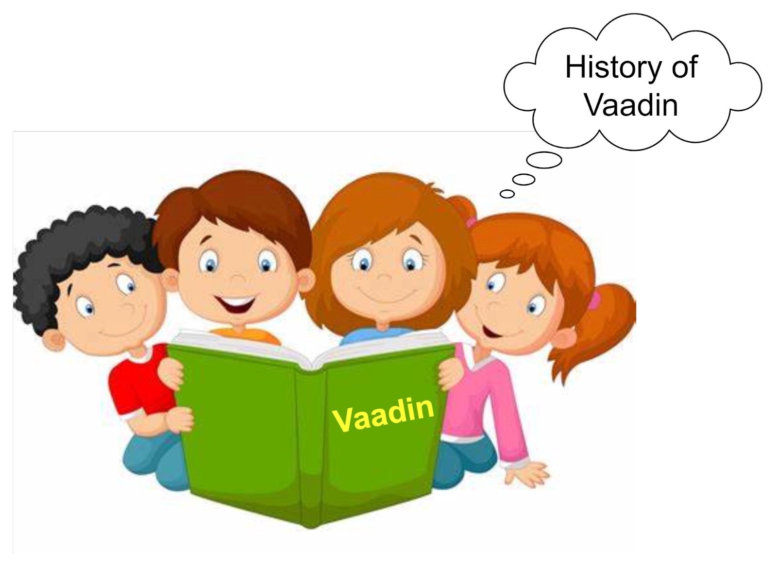
Introduction
Many of you do not know that Vaadin’s development was initially started as an adapter, developed on top of the Milestone 3 open-source web framework, and it was first released in the year 2002. It led to the introduction of a client-communication and rendering engine based on Ajax. This concept’s development started as a commercial product separately in 2006. This is the reason you can observe that a large part of Vaadin’s server-side API still shows compatibility with Millstone’s Swing-like APIs.
There are several components of Vaadin which make it quite easy to operate, and therefore, it is now one of the most preferred platforms used for web development. In this blog, we will discuss one such component of Vaadin, that is, Vaadin-Badge, in detail.
Vaadin-Badge
The colored text element, which contains small bits of information, basically the messages to be conveyed, is known as Vaadin-Badge. It can be used for labeling any content, displaying some metadata, or highlighting some important information.
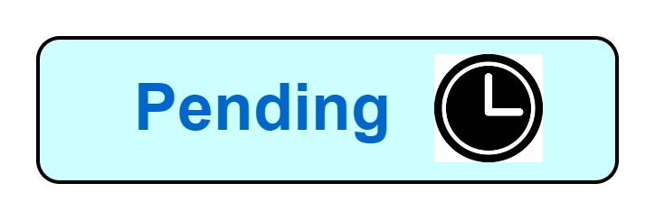
To understand this thing better, you can refer to some sample Vaadin-Badge below.
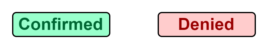
The Java Code under the BadgeBasic.java extension to implement the badges below is given below for your reference.
Span pending = new Span("Pending");
pending.getElement().getThemeList().add("badge");

Span confirmed = new Span("Confirmed");
confirmed.getElement().getThemeList().add("badge success");

Span denied = new Span("Denied");
denied.getElement().getThemeList().add("badge error");

Span onHold = new Span("On hold");
onHold.getElement().getThemeList().add("badge contrast");
Output:
Components of Vaadin-Badge
There are two components of Vaadin-Badge available to us, namely, Label and Icons. We will discuss these all one by one in detail as we proceed further.
🍃 Label
Everybody reading this blog does have an idea of what a label means. It is a precise text that can be written on anything, in this case, Vaadin-Badge, to signify the importance and use of that thing. Every Vaadin-Badge should contain a label. It should be clear, concise, and must be written in a sentence case. The user of this badge must ensure that the test written should not exceed two words. You can refer to the example and explanation below to get a better understanding.
In the image above, you can see a Vaadin-Badge, the message ‘Pending’ is the label for that badge which signifies that the process for which the Badge is being displayed is Pending.
🍃 Icons
Icons are some symbols that are added along with the text in a Vaadin-Badge. Icons are not compulsory to be added, that is, even if they are not added, any badge will work as usual. Icons can be added before or after the label in a Vaadin-Badge, that is, on either side of the label. You can refer to the example and explanation below to get a better understanding.
From the images above, you can assume what an icon would look like. Also, both the examples, that is, before and after the text, have been presented clearly.
The Java Code under the BadgeIcons.java extension to implement the badges with icons present in the image above is given below for your reference.
// Icon before label
Span pending1 = new Span(createIcon(VaadinIcon.CLOCK), new Span("Pending"));
pending1.getElement().getThemeList().add("badge");

// Icon after label
Span pending2 = new Span(new Span("Pending"), createIcon(VaadinIcon.CLOCK));
pending2.getElement().getThemeList().add("badge");

private Icon createIcon(VaadinIcon vaadinIcon) {
    Icon icon = vaadinIcon.create();
    icon.getStyle().set("padding", "var(--lumo-space-xs");
    return icon;
}
The Vaadin-Badge provides you with an Icon-only option. The icon-only badges are such badges in which icons are used without any label. Such badges are when there is extremely usual recurring content. In such cases, the icons used are highly standardized and universally understood. You can refer to the example and explanation below to get a better understanding.
From the images above, you can assume what an icon-only badge would look like.
The Java Code under the BadgeIconsOnly.java extension to implement the icon-only badges present in the image above is given below for your reference.
Icon confirmed = createIcon(VaadinIcon.CHECK, "Confirmed");
confirmed.getElement().getThemeList().add("badge success");

Icon cancelled = createIcon(VaadinIcon.CLOSE_SMALL, "Cancelled");
cancelled.getElement().getThemeList().add("badge error");

private Icon createIcon(VaadinIcon vaadinIcon, String label) {
    Icon icon = vaadinIcon.create();
    icon.getStyle().set("padding", "var(--lumo-space-xs");
    // Accessible label
    icon.getElement().setAttribute("aria-label", label);
    // Tooltip
    icon.getElement().setAttribute("title", label);
    return icon;
}
Theme Variants
Vaadin-Badge features various theme variants that can be as per the requirements. The variants are available in different sizes, colors, and shapes. It is also possible to combine any of these theme variants together.
🍃 Size
There are two different sizes you can use for Vaadin-Badge variants, namely, default (normal) and small. The default one is the normal size variant and you do not need to make any changes for that. The small theme variant is used to make a badge smaller. It can be used when you have limited space or in the compact portions of the UI. To understand this thing better, you can refer to some sample Vaadin-Badge below in which we have applied a small variant.
The Java Code under the BadgeSize.java extension to implement the small theme badges present in the image above is given below for your reference.
Span confirmed = new Span("Confirmed");
confirmed.getElement().getThemeList().add("badge success small");

Span denied = new Span("Denied");
denied.getElement().getThemeList().add("badge error small");
🍃 Color
Vaadin-Badge features four different color variants, namely, default, success, error and contrast. We don’t count the primary variant here because that can be applied with the other four for a more impactful presentation of the badges.
To understand the concept of the Primary variant better, refer to the image below which shows a clear difference between the primary-paired badge and not paired badge.
The primary variant under the theme name Primary is used to depict some more important information. Its work is to draw some extra attention.
The Java Code under the BadgeColor.java extension to implement the primary-paired theme badges present in the image above is given below for your reference.
// Default variant
Span pending = new Span("Pending");
pending.getElement().getThemeList().add("badge");

// Primary variant
Span pendingPrimary = new Span("Pending");
pendingPrimary.getElement().getThemeList().add("badge primary");
The table below shows the theme name and description for all other variants for color.
Variant |
Theme Name |
Description |
| Success | Success | As you can assume by its name, this variant is used to highlight the positive outcomes. It basically denotes completion. |
| Error | Error | This variant sound like danger and is used to depict alerts, failures, or warnings. |
| Contrast | Contrast | The contrast variant is used to provide differentiation as it differentiate the badge from the rest of the UI. This variant is preferred to be used for neutral badges when there is neither success nor error situations. |
| Normal | No Theme Name | It is the very basic default style which is used to provide some common information. This variant is usually confused with a Button or link. |
🍃 Shape
The only other shape provided under this is pill. The pill theme variant produces a badge with a little more rounded corners. It is just used to make badges or buttons more distinct from one another. To understand this thing better, you can refer to some sample Vaadin-Badge below in which we have applied pill variant.
The Java Code under the BadgeShape.java extension to implement the pill theme badges present in the image above is given below for your reference.
//No pill variant
Span onHold = new Span("On hold");
onHold.getElement().getThemeList().add("badge contrast");

//With pill variant
Span onHold = new Span("On hold");
onHold.getElement().getThemeList().add("badge contrast pill");


 8+ registered

