Do you think IIT Guwahati certified course can help you in your career?
Introduction
Vaadin Flow (previously Vaadin Framework) is a Java web framework used to create web applications and websites. The programming model of Vaadin Flow enables developers to use Java as the programming language for implementing User Interfaces (UIs) without having to use HTML or JavaScript directly.
In this article, we will discuss Vaadin basic layouts. We will start by introducing two types of Vaadin basic layouts:vertical and horizontal layouts, and the alignment associated with them. Afterward, we will discuss spacing, padding, margin, and expanding items in our discussion of Vaadin basic layouts. So let’s get started!
Vaadin Basic Layouts
Vaadin's layout consists of two basic components: Vertical Layout and Horizontal Layout. They render their contents vertically and horizontally, as their names imply. Components are displayed in the order in which they are added to either layout.
Vertical Layout
Vaadin's layout consists of two basic components:
Vertical Layout and
Horizontal Layout.
They render their contents vertically and horizontally, as their names imply. Components are displayed in the order in which they are added to either layout.
Vertical Layout components can be aligned both vertically and horizontally.
Components can be placed at the top, middle, or bottom. Alternatively, you can position components by specifying how excess space (if any) in a layout is distributed among them.
Start (Default): The position of all the items is at the top.
Center: The position of all the items is at the vertical center.
End: The position of all the items is at the bottom.
Between: The available space is distributed evenly among the items. There is no space before or after the first or last item.
Around: The available space is distributed evenly among the items. The space between items is half the size of the space before and after the first item.
Evenly: The available space is distributed evenly among the items. The space between items, before the first item, and after the last item is all the same.
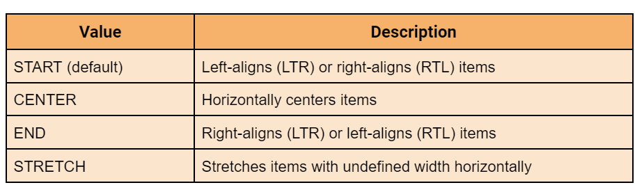
Alignment Positions
The position of alignment in Vaadin while doing vertical alignment in the vertical layout is given in the following table.
Horizontal Alignment
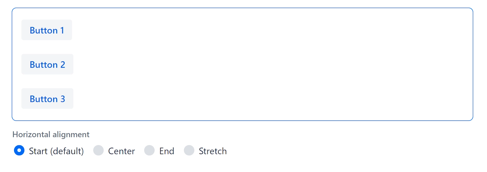
Vertical Layout components can be left-aligned (the default), centred, right-aligned, or stretched horizontally.
Start (Default): The position of all the items is set at default, i.e. left aligns/ left to right (LTR) or right aligns/ right to left (RTL) items.
Center: The position of all the items is at the horizontal center.
End: The position of all the items is set at the end, i.e. right aligns (LTR) or left aligns (RTL) items.
Stretch: Items with an undefined width are stretched horizontally.
Alignment Positions
The position of alignment in Vaadin while doing horizontal alignment in the vertical layout is given in the following table.
Horizontal Layout
The horizontal Layout arranges components in a row side by side. It has an undefined width and height by default, which means that its size is determined by the components it contains.
A horizontal Layout, like Vertical Layout, allows for vertical and horizontal component alignment.
Components can be placed at the top, middle, or bottom. Items can also be stretched vertically along the layout's text baseline.
HorizontalLayout layout = new HorizontalLayout();
layout.setPadding(true);
layout.add(new TextArea("Text area 1"));
layout.add(new TextArea("Text area 2"));
layout.add(new TextArea("Text area 3"));

...

radioGroup.addValueChangeListener(e -> {
    FlexComponent.Alignment alignment = e.getValue().getAlignment();
    layout.setAlignItems(alignment);
});
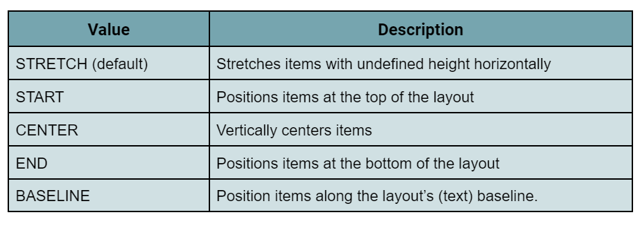
Output:
Stretch (Default): Items are at default positions and with an undefined height they are stretched horizontally.
Start: Items are placed at the top of the layout.
Center: Items are placed at the vertical center of the layout.
End: Items are placed at the bottom of the layout.
Baseline: Items should be placed along the layout's (text) baseline.
Alignment Positions
The position of alignment in Vaadin while doing vertical alignment in the horizontal layout is given in the following table.
Horizontal Alignment
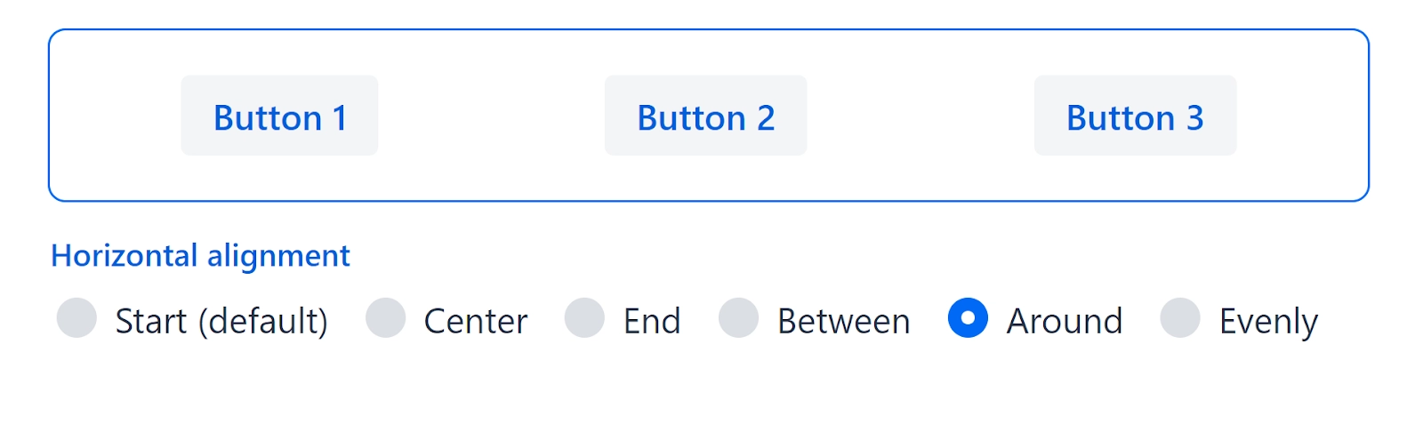
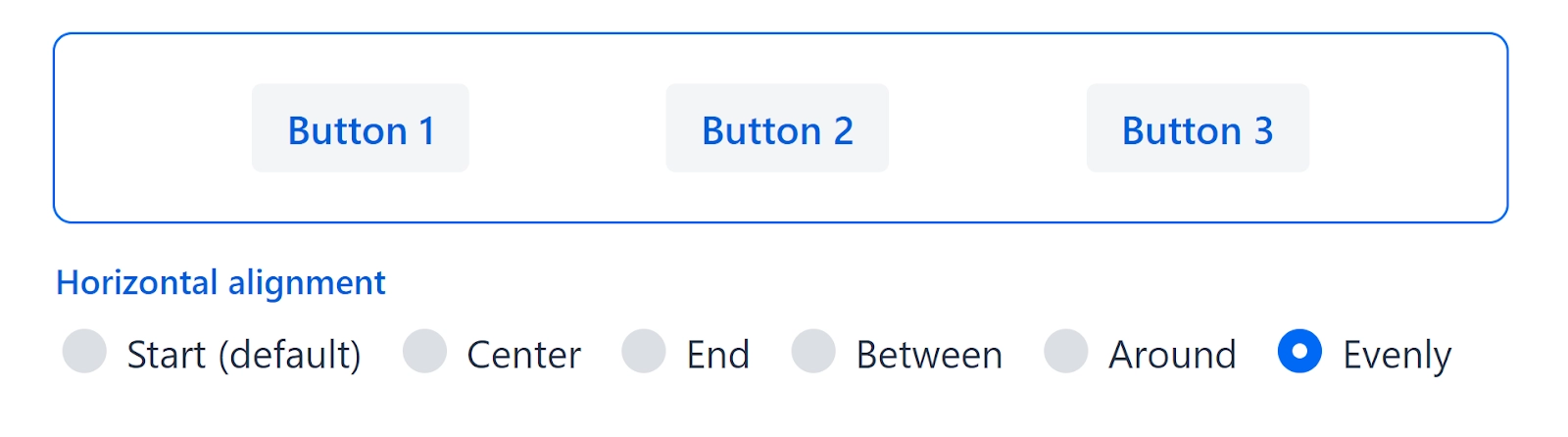
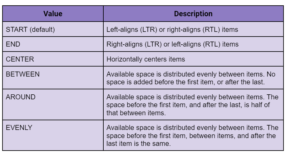
Horizontal Layout components can be left-aligned, centred, or right-aligned. Alternatively, you can position components by specifying how excess space in a layout is distributed among them.
Start (Default): The position of all the items is set at default, i.e. left aligns/ left to right (LTR) or right aligns/ right to left (RTL) items.
Center: Items are placed at the horizontal centers.
End: The position of all the items is set at default, i.e. right aligns (LTR) or left aligns (RTL) items.
Between: The available space is distributed evenly among the items. There is no space before or after the first or last item.
Around: The available space is distributed evenly among the items. The space between items is half the size of the space before and after the first item.
Evenly: The available space is distributed evenly among the items. The space between items, before the first item, and after the last item is all the same.
Alignment Positions
The position of alignment in Vaadin while doing horizontal alignment in the horizontal layout is given in the following table.
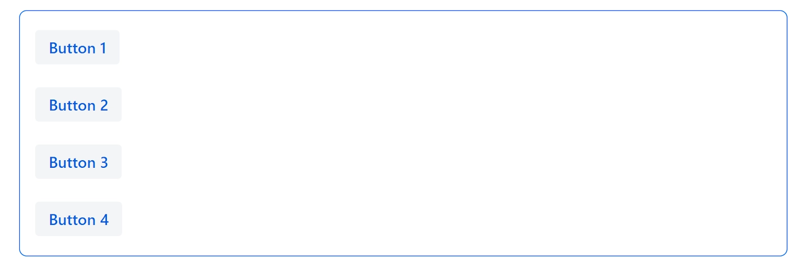
Spacing
Spacing is used to make room for components in the same layout. Spacing can aid in the prevention of misclicks and the differentiation of content areas.
VerticalLayout layout = new VerticalLayout();
layout.setAlignItems(FlexComponent.Alignment.STRETCH);
layout.add(new Button("Button 1"));
layout.add(new Button("Button 2"));
layout.add(new Button("Button 3"));

RadioButtonGroup<String> radioButtonGroup = new RadioButtonGroup<>();
radioButtonGroup.setLabel("Spacing");
radioButtonGroup.setItems(ENABLED_OPTION, DISABLED_OPTION);
radioButtonGroup.setValue(ENABLED_OPTION);
radioButtonGroup.addValueChangeListener(
        e -> layout.setSpacing(ENABLED_OPTION.equals(e.getValue())));
Output:
Disabled: The alignment of the item when the spacing is disabled.
Enabled: The alignment of the item when the spacing is enabled.
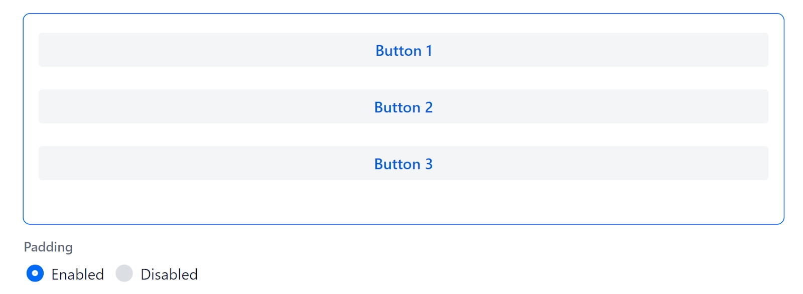
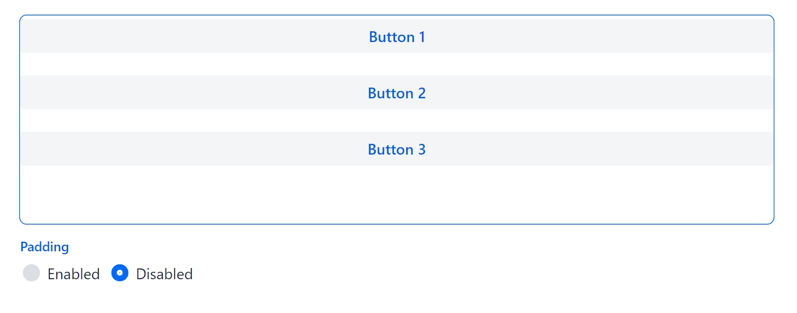
Padding
Padding is the space between the outer border of a layout and its content. Padding can help separate the content of a layout from its surroundings. The padding theme variant is used to add padding.
VerticalLayout layout = new VerticalLayout();
layout.setAlignItems(FlexComponent.Alignment.STRETCH);
layout.add(new Button("Button 1"));
layout.add(new Button("Button 2"));
layout.add(new Button("Button 3"));

RadioButtonGroup<String> radioButtonGroup = new RadioButtonGroup<>();
radioButtonGroup.setLabel("Padding");
radioButtonGroup.setItems(ENABLED_OPTION, DISABLED_OPTION);
radioButtonGroup.setValue(ENABLED_OPTION);
radioButtonGroup.addValueChangeListener(
        e -> layout.setPadding(ENABLED_OPTION.equals(e.getValue())));
Output:
Disabled: The alignment of the item when the padding is disabled.
Enabled: The alignment of the item when the padding is enabled.
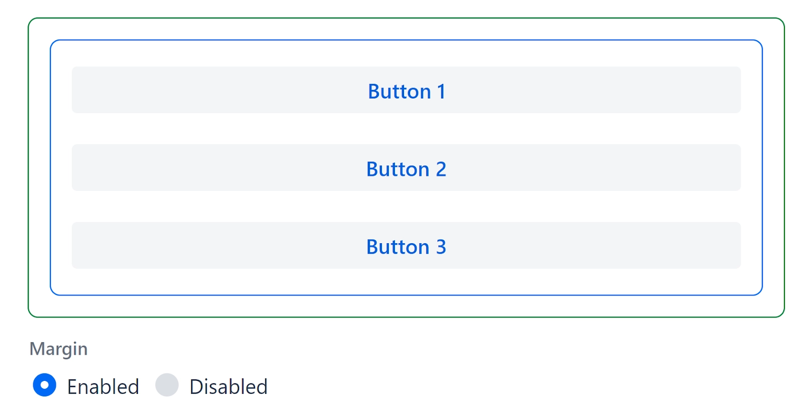
Margin
To make space around a layout, use margin.
VerticalLayout layout = new VerticalLayout();
layout.setWidth("auto");
layout.setMargin(true);
layout.setAlignItems(FlexComponent.Alignment.STRETCH);
layout.add(new Button("Button 1"));
layout.add(new Button("Button 2"));
layout.add(new Button("Button 3"));

RadioButtonGroup<String> radioButtonGroup = new RadioButtonGroup<>();
radioButtonGroup.setLabel("Margin");
radioButtonGroup.setItems(ENABLED_OPTION, DISABLED_OPTION);
radioButtonGroup.setValue(ENABLED_OPTION);
radioButtonGroup.addValueChangeListener(
        e -> layout.setMargin(ENABLED_OPTION.equals(e.getValue())));
Output:
Disabled: The alignment of the item when the margin is disabled.
Enabled: The alignment of the item when the margin is enabled.
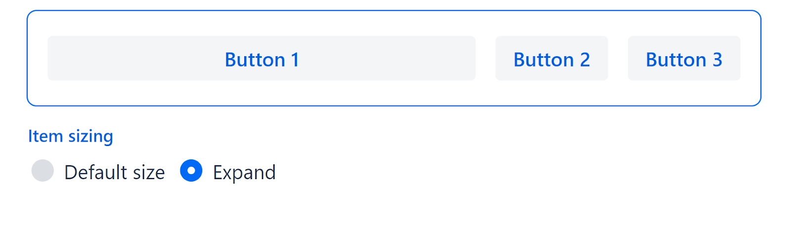
Expanding Items
Components can be designed to expand and take up any extra space in a layout. When multiple components expand, they do so relatively to each other. For example, if you have two items with expanding ratios of 2 and 1, the first item will take up twice as much space as the second.
Default Size: The position of the items when expanding alignment is set on default. We had selected the item “Button 1”.
Expand: The position of the items when expanding alignment is turned on. We had selected the item “Button 1”.
Frequently Asked Questions
Is Vaadin a widely used framework?
Vaadin is an established web framework for creating rich internet applications. Vaadin makes developing web-based GUIs feel like developing a desktop application, which is great, comfortable, and fast.
Is Vaadin a frontend or a backend system?
Vaadin is an open-source platform for developing modern, collaborative Java backend web apps. It combines UI components, frameworks, and tools into a cohesive web development stack.
What is the purpose of Vaadin?
Compared to traditional web technologies, Vaadin provides many more components, layouts, and listeners; thus, it is far preferable to use Vaadin. Vaadin is fully object-oriented due to its Java foundation. A Java developer can easily create a website by understanding Vaadin classes and their applications.
Conclusion
In this article, we have extensively discussed the Vaadin basic layouts, including two types of Vaadin basic layouts, vertical and horizontal layouts. Afterward, we discussed spacing, padding, margin, and expanding items, concluding our discussion of Vaadin basic layouts.
If you think this blog has helped you with Vaadin basic layouts, and if you would like to learn more, check out our articles Vaadin Dialog, Vaadin Date Picker, Vaadin Badge, and Vaadin Themes. You can also refer to our guided path on the basics of java and many more on our Website.
But suppose you have just started your learning process and are looking for questions asked by tech giants like Amazon, Microsoft, Uber, etc. In that case, you must look at the problems, interview experiences, and interview bundle for placement preparations.
Nevertheless, you may consider our paid courses to give your career an edge over others!


 9+ registered

